Reader Design: Erin's Fresh Space

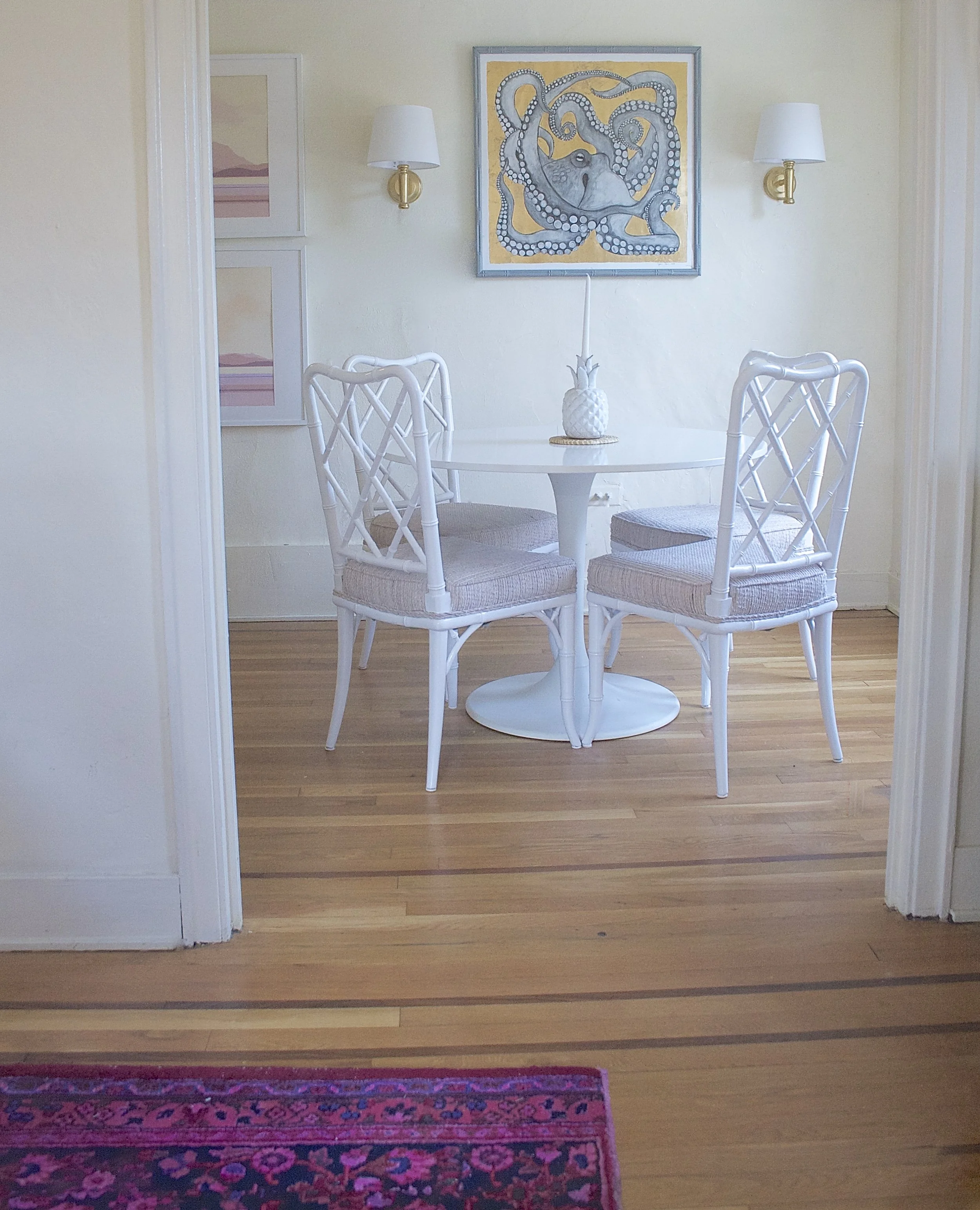
We're off to Pittsburgh today, mutts! A great, interesting East Coast city that's especially great (or so I hear) during football season. Erin's fresh and ecletic home, though, is perfect in any season. 

IMG_6792.jpg
 
IMG_6795 (2).jpg
 

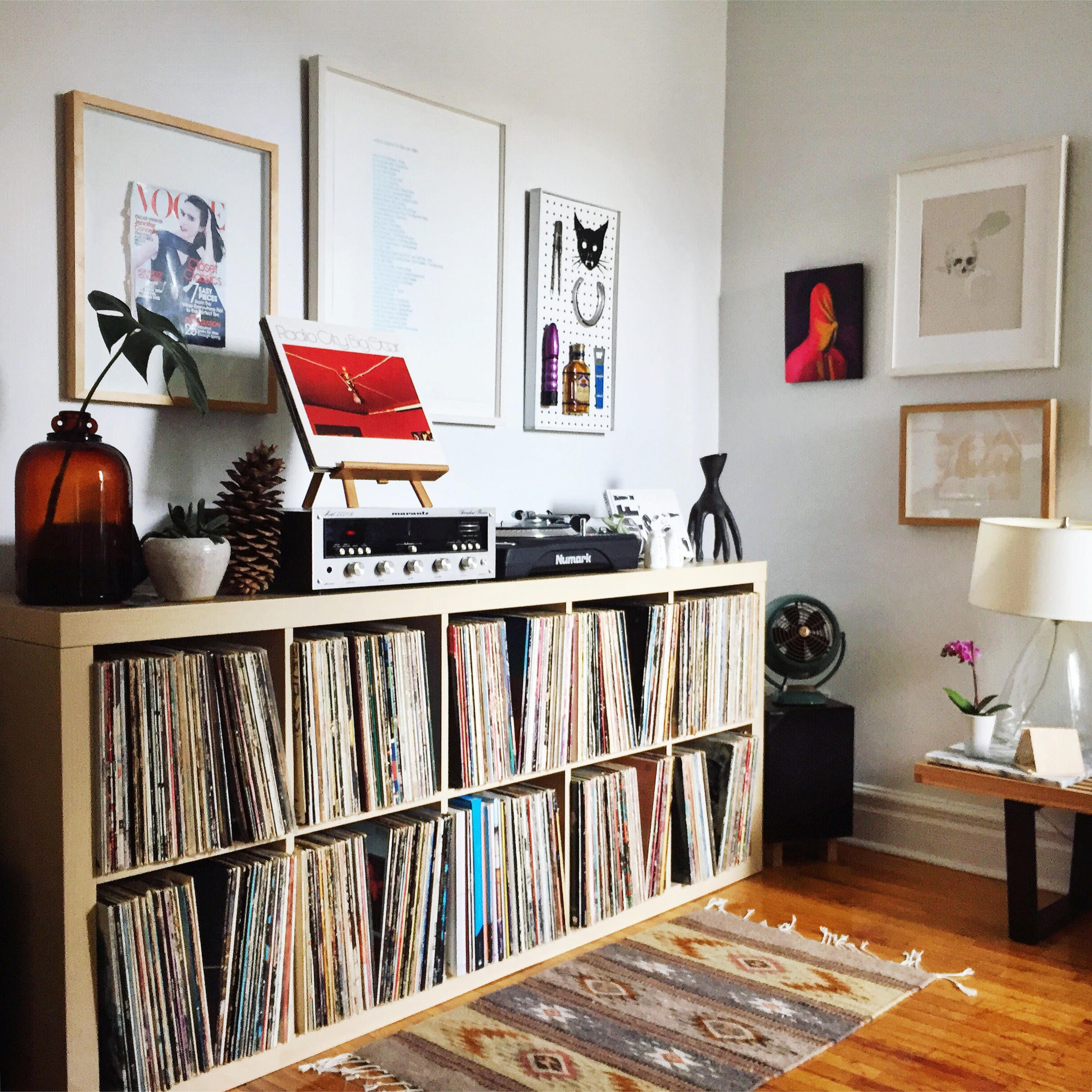
This place is chalk full of unique and interesting finds. The closet home I've seen like Erin's is an Airbnb I stayed in in London earlier this year that had artwork of actual human skulls...  you know your home is different and interesting when you're on THAT level. Erin's design inclinations may be due to her inherent taste, her attraction to rare things, and perhaps, something as simple as geography.

Well, I was born and raised in South Carolina, and I spent 6 years in Manhattan on the Upper East Side, so I like to think my style is combination of those regional elements— the laid-back, classic comfort of the south sprinkled with the refined glam of New York City.
IMG_4095.jpg
IMG_6785.jpg
 
IMG_6784.jpg
 

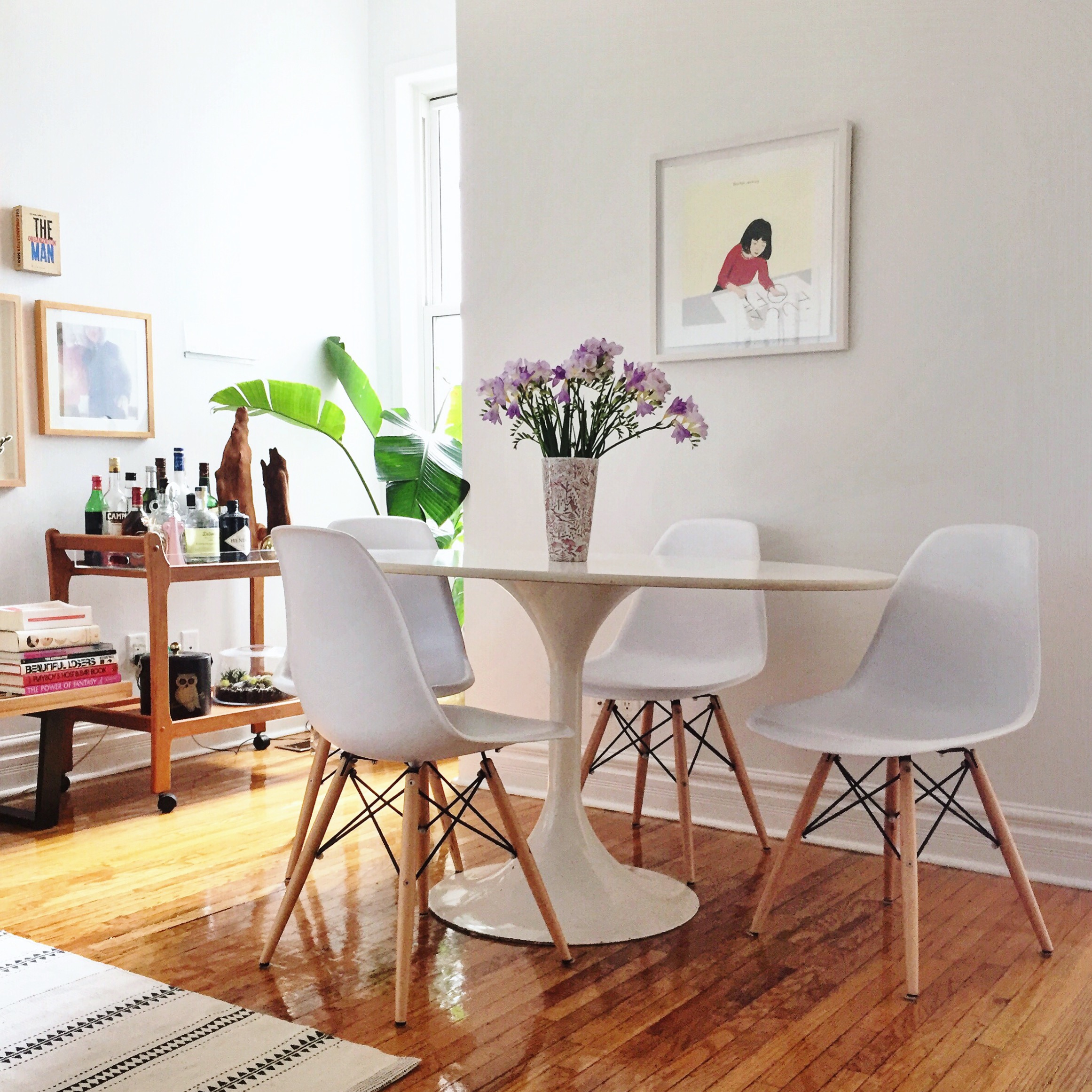
You'll probably quickly note that Erin's home doesn't have many traces of trendiness; she does a great job of staying true to her tastes, using trendy elements sparingly. 

There are definitely trends that I have gone ga-ga over, and it is hard to refrain sometimes. I fell prey to a chevron duvet a few years ago, which still makes me cringe a little looking back! It’s one of the oldest design mantras in the book, but I think the key is using in moderation, and keeping the super trendy things limited to throw pillows or artwork, items that can be easily (and inexpensively) changed out later if you decide you are tired of it or the trend has passed.

Reeling yourself in and only keeping trendy elements to ones that are easy to swap out later is truly easier said than done, but Erin, you make it look easy - and the trends Erin does select, like over-saturated rugs and a pedestal table, still look timeless and functional. In addition to being unique, Erin values comfort just as much.

You know when you see pictures of beautiful rooms that stop you in your tracks and think - “Wow, that is so stunning! But I don’t feel like I could sit on any of that furniture!” I want it to feel the exact opposite of that.
IMG_3789.jpg
IMG_3492.jpg
IMG_2976.jpg

Every choice in Erin's home seems to just invite you in - either physically, saying 'take a seat,' or emotionally, inviting you to ask a question or dive deeper into the story. 

In the bedroom, one of Erin's favorite pieces is the framed art above the bed, which is actually a vintage Hermes scarf. 

I love the nautical theme & pastel colors (I grew up sailing). I based my entire NYC studio design around it when I lived there, and later our master bedroom when I got married. Luckily my husband isn’t too picky about the pink!

Erin, your home is special indeed. Thanks for the tour! Follow Erin along on Instagram at @mediumalistdesign.

See you next week!

McKenna Sig.jpg

Reader Design: Elaine's Vintage Digs

Mutts, we are officially back after a few weeks away for some much-needed summer relaxation. It just doesn't feel like summer without a few days to unwind near the water or in the mountains - pick your poison. I'm currently in the mountains of Virginia with family for the weekend - and the red eye from the Seattle is to thank for today's #stylemuttspaces delay.

Now, on to the good stuff. We're back to Canada to tour Elaine's vintage home. 

Her home is chalk-full of eclectic finds, great texture, cool tones paired with typical warm mid-century elements, and lots of personality. 
From Elaine:

I like to throw in a dash of dirty ‘70s décor into my spaces (think vintage fibre art, rattan, brass and lots of crazy plant lady action). I also get a kick out of juxtaposing harder, more minimal pieces with organic, handmade elements. Nothing sexier than mixing materials — keeps things from looking too matchy-matchy.

Right away, we get to see the best vintage find of all - the Don Freedman wall hanging that totally makes the living room, which fellow Torontonian Jo @jmwearing hooked her up with. 

Freedman designed a whack of super fun and deliciously kooky fibre art for Interlude in the 70’s. The colours couldn’t go more perfectly with what we have going on in the living room and that wall was crying out for a little sum sum!

Despite its urban location, the decor channels an aesthetic that used to be typically found in the southwest - but now is taking locations far & wide by storm. 

Sometimes I like to pretend I’m staying at an Airbnb situated somewhere in Joshua Tree and not living in a rental in downtown Toronto. A girl can dream, no?

The whole home has the vibe of an artist's studio - relaxing, interesting, with plenty of conversation-starting pieces. It's the kind of place that absolutely inspires with quality pieces that have been carefully curated and melded together. What I love about Elaine is that she naturally leans toward one-of-a-kind items, so you won't find many big box purchases! 

And finally, Elaine leaves us with a big heaping for gratitude for this crazy design community of which we're all a part: 

I’ve just been awestruck about the amount of creativity, inspiration, and goodwill I’ve encountered from the online home décor and design community. At first I felt like a total goof hashtagging posts on Instagram—but then I realized that’s how you find your “people.”

Hashtags are how we came to find each other, so we certainly those same feelings. Thank you all for following along, and thank you to Elaine for showing  us around her gorgeous home. Follow along on Instagram at @lana_gto for more. 

Mid-Mod Dining Chairs

Not even two weeks into the summer and somehow I managed to get my hands on some Brody mid-century modern dining chairs!  Can I get a holla?!?!  Except there was only one problem...

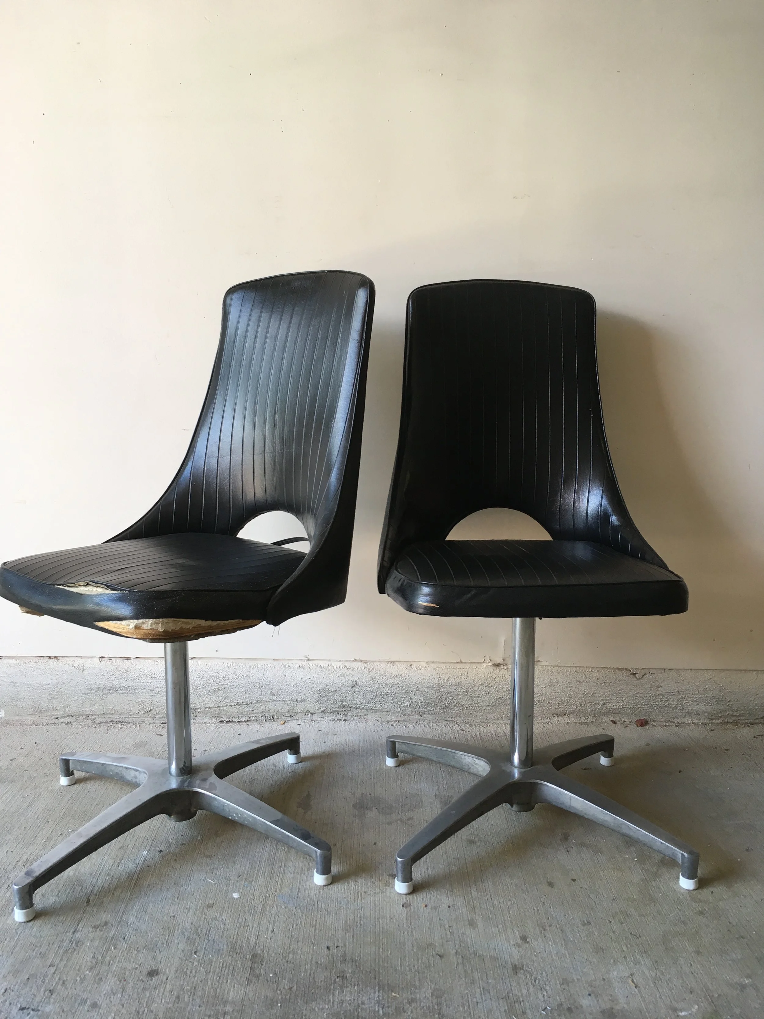
 They looked like this:

See that splitting vinyl??  Tres tragique!  What's worse was even the underside of the chairs had instructions on how to care for the upholstery.  Someone had seriously neglected these puppies in a past life...

I motion that they add to the *DON'TS column: "Do not give to frat house or wreckless bachelor" (which is how I got my hands on them).

Since the original vinyl was so SHOT, I  had no choice but to replace the fabric.  New upholstery challenge accepted! 

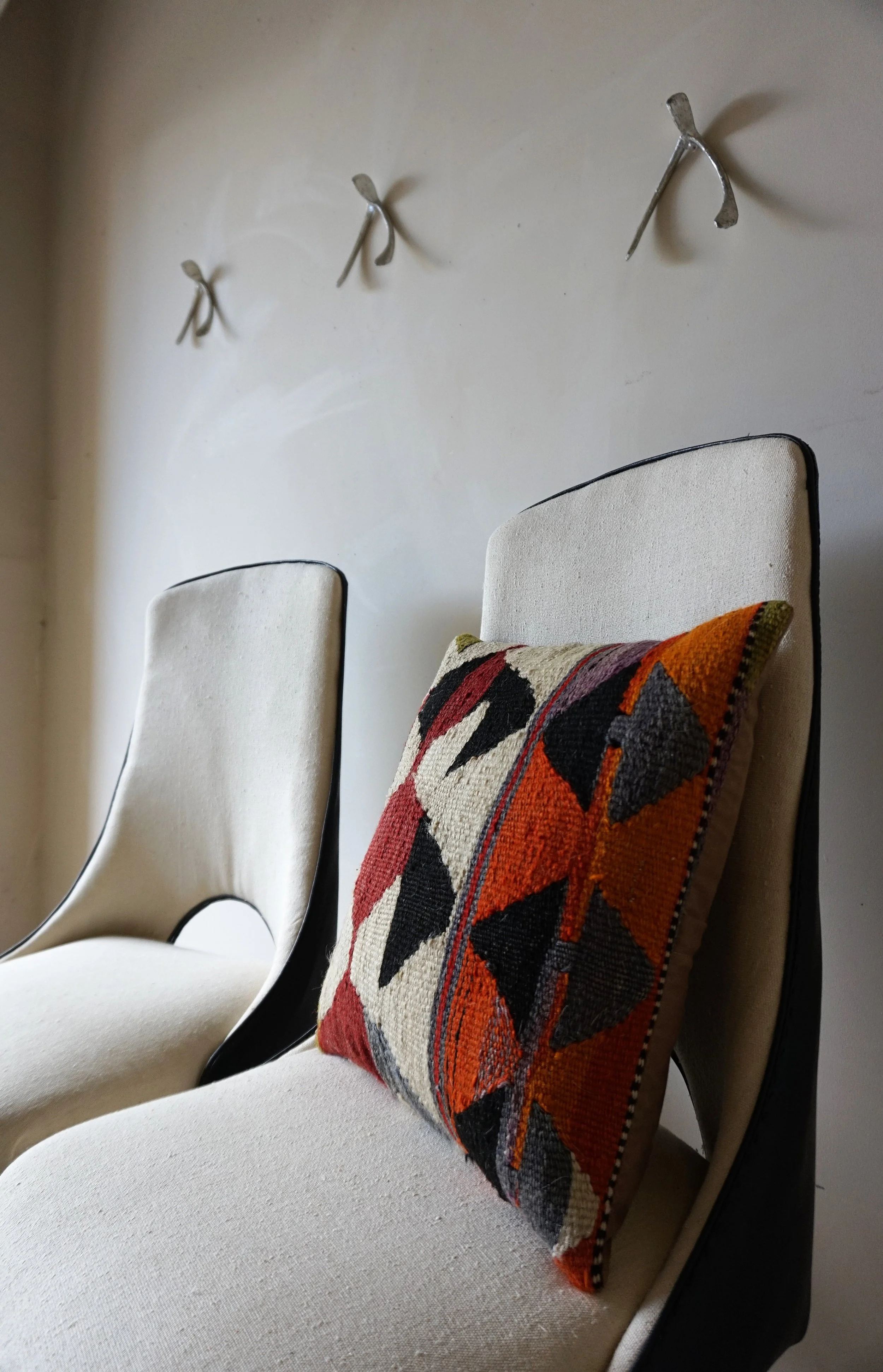
As is my usual reupholstery MO, I went with a cream linen that really lightened up their silohuettes.

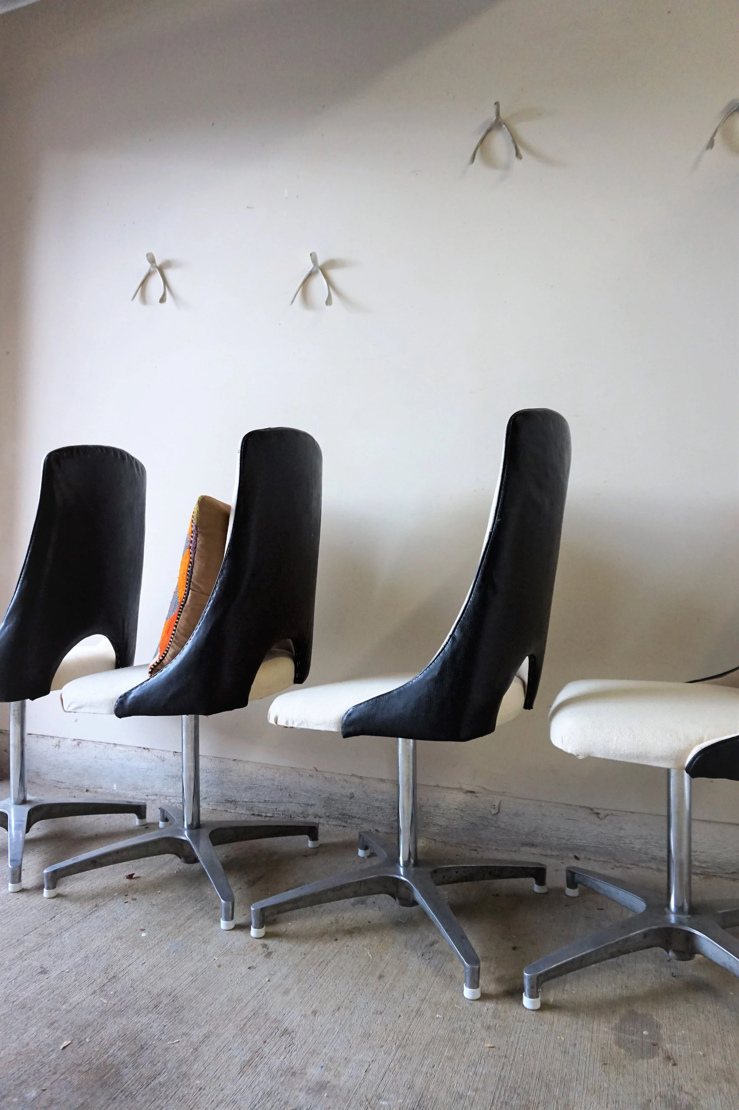
In a perfect world, I would've restored the original fabric.  But the seats and the backrests were truly unsalvagable.  The back panels, however, where in mint condition so after some jerry-rigging, I found a way to keep them for a two-toned contrast.

The chairs' original swivel chrome bases were in excellent shape as well. 

The backrests had some cute keyhole detailing - which I'm not gonna lie, was one of the trickiest parts of the reupholstery project.

But those wishbone keyholes, coincidentally, inspired the unconventional staging wall-art.

And (of course), I couldn't style a chair without my favorite Kilim pillow kid (shhh don't tell the others).

Is it just me or do they look like a chorus line?  

Let's practice that high kick ladies.

If you're in the D.C. Metro area and are looking for a set of dining chairs (or even some occasional or desk chairs if that's what you're in to) - hit me up.

DSC01411.jpg

Mid-Mod Dining Chairs
Now Available for Sale
$175 each/ $600 for the set

If you are interested in this set or a custom order like it, email me at cate@stylemutthome.com.