Reader Design: Abbie's Layered Look

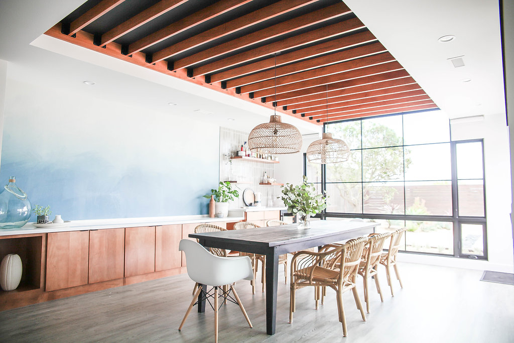
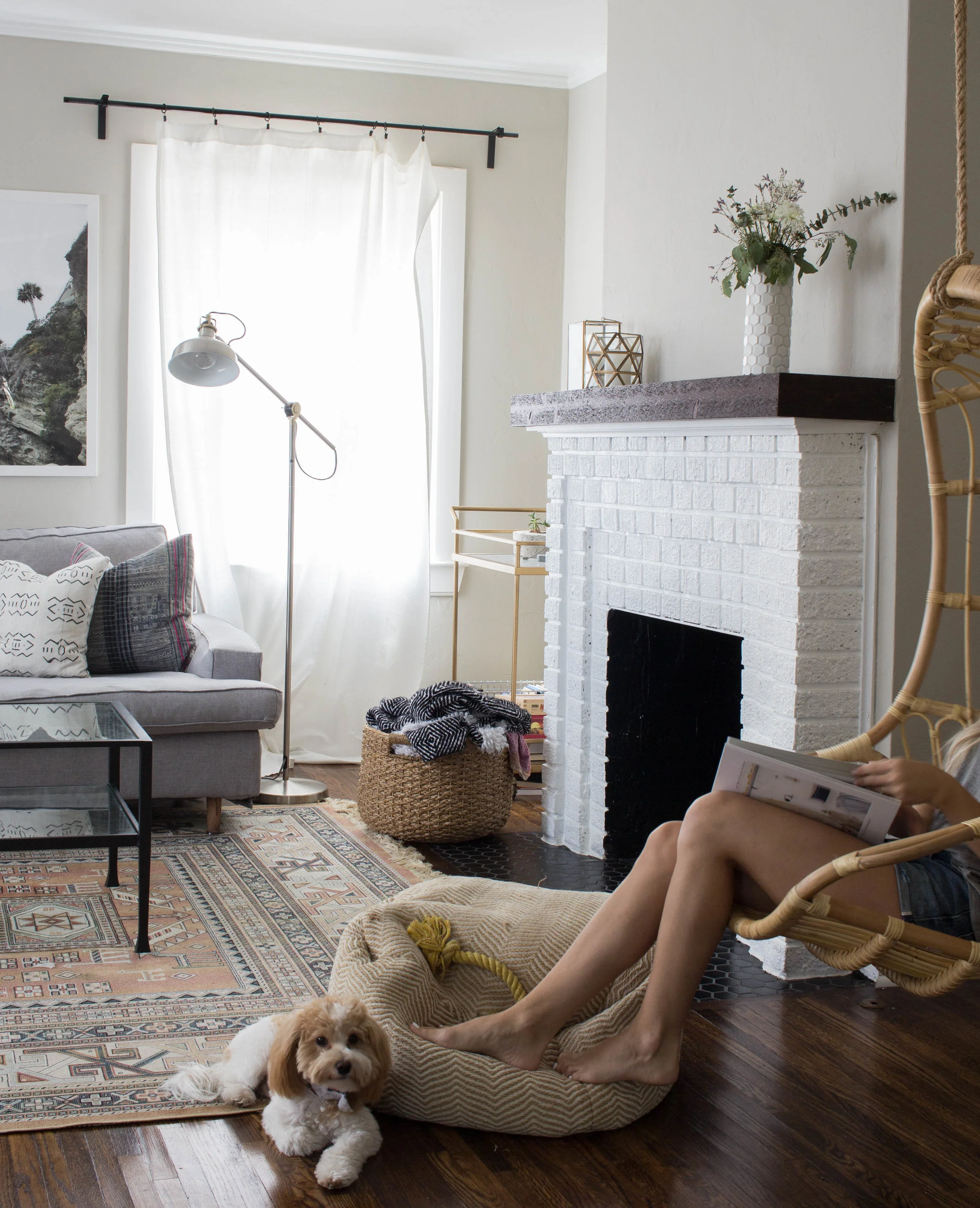
Off we go to California! Abbie's home is layered with textiles and fun finds, but all of it cohesively ties together for a home that's consistent with it's Southern Cali location.

 
anaberdesign-13.jpg
 

From Abbie:

We are influenced the the beach community around us. There’s a certain lifestyle here that promotes approachable interiors. We have a large indoor/outdoor space that we use for get togethers and family events. When we remodeled to create a dining room, so many people questioned why we would want such a “formal space.” It actually isn’t formal at all. Our dining space is a common room that facilitates our lifestyle. We love design and modern living, but it has to be approachable. I would also add that the “cool” part of our space is the approachable, laid back feel. We want friends to visit and not be afraid to touch things or sit on things.
anaberdesign-22.jpg
anaberdesign-40.jpg
 
anaberdesign-49.jpg
 
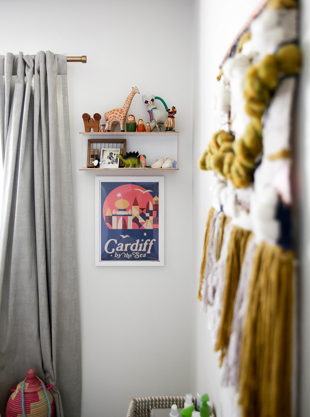
When I’m designing and decorating my home in particular, I always want to feel that our space is fresh and not too on trend. I love the look of a well-curated, well-traveled space. I want each item to feel like it has a story behind it, not just some piece that was acquired to fill a spot. The more time we spend here and the more places we travel to, I think the better our home will “age.” I also think it’s important that our space reflect comfort as well as spirit! I want our home to have a personality!
anaberdesign-82.jpg
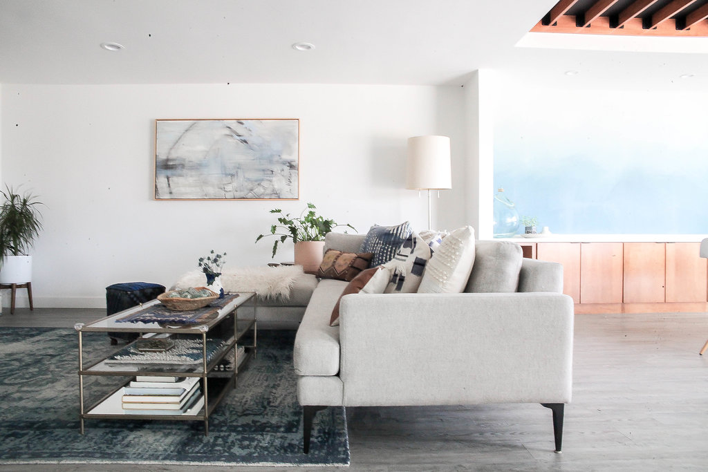
I love to mix textures. I’m big on sticking to a neutral color palette but then layering that color with various textures, materials, and patterns. I’m a true textile lover being that I have my own line of pillows and blankets. I’m always on the hunt for unique textiles to liven a space. I also feel that my space is a true reflection of high and low as well as collected items. If I’ve purchased furniture from a larger company, I make sure that my smaller furnishings are unique and special to me. That means that I try and collect items from my travels to incorporate into my space. That personalizes a room so much!

A perfect example of Abbie's use of textiles is right in the living room. All those pillows are stand-outs on their own, but when paired together, they create what may possibly be the most inviting couch I've ever seen! 

anaberdesign-102.jpg

In the office, one of the best elements has to be the polished concrete flooring, which speaks the same language at the floors throughout the rest of the home but adds a surprise element.

anaberdesign-108.jpg
anaberdesign-115.jpg

In the nursery, Abbie picked out this wallpaper from Ferm Living before she chose anything else, even though she was aiming for a neutral space. But let's be honest... slate-navy wallpaper is pretty much a neutral and makes for a pretty stylish nursery! 

anaberdesign-117.jpg

All these details have come together to create a truly perfect family home. It certainly didn't happen overnight, but it was absolutely worth it.

We closed on the house on our wedding day and went into renovation immediately. It was a 1960’s original. We pretty much gutted it all, and it was a labor of love. Last May, we did another remodel, turning our outdoor pergola into a dining space. We also added 4 feet off the kitchen to make a cozy breakfast nook. The timing couldn’t have been more perfect with our little one starting to walk (and now run).
 
anaberdesign-122.jpg
 

Abbie, thank you for showing off your space - you have a lot to be proud of! Follow Abbie along on Instagram at @anaberdesign for more.

McKenna Sig.jpg

Reader Design: Erin's Fresh Space

We're off to Pittsburgh today, mutts! A great, interesting East Coast city that's especially great (or so I hear) during football season. Erin's fresh and ecletic home, though, is perfect in any season. 

IMG_6792.jpg
 
IMG_6795 (2).jpg
 

This place is chalk full of unique and interesting finds. The closet home I've seen like Erin's is an Airbnb I stayed in in London earlier this year that had artwork of actual human skulls...  you know your home is different and interesting when you're on THAT level. Erin's design inclinations may be due to her inherent taste, her attraction to rare things, and perhaps, something as simple as geography.

Well, I was born and raised in South Carolina, and I spent 6 years in Manhattan on the Upper East Side, so I like to think my style is combination of those regional elements— the laid-back, classic comfort of the south sprinkled with the refined glam of New York City.
IMG_4095.jpg
IMG_6785.jpg
 
IMG_6784.jpg
 

You'll probably quickly note that Erin's home doesn't have many traces of trendiness; she does a great job of staying true to her tastes, using trendy elements sparingly. 

There are definitely trends that I have gone ga-ga over, and it is hard to refrain sometimes. I fell prey to a chevron duvet a few years ago, which still makes me cringe a little looking back! It’s one of the oldest design mantras in the book, but I think the key is using in moderation, and keeping the super trendy things limited to throw pillows or artwork, items that can be easily (and inexpensively) changed out later if you decide you are tired of it or the trend has passed.

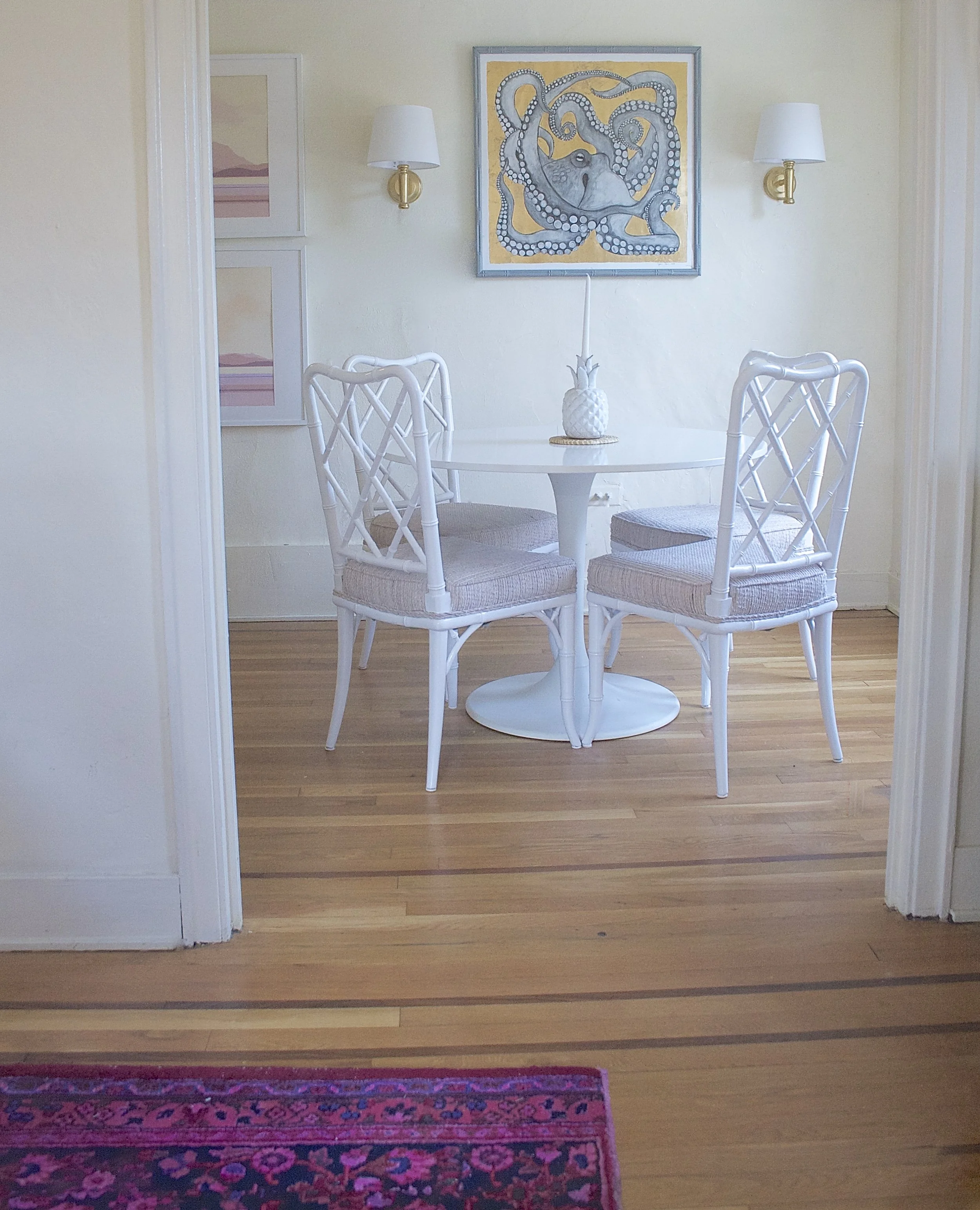
Reeling yourself in and only keeping trendy elements to ones that are easy to swap out later is truly easier said than done, but Erin, you make it look easy - and the trends Erin does select, like over-saturated rugs and a pedestal table, still look timeless and functional. In addition to being unique, Erin values comfort just as much.

You know when you see pictures of beautiful rooms that stop you in your tracks and think - “Wow, that is so stunning! But I don’t feel like I could sit on any of that furniture!” I want it to feel the exact opposite of that.
IMG_3789.jpg
IMG_3492.jpg
IMG_2976.jpg

Every choice in Erin's home seems to just invite you in - either physically, saying 'take a seat,' or emotionally, inviting you to ask a question or dive deeper into the story. 

In the bedroom, one of Erin's favorite pieces is the framed art above the bed, which is actually a vintage Hermes scarf. 

I love the nautical theme & pastel colors (I grew up sailing). I based my entire NYC studio design around it when I lived there, and later our master bedroom when I got married. Luckily my husband isn’t too picky about the pink!

Erin, your home is special indeed. Thanks for the tour! Follow Erin along on Instagram at @mediumalistdesign.

See you next week!

McKenna Sig.jpg

Reader Design: Courtney's Sentimental Spot

You're probably wondering why I'm calling today's stunning Tulsa, Oklahoma feature 'sentimental.' After all, we probably all have some sentimental attachment to our homes. How could we not, after pouring bits of ourselves - our time, our money, our souls - into them. 

But today's home is seriously sentimental. It's literally the place where Courtney met her husband Jordan. 

That's right. They met here. In this room, in fact - the living room. 

Living Room 1.jpg
Entry.jpg
Living Room 2.jpg

From Courtney:

My husband, Jordan, renovated our home with his sister and brother-in-law before we met. They bought the home at an auction on the front porch and uncovered the original hardwoods, gutted the kitchen, replaced all the windows, and added central air. He had two roommates at the time, and I had a mutual friend with one of Jordan’s roommates. We were hanging out in the living room one day and Jordan came home. We briefly met and a few weeks later he asked me on a date! Less than a year later, we were married and I moved into the original place we met.
Living Room 4.jpg
Dining Room 2.jpg

An incredible story, right? Not to get too sappy, but I think it's clear that this place has been built with and around love since the beginning, with it's original woodwork, comfy and cozy layout, and carefully selected decor.

Courtney describes her home as "a little beachy, a little modern, a little Southern, and nothing too perfect" - it's just an accurate representation of life, a place that makes you feel calm without false pretense or expectations. 

Open Floor Plan View.jpg
I’ve always had the desire to cultivate a peaceful home, a place where there is a sense of rest and a place where others are invited to come in, unload their burdens and enjoy a place of peace. It’s more than creating a pretty space; I enjoy creating a space for others to feel comfortable in.

The 1930's bungalow has plenty of idiosyncrasies, and despite her inclination for all things modern, Courtney tries to stay true to the roots of the home. She selected simple, period-appropriate dining chairs, paired with vintage rugs throughout the living space. A comfy couch accented with real cotton textiles. 

Kitchen2.jpg

Courtney is continuing to let their home guide her as it will. 

I spend a lot of time at home, so I am always tweaking something! Nothing is perfect if you look closely and I have so many unfinished projects that are on my “to-do” list. Most everything has a DIY touch to it because you learn to get creative when you’re newlyweds. Our home is always evolving, and we have so many projects we are saving up for, but we still love where it is now.
 
Studio1.jpg
 
Bedroom.jpg
Bathroom2.jpg

And here's some sage advice to close us out: 

The best advice I’ve been given is to enjoy your home before it is where you want it to be. This advice has taught me that creating a peaceful home is more than a space that reflects your style and Pinterest board, it is opening your home for others and focusing on the relationships that are built there. The style will come with time.

Courtney, thank you for letting us in for a tour today! You have a stunning home, and we can't wait to see where it takes you. Follow Courtney along on Instagram @alwaysrooney to share in the journey.

Till next time,

McKenna Sig.jpg