Design Reveal: Color, But Make It Sophisticated

It’s a design reveal day! These are among my very favorite days of the year. The precious day when I get to share the fruit of many months, sometimes over a year, of work! I don’t share all of my work - 10% of it, in fact! So these projects that make it are truly special to me and I feel so humbled to get to share them with you friends.

Speaking of friends, the amazing client who owns this home has been an acquaintance for many, many years! Her older sister, Lori, was my Young Life leader in high school! In fact, it was Lori who suggested this effort together in the first place. Sure enough, Jenny and I hit it off right away and now is a sweet friend!

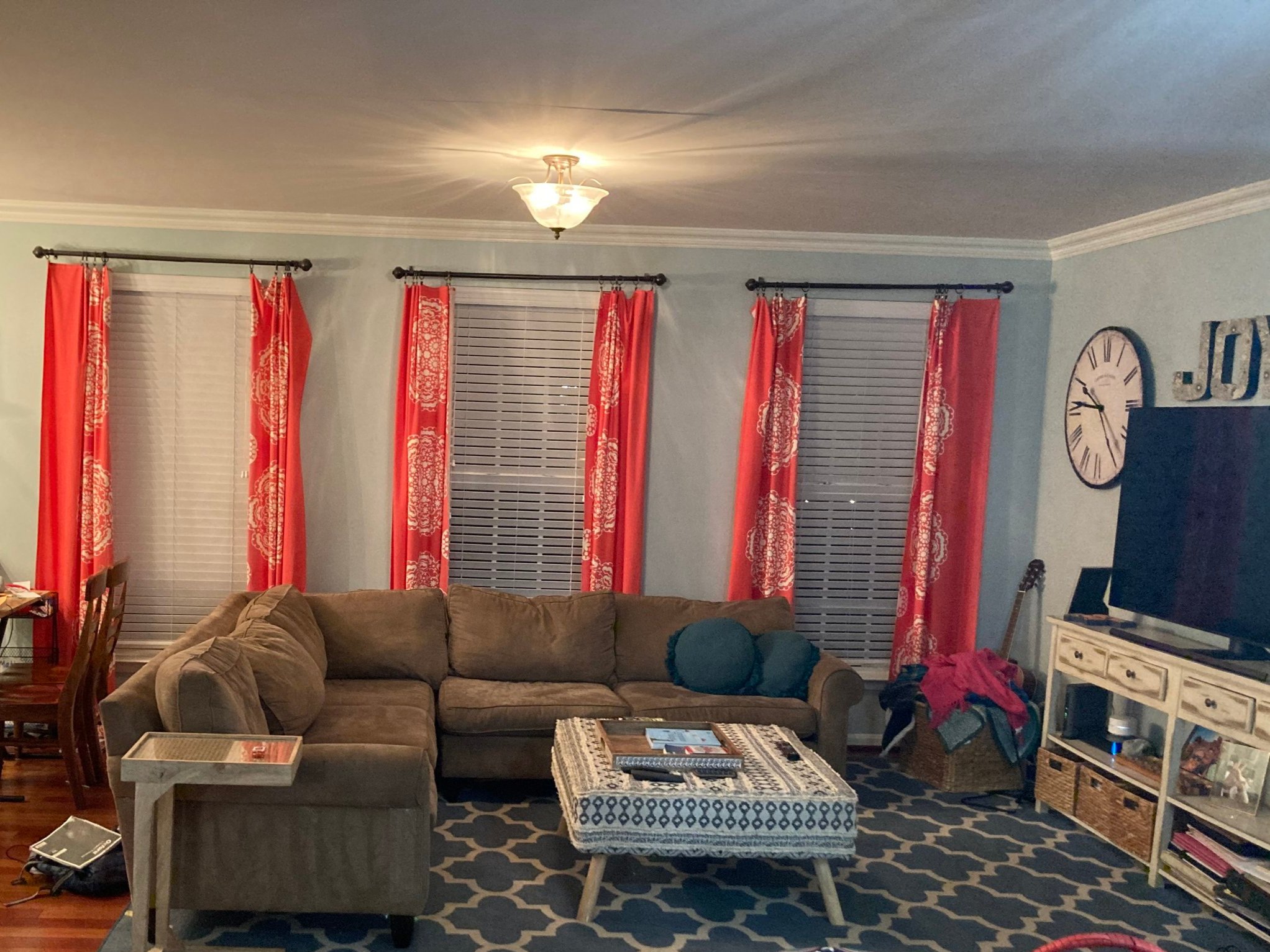
When we first connected, she wanted to completely transform her main floor, which includes a family room, dining room, den and kitchen. She had been saving up for this and was ready to hit the ground running! The main objective was to fill her home with color but make it feel grown up - whimsical yet sophisticated. Jenny realized she had gotten about as far as she could with the assortment of hand-me-downs and random pieces she’d found here and there, but (like many), the more she added to her home, the further she got from her vision.

Family Room

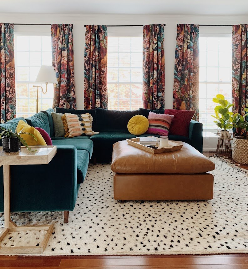
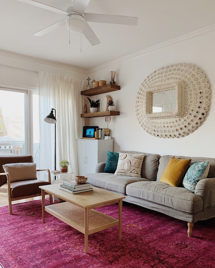
It may seem counterintuitive to get your walls white when you love color so much, but this was a move I really encouraged from the beginning. But not without a vision of what would come next:

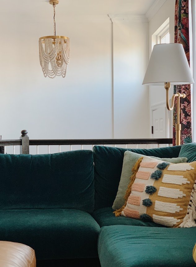
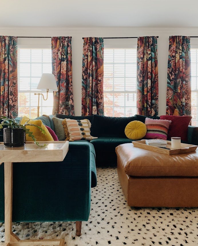
I don’t think white walls are the answer for every single project, but I knew that it would be the game changer for this home; the defining factor that would enhance all the colors we were about to explode. Now, this home glows like a sunset!

I mean, it absolutely GLOWS! And there was no laying out samples of patterns and fabrics together to come up with this. I stayed in the general family of jewel tones and then ran in every possible direction. Jenny wanted allthecolors so there was really no holding back. Of course, playing off the color well are very grounding elements like the black and white rug and the camel leather ottoman. It’s all about striking balance where it matters most!

Let’s shift to the dining room!

Dining Room

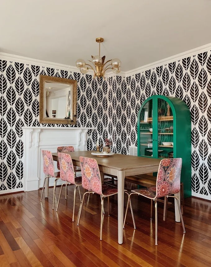
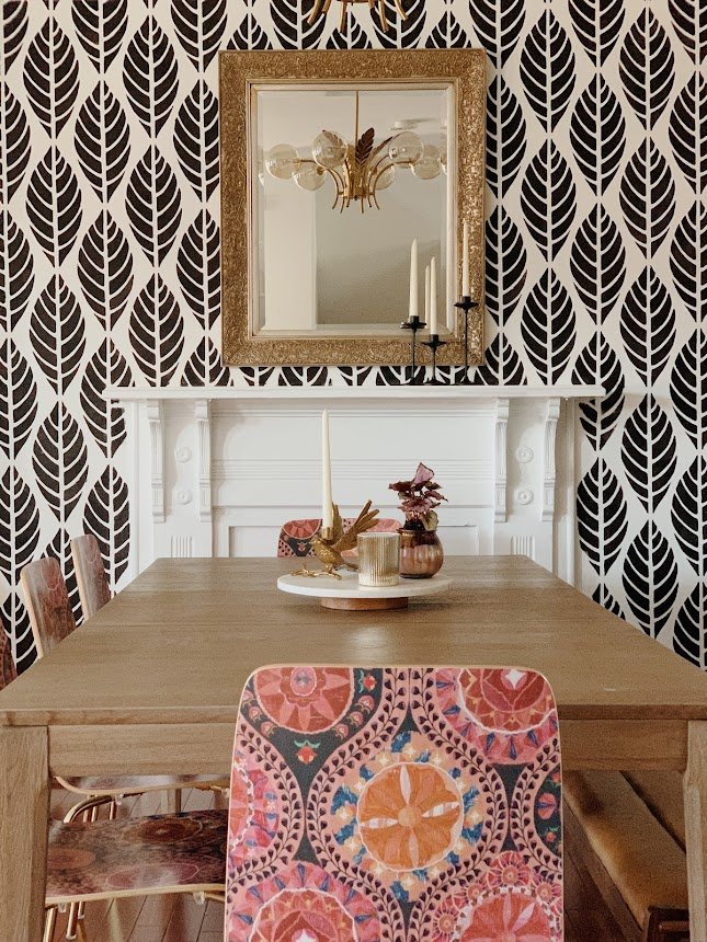
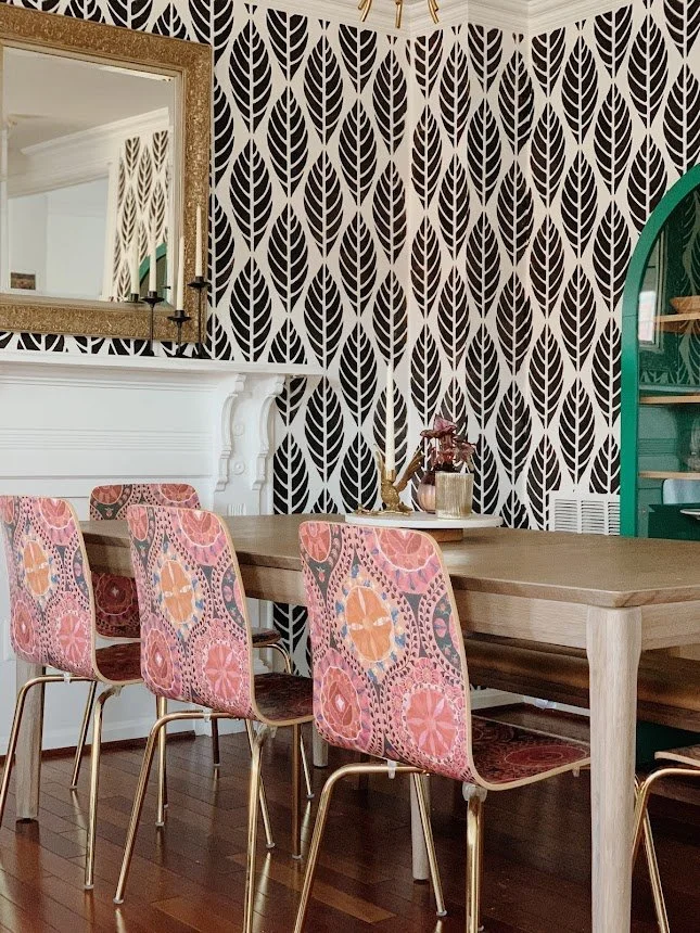
Since the dining room and family room are literally side by side, I wanted to carefully craft a TOTALLY separate space that felt as exciting as the family room, without making it feel like it was a completely different house. The objective here was more cohesion than matching. A playful but black and white pattern on the walls creates a balance to the family room, while the chairs and cabinet echo the jewel tones. Again, there was no matching or looking closely to be sure that the colors ‘went’, but it was staying in the jewel tone family that I knew would be enough.

There is not a dull line of sight from any point in this home!

Den/Kitchen

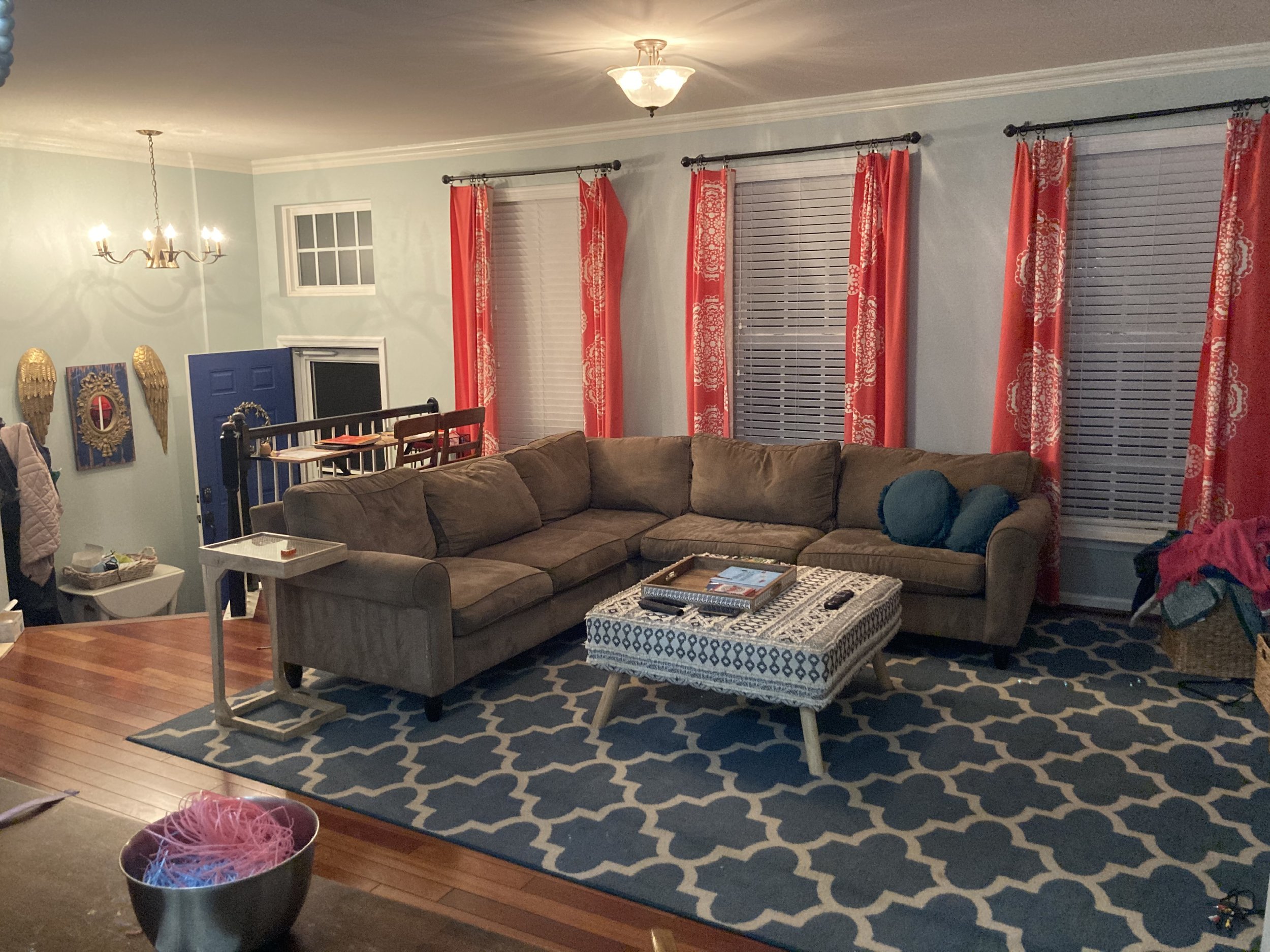
Like the other areas around this main floor, there was already quite a bit of color going on. Yet, the heavy wall color and the varying tones of color between the rug, chair and decor were all competing to make this room feel very heavy and dark. The strategy in here was the same as the other spaces - get the walls a nice clean white and then build up the color using jewel tones, balanced by beautiful uses of wood and leather.

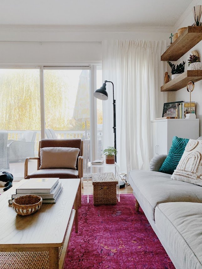
Replacing the two lower floating wood shelves with a simple white cabinet decreased the visual weight of the space, providing a relaxed balance to the assortment of color used in the pillows and rug. I have never loved fuscia more in my life! I LOVE this rug in here!

The kitchen is still in a bit of progress until tile backsplash is installed, but painting all the lower cabinets and this accent wall in a saturated teal just creates the most incredible contrast to the freshly painted white uppers (with saturated teal knobs). And just look how rich the leather stools are against this color. Oh my word! It’s just stunning.

I absolutely delight in the work I get to do and feel so incredibly grateful to be trusted with peoples homes. To be given the opportunity to work on a project SO unique like this is just such a treat. If you’ve been a part of this community for any amount of time you know this is unlike any other project I’ve shared - and that’s what I’m feeling particularly proud of right at this moment. To go all out and deliver my best work in a style that is different from my own is what I love about design! Trying new things and having so much fun playing around! I don’t like feeling boxed in or delivering only what’s expected of me; rising to a challenge and even showing something surprising satisfies so much of who I am as a person.

Next week I get to go shoot my last project of the year! It’s another doozie, just a heads up :)

Thank you so much for coming by today!
Design Reveal: Deedees Digs

Hello there! There’s no dancing around it, THIS is my favorite design project to date. I got to work with my sister! Quick story, when she was around 2/3 and I was 9, she pronounced her name (Casey), as ‘Deedee’. I was Cha-chi (Chelsea). The nicknames stuck and we use them here and there! The past year has been a whirlwind as Casey fled overcrowded NJ as the covid cases started exploding and came to live with us for a bit! Then she moved in with my folks, and just this past January moved back up to NJ! Getting to be a part of her apartment search was a fun and exciting insight into her subconscious. I learned she likes quirky spaces with interesting nooks and angles - and a strong aversion to cookie cutter! So it may be surprising that the below apartment was her winner:

Blank 2000 x 2000-1.png

It’s BASIC. And she was weary - in fact, she had seen 4 identical apartments to this one in the same building, which is precisely what she was trying to avoid. But here’s the kicker:

IMG_5509.jpg

A million dollar view of the worlds greatest city. NYC is a global landmark herself and a place we have enjoyed visiting with our Momma over the years for girls weekends away. This Jersey Heights apartment is nestled high above charming Hoboken, with an unobstructed view of this beautiful skyline. At Christmas, the Empire State building (left window), is list up in changing colors. On Valentines day it glowed pink. There is nothing basic about this view. This apartment is on the corner of the building, so Casey’s other views look out over a bustling park busy with dogs and their owners - one of Casey’s greatest amusements. So, the views of this top floor apartment tipped the scale. But how to create that quirky, nook-y feel?

0964E433-3E7C-4BA3-BB2B-AFD7CD80278E-D7700233-1CB3-42A2-8BEE-92754CEE0654.jpg

One of the first ideas I shared with Case was this washed brick wallpaper. I have NEVER used a faux stone wallpaper before and thought I never would…but this was a perfect project for it! It’s non-committal as it’s a peel and stick paper, and it does wonders for this otherwise box-like room. My Mom and Casey installed it together (without a stool or ladder, I hear), and I can’t believe how awesome it looks. Sometimes as a creative I will get really excited about an idea, and still be blown away by how awesome it turns out - like it’s a surprise lol!

56507D08-1565-4B07-A245-2A1F8379DE3A-B5155988-75A2-4CD8-B8F6-084EEEB48635.jpg
844A9E85-DF89-49E2-B76B-F6C1AA79C034-AF9DD0A1-4FF5-45FE-B590-44E52EB1268A.jpg

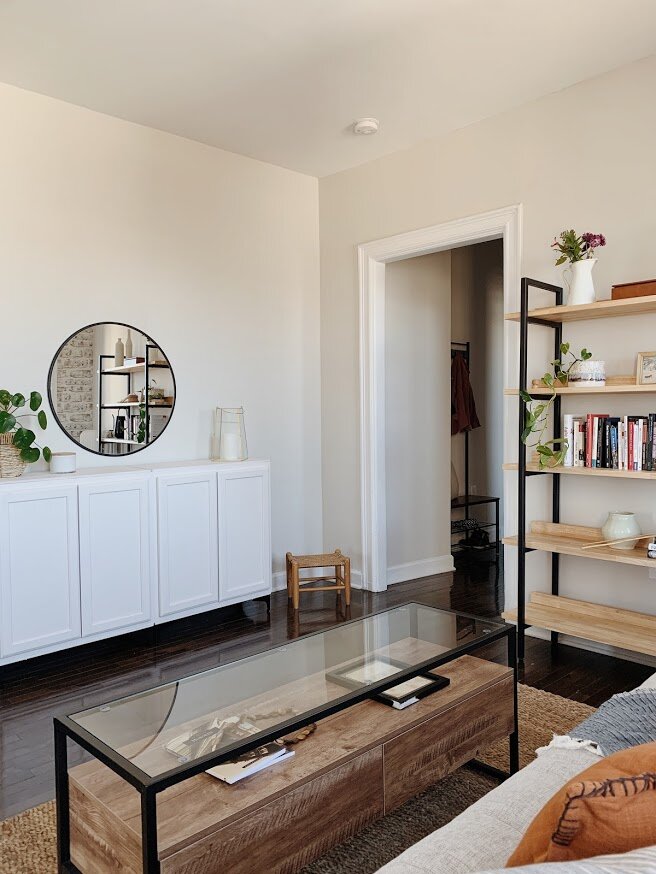
Mixing up the heights of the elements in the room helps, too! Balancing high pieces with lower pieces is a great way to create some movement around a space. These shelves from Castlery were one of Casey’s early requests - a place to shelve books, and ultimately collect a whole shelf of childrens books and short stories about disabiliy (not just the career Casey has pursued but a tremendous passion of hers to learn and share through education).

1826A273-040C-41BF-BCB3-B8FE2245BF36-DAD9FCBB-BC88-4FA7-B8CD-E8A49C2B1DC7.jpg
5E567561-9567-4962-B472-36C50D06A3E7-B25AFCEF-1D3A-4EA2-9749-8D0C15CB7903.jpg

The sofa itself was a complex decision - being that this is a one bedroom apartment, Casey really wanted to have a place for guests to sleep. The obvious choice was a pull-out sofa, but I was having a hard time finding pull out sofas that also functioned as long enough sofas. Most of them were in the 50-72” length, which would have been too petite for this space. I, myself, have an Article Sven sofa, and one afternoon was doing my work from it, and realized how comfortable the cushion itself is. And not only does the cushion come off, but underneath the cushion is a memory foam type padding. SO, this Article Sven sofa could sleep 2 people comfortably, but as a sofa by itself, it’s 86” length is perfect for this space.

0D530791-5A77-444B-B889-584065197694-EB1CED9F-C626-4D9B-9F68-579B65FDAD97.jpg

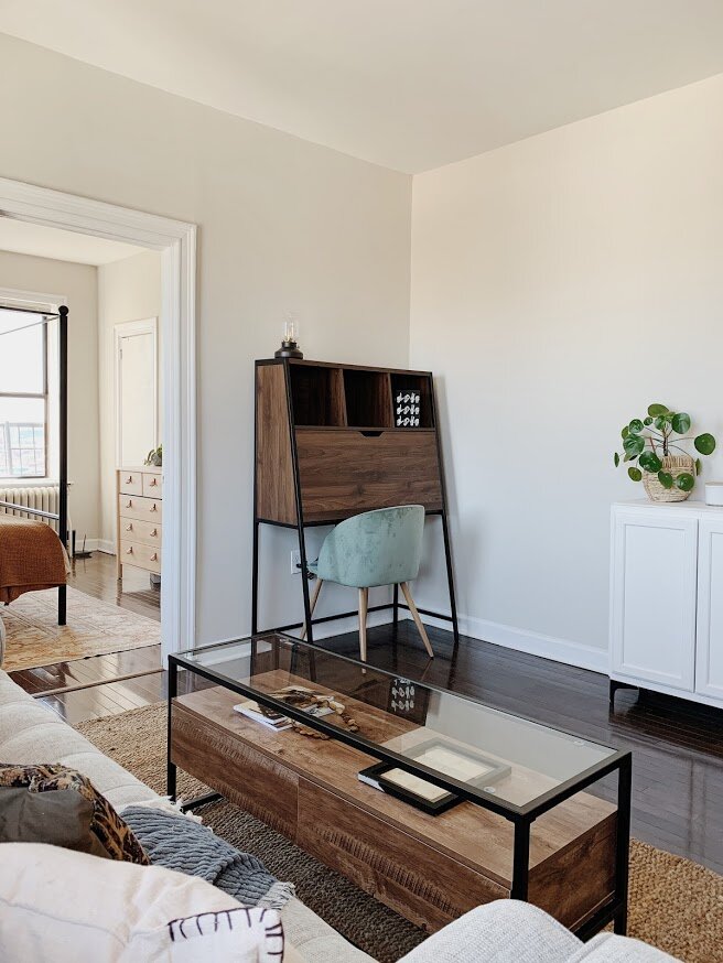
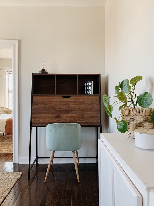
And a typical stop in anyone’s home these days, the WFH corner (work from home). Casey does not like clutter ( we are cut from the same cloth, afterall), so having a modern secretary style desk that can close and hide all work-y materials was a perfect solution here.

38E537F9-D48C-44B5-85F5-A69AD27C25FC-65B0D559-F555-4879-A7BE-73BF59C8D6D9.jpg
F687E345-8D67-428A-A8A7-4AC2CEEAFC4B-4224827A-7475-4E1E-A870-426461B3961E.jpg
61D64D96-9115-4249-910B-0764FD8EBA4E-AD4E1EF1-0FFE-46AA-91DA-89F3632D26FA.jpg
4DA2A486-9E03-4001-8C8E-9A9EA6CCBC7C-76C3CB5E-A21E-4809-BD3C-07F05F7026BF.jpg

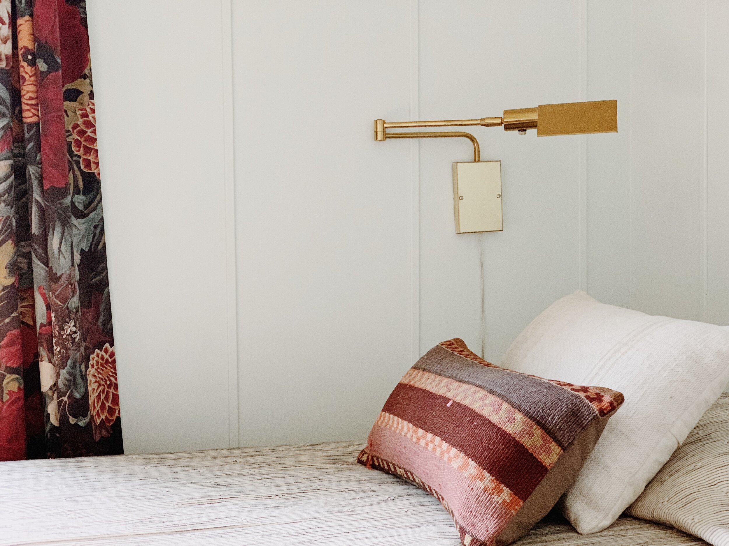
Another little architectural detail one can add to make a space feel more unique is lighting! This plug-in sconce adds some height, a little shine, a little interest, and does a fantastic job illuminating the space at night so she doesn’t have to use her overhead. Thank you for installing this, Dad! My Dad could work for TaskRabbit, he’d love it.

7F929351-E537-4DA6-90C9-D82838F59BA1-EF08CA8A-66B8-4096-B241-FCBE2C050021.jpg

One must-have in this apartment was closed storage. With zero closets in the main living spaces or entryway, I really wanted to give Case a place to store things like towels, linens, textbooks, etc, without cramming her small bedroom closets. This ‘sideboard’ is actually a pair of kitchen uppers bought new from Lowes, that I then painted and added legs to, while Matt added a flat top surface.

F7AF4526-9ACF-4509-8C5C-2243018938D5-B0F8B82C-55E4-492D-884A-229316FC083D.jpg
7B250C7B-7855-4692-818C-154AC7894261-852AF547-3730-49AD-9B16-7C873A1006F8.jpg
C746430E-9D3C-4882-B999-2763B08A5E7E-87178F6C-28BA-4D04-B7FB-4C1DAAE88C8A.jpg

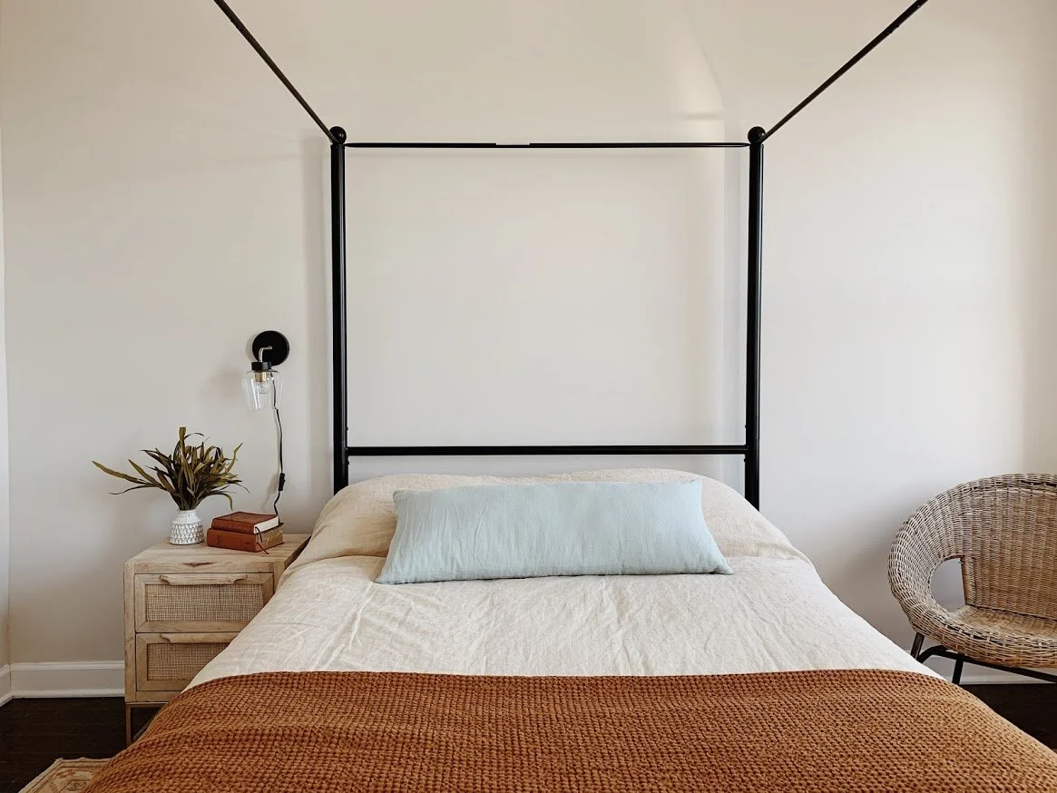
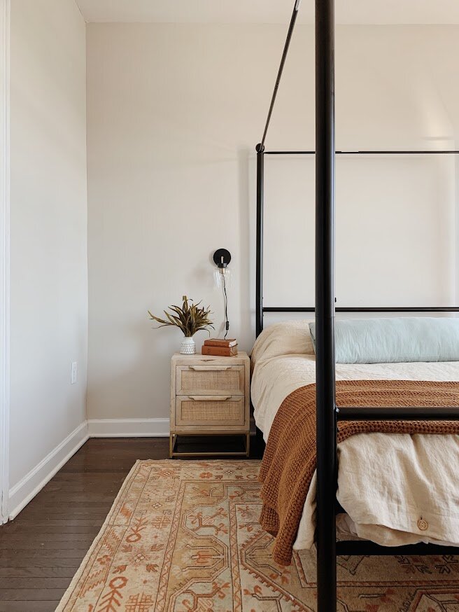
In the bedroom, the solution de quirk is the canopy bed. I didn’t want to cram a lot of things in here, but knew a canopy bed would feel very cozy and nook-like all on its own. Paired with simple bedding from Magic Linen, a cane nightstand, leather pull dresser and a woven chair (FB Marketplace), this space came together very organically. The very first element, however, was the rug! I found the rug at one of my favorite Etsy shops, Rugville. My inspiration for this room was the gorgeous sunrise that poured in over the skyline on the first morning I woke up in this room - Casey and I came up to see the place together after it became hers, and we slept a hard night on the floor. But it was so totally worth it. The surprise in the morning was like heaven kissing the city right in front of us. I wanted this room to have the same glow.

8FFF2280-9235-4199-89DE-996745300C5A-A5E674C6-737C-4172-94A8-ABE35A768F3E.jpg
0B13AFBD-BF8A-41A6-8684-7867909DCFD5-F2E14B02-F159-4ABA-A8E3-42906D9A5422.jpg
99DCD911-3031-42A9-96FA-05A82BB69764-1069AE43-A621-445D-B4CE-419DA9B219D0.jpg
C84C3719-F8EE-4D34-9520-0564B096D2B4-6D9F8740-CEED-46E0-96D0-E35F714DDC71.jpg
C972D140-0960-4829-8077-AE2ACF96B186-23D8A80E-21A1-4ADA-B78B-F1EBF7C5686E.jpg
6A1D9881-822B-453A-A565-82FE23069AA9-AA021BAB-5AE8-4CF8-9DFE-446F2B267AE4.jpg
84F39FF7-CD2F-4969-BF2C-663AABDC0829-720A9DC9-6B45-40C3-B9BF-8B67112CE2C0.jpg
E7508F02-CDC2-457C-9056-5750C9B59A62-EA5820E1-D2DE-47A0-8764-6CF5FCE90A86.jpg
30765964-7FBB-44B4-B709-55DD9ECB5672-679DFD77-5CA7-4932-A3AC-DDA423B1C6EA.jpg
44207095-6FA6-4F68-803B-F94B30FB6A95-2C3F7018-D53A-4A65-A7FE-C9C87CCEE3F7.jpg

As I mentioned, this apartment is a bit short on closets. This storage piece from Vasagle is a perfect entryway drop-zone. Easy to walk around, it doesn’t take up a lot of room but it carries a heavy load.

C8263EFB-615A-410C-A0E0-7AE5553B00CE-EBF94570-A86B-4C29-8262-6D205B4E2759.jpg

Rugs are literally one of my favorite elements of creating a home. This was another vintage find from Etsy shop Vintport.

65B56DFC-E243-43B6-ADE8-60AA2E0688F4-A5DC325C-80D3-43EB-B8B8-5B0AC8AA1DD2.jpg
8AC67CF6-1D34-458D-9CDF-4CA979C26322-29C26127-0E45-42BB-BBE6-8EB0FDB1C9EC.jpg

The kitchen is simple, cozy. We had held out hope that we’d be able to paint the cabinets something neutral, which was denied. So to suit the space, a gorgeous blue-green chair just felt right. After sorting through a few options, Cate found these while we were all sitting together one evening amongst children, video-gaming men and wine. And they’re lovely!

99F6D66E-B552-4818-BE2A-9F7AD9300220-46823193-D06C-4CFF-B18B-C3B40AEB9C9A.jpg
39D3C5C9-8557-4CEB-AA7C-75CF2B48CC39-C7166168-CB8C-4F04-B732-C536A372F370.jpg

There you have it! A not-so-cookie-cutter apartment anymore. Shire and I have already been treated to a weekend visit and while we thoroughly enjoyed the fun of Hoboken and the neighborhood parks, it was so special to enjoy this home together at the start and end of our daytime adventures. The fun of this project is only just beginning.

Thank you so much for coming by!

Chelesa.jpg

'Shire Green', SW

Hello, sweet friends! Well we are just barreling through the seasons here, aren’t we? Aspects of this new weird normal feel like a marathon, but I’m also getting seasonal amnesia - you know how sometimes when you’re driving and you end up back home but hardly remember how you got there? (this IS normal, ask around) That’s how the seasons are kind of feeling. The pandemic started when the weather was still cool in March, then we blew through Summer and are rounding the corner to Fall and the air is turning crisp. How’d we get here? I, for one, don’t intend to barrel through the Fall. I quite enjoy this season and we intend to take full advantage of all of its sweet gifts.

Since March work has increased, schools have closed, I released my Interior Design Starter Guide, and we finally started letting Albus upstairs to our bedroom level. Those are the highlights in a nutshell! In all seriousness, what has been hard about this season has also been met with all that is rich and precious about it at the same time. Life has been busy on an other worldly level, but at the same time there is nothing like being with my family to fill my cup. Gratitude has not escaped me and I know that is a direct gift from the Lord.

Towards the end of Summer Matt and I suddenly realized we had no established work spaces for our kids to do virtual school from this year. We thrust ourselves into creating functional desk areas in their rooms in time before the first day of school (yesterday!), and I’m relieved to share we got it done! It was a stretch, but done. Re-working Shire’s room to even make space for a desk was a challenge. But for me challenge and opportunity are synonymous and we really had a ton of fun! Since we were going to be moving things around I asked Shire if she wanted a fresh color which was an instant and surprising “YES!”

before.JPG

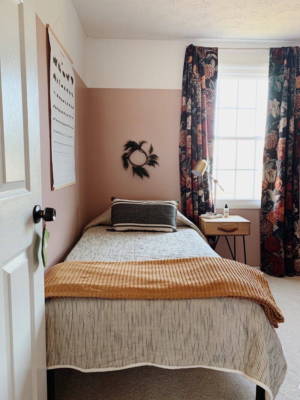
She’s loved her pink for several years, but she shares my curiosity and joy in creativity and wanted to try out green. After many swatches and samples, she ended up mixing two colors from Sherwin Williams and got to name it!

PicMonkey Collage.jpg

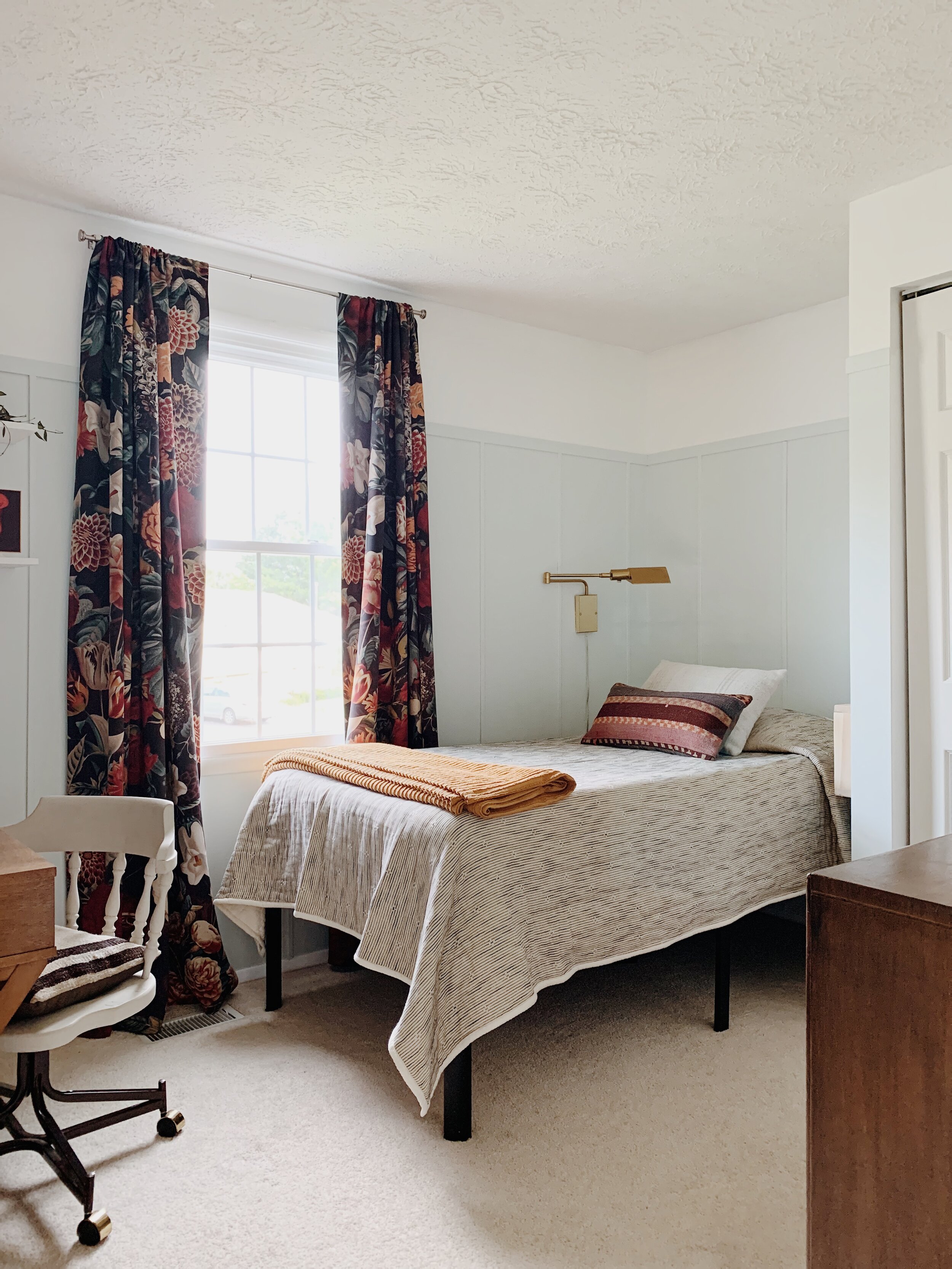
‘Shire Green’ is soft and minty with just a slight touch of gray. It’s perfectly dreamy; and so fun that our girl got to create it!

We went 3/4 the way up the wall, just like we did with the pink, but added vertical trim for some cozy texture and needed visual interest for such a light color. Before we added the trim it kind of just blended with the white, so I love that the trim work establishes the two colors.

5.JPG

Her bedding and curtains didn’t change, but it’s fun to see how the new color plays off both. Everything else in the room is new, new to us, built or on loan!

7.JPG

The light is a sweet borrow from Cate who used the pair in her master bedroom a few years ago and I love that it can bend out of the way when not in use!

12.JPG
10.JPG

Since Shire specifically requested her bed be placed in this nook (we were originally going to put the desk in the nook), we needed a slim nightstand solution, which Matt created out of scrap wood in our garage.

13.JPG
14.JPG

The desk is a piece we found at Target (linked here), and the chair I created from two Facebook Marketplace pieces I found, and the shelves….oh, those shelves. I really wanted corner shelves here so she could get as much up on shelves as possible, but it turns out the studs on this wall are every 24”, which didn’t work for your standard brackets. We found these horizontal brackets online (linked here), and while they ended up being the only possible way we could hang shelves where we wanted them, they felt like a visual eye-sore. Very garage-y looking. But honestly, as soon as I got her stuff up on them they grew on me!

15.JPG
16.JPG
19.JPG

That gorgeous mirror we’ll call a temporary trade - we loaned all our weight lifting equipment to my brother and Cate as soon as the gyms closed, and we got their mirror for when my sister was staying with us earlier in the pandemic. Weights for a mirror - not a bad deal! The dresser I am going to hold off on sharing because Shire and I have plans in place for the piece. She and I had searched all Summer for a refinishing project we could tackle together, and that cutie showed up just last week on FB Marketplace for a steal. It’s the perfect shape for our inspiration, (see here - of course, the project will be entirely dependent on our skills, so who knows where we’ll end up!)

17.JPG

Have you been cornered into updating any parts of your home during this time of COVID? Or simply taken on any refreshes in the name of creativity? Drop your project(s) in a comment below! Would love to hear what you all have been up to?

Thank you so much for stopping by!

Chelesa.jpg