Reader Design: Heather's Blended Digs

We're edging closer and closer to 2018, and the start of a new year always brings with it both excitement for the future and reflection on the past. How appropriate that today we're headed to a home that expertly blends old and new, keeping with the trends of today while paying homage to timeless design and craftsmanship. 

Let's head off to Heather's home near Minneapolis, Minnesota!

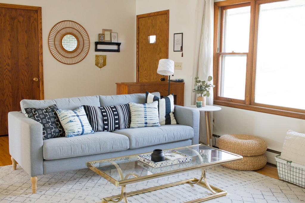
Living room_sofa.jpg
Living room_back of sofa.jpg
Living room_armchair.jpg
Living room_coffee table.jpg

From Heather:

I would describe my style as transitional with a heavy mid-century modern bent and a bit of boho thrown in. I truly am a style mutt in that I love old mixed with new, colors mixed with neutrals, and fall somewhere in the middle of the minimalist/maximalist spectrum.

I long for my home to be a safe place for all who enter. I want it to be warm and welcoming. My main goal in decorating is making our home a place where people feel comfortable to be themselves, which sometimes means I sacrifice form for function. It’s one thing for your home to look beautiful in photos, but it’s a whole other thing for it to feel beautiful to people. For a space to feel like it’s cozy and for it to function well is equally, if not more, important than how it looks.
Dining room_full.jpg
My husband and I spent a couple weekends removing the cabinets on this wall, hanging removable wallpaper, and installing the shelves. To-date, I think it’s my favorite home update we’ve done. It took our kitchen from outdated, dark, and closed off, to open, airy, and modern.

I believe in updating, renovating, and decorating within your means. If you don’t have the time or money to do a project, then don’t stress about it! Do what you can with what you have where you’re at. That means that you may need to do smaller, short-term fixes until you have the budget for a larger renovation (like we did in our kitchen). Or it may mean that you embrace a part of your home that doesn’t feel perfect, but is good enough. It doesn’t have to be perfect to be beautiful!
Kitchen_shelves.jpg
Kitchen_full.jpg
Kitchen_fruit.jpg

Heather and her husband took their time with this space and made it perfectly their own. It's the ideal spot to cozy up in the Minnesota weather to come. Heather also did this design consciously which can be so hard to do - financially and aesthetically. 

Bedroom_bed.jpg
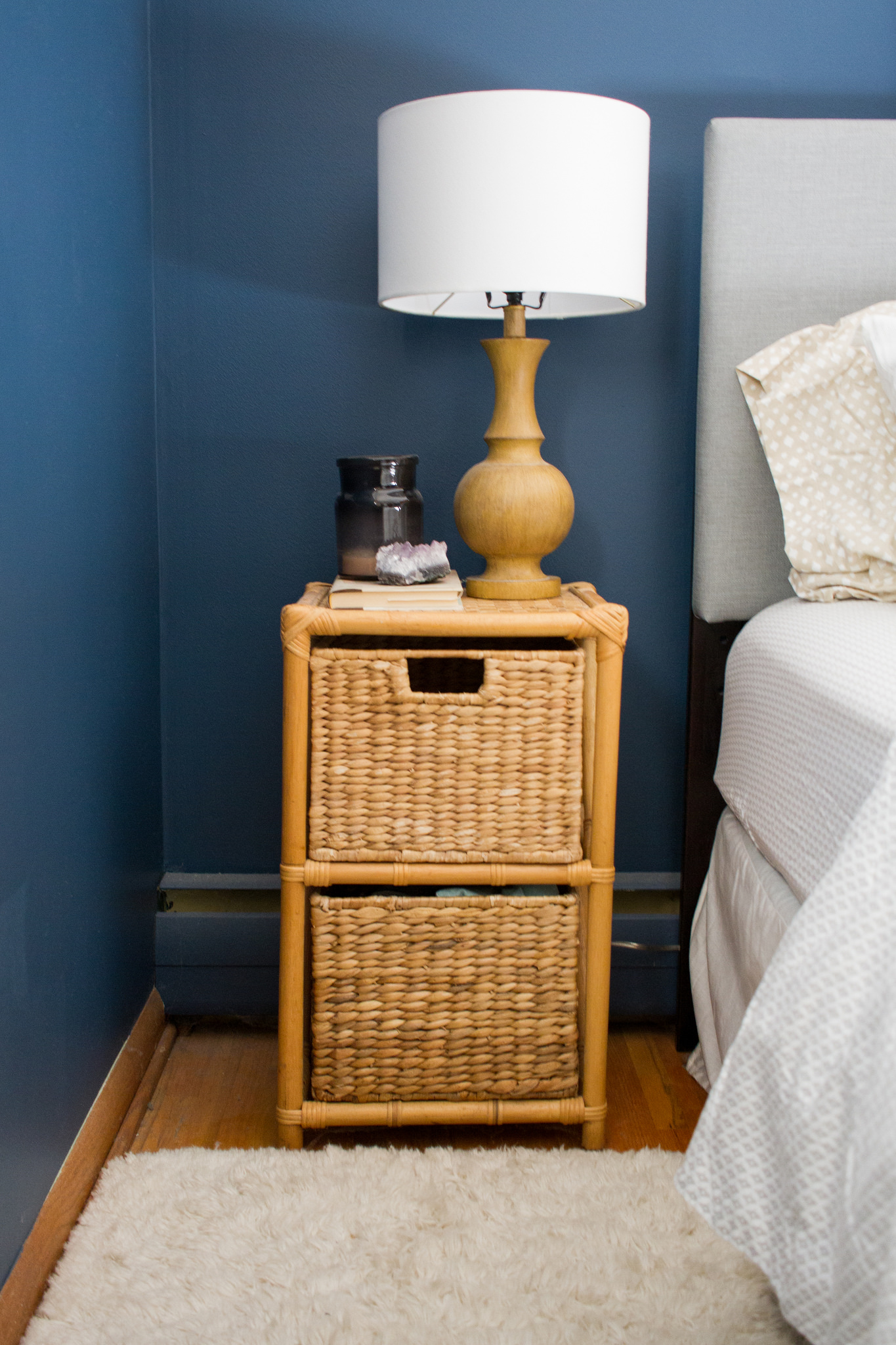
Bedroom_side table.jpg
Bedroom_painting.jpg
I tend to be pretty thrifty when purchasing home decor, but one thing that I am willing to splurge on more than others is original art. Pieces that aren’t mass-produced are so special, and getting to support the artists who create them is a gift. But if you don’t have it in your budget to splurge on original artwork, thrift and antique shops can be a great resource for you! I recently found this seascape at our local thrift shop for $4, and I love the character it adds to our bedroom!

Thanks for the tour today, Heather! 

Follow Heather along on Instagram @mysahomestyling for more! All photos shot by Lana Douglas of 1987 Photography. Check out Lana's photography on Instagram at @1987photography.
McKenna Sig.jpg

Oh Grow Up... Art ||Flip List Item No.4||

For a few months now, my collection of original abstract artwork has felt...off.  It's like you're trying to copy your mom's crowd-pleasing artichoke dip and yet it just doesn't taste the same when you do it - you feel me?

image.jpg

In an effort to solve this art conundrum, I declared "Grown-Up Abstract Art" as item No.4 on my furniture flip bucket list and began to do some research on what ingredients may be missing from my art collection.  After consulting pinterest, I kept stumbling on some delicious abstract art showcased in gorgeous, minimal floating frames.  

Source: Ellen Dodd

Source: Ellen Dodd

And so my first theory was formed.  I rummaged up some spare wood trim to fashion a make-shift gold frame for one of my smaller pieces, but when I finished it still felt juvenile somehow.  

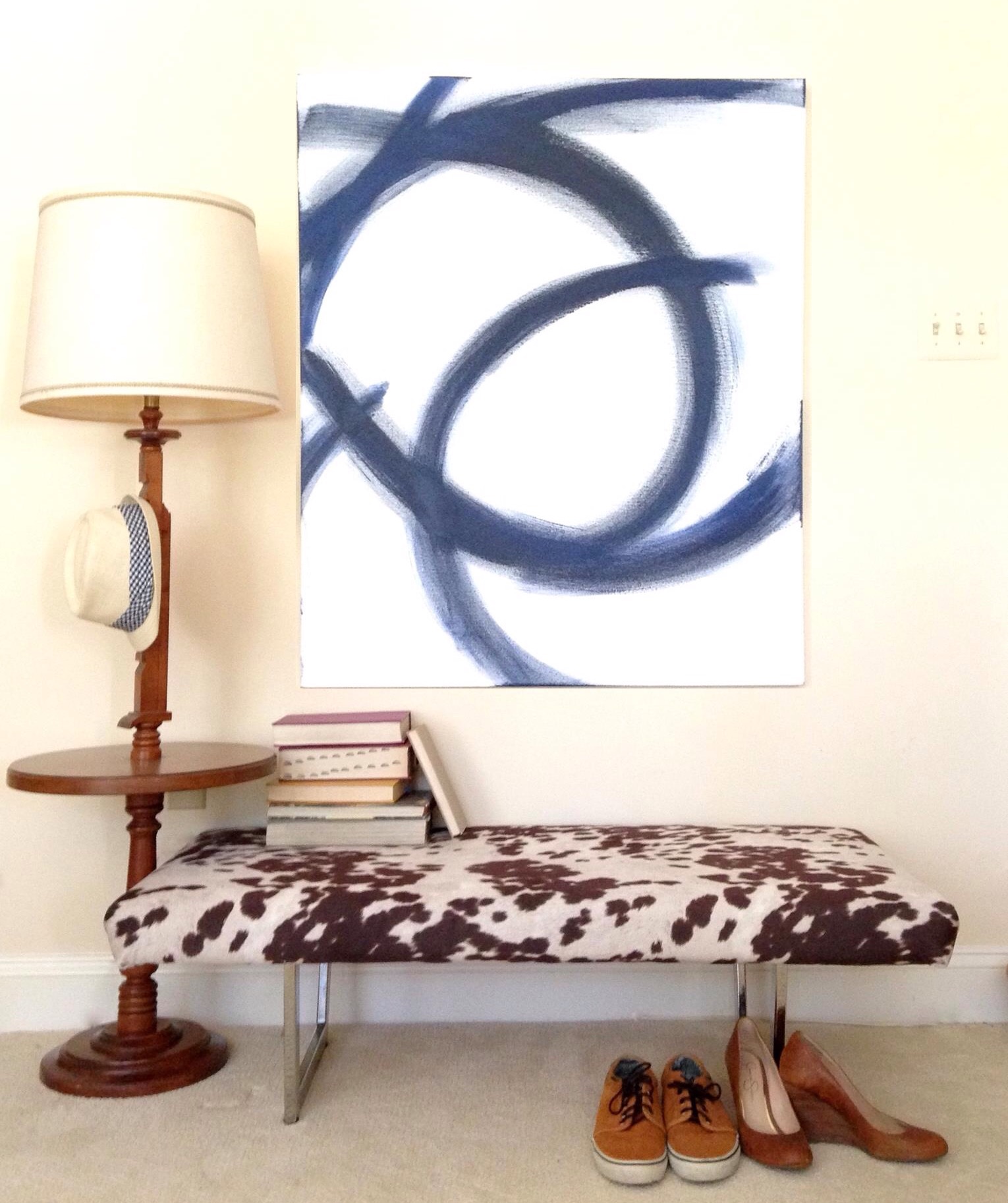
After mulling over it for a little while longer, I began to think that perhaps my portions were off.  I love to paint but I'm no professional artist - when I paint, I can't help myself: I love ALL THE COLORSSSSSS.  But perhaps I need to balance out the generous helpings of bold pops of color with some graphic patterns and white elements like this large piece I painted to help stage the cowprint bench.  [It actually sold at our Pop-Up Shop at Sweet Clover Barn so I never got the chance to mix it into my new abstract art recipe.]   And interestingly enough, despite my obsession with large-scale abstract art, I don't actually have any pieces hanging in our apartment. 

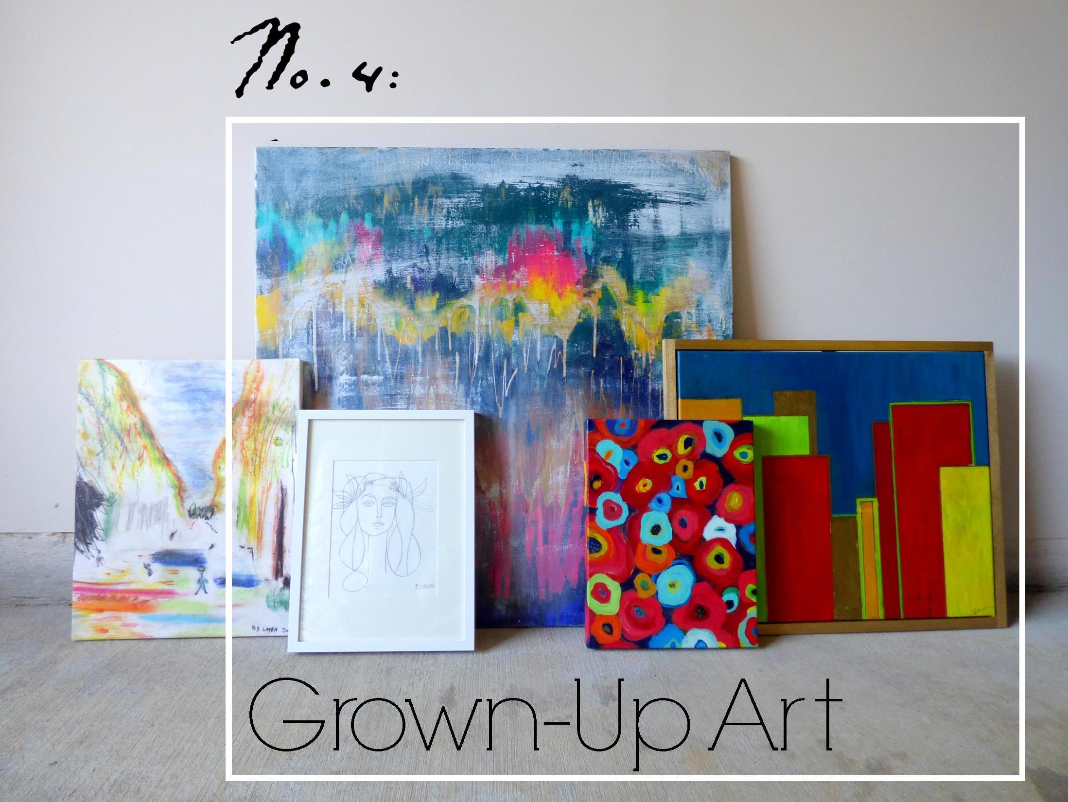
Ok so let's meet the "art ingredients" I do have in stock and let's see if we can mix them together for a winning combo.

Meet Art.jpg
Van Gogh's Les Alyscamps

Van Gogh's Les Alyscamps

  • "Les Ales Camps" - a 3rd Grader made this piece at a school I worked for.  The elementary art program was doing a series on Van Gogh and this young artist was studing Van Gogh's Les Alyscamps (which she mistakenly labeled as "Les Ales Camps" in the top right corner lol.  I loved the playful take so much that I had it printed on a canvas to hang in my office.
  • "Unnamed" - this is the largest piece of abstract art I've done and yet I haven't found a place for it.  I think I feel like it would overpower any of our small spaces so I've never hung it in our home.
  • "Hadley" - this is the piece I tried to give a floating frame.  I think the proportions are off and I would like it better if the frame were thinner and little daintier.
  • "Picasso" - this is another piece I can't take credit for.  I just love this line drawing so much that I traced it on some paper and popped it in a frame - forgive me Pablo P.
  • "A Riot of Color [in a dreary world]" - name that movie!  I painted this poppy-inspired piece while watching a Heath Ledger favorite (may he rest in piece).  You may recognize this pop of red from staging this piece here

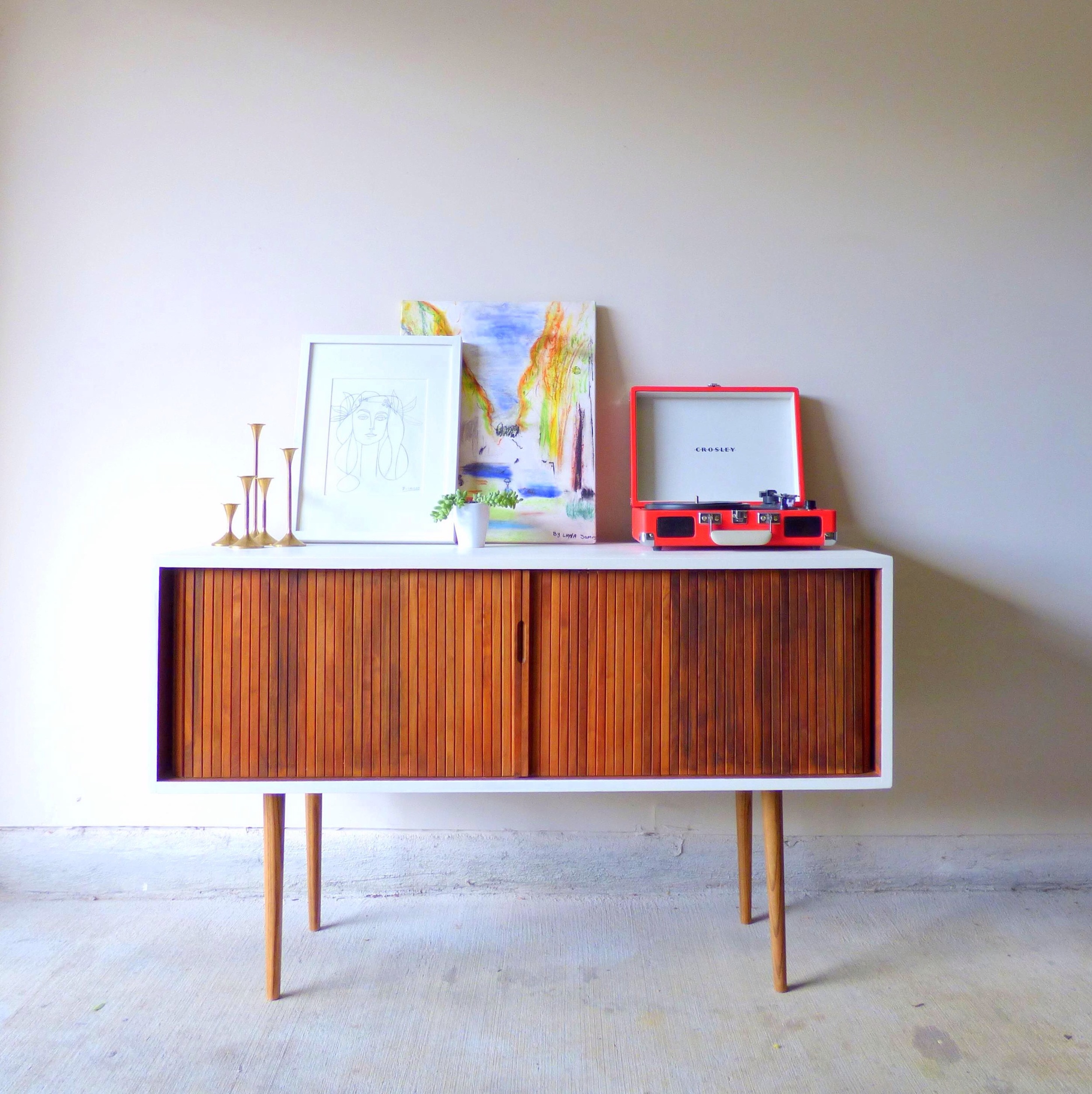
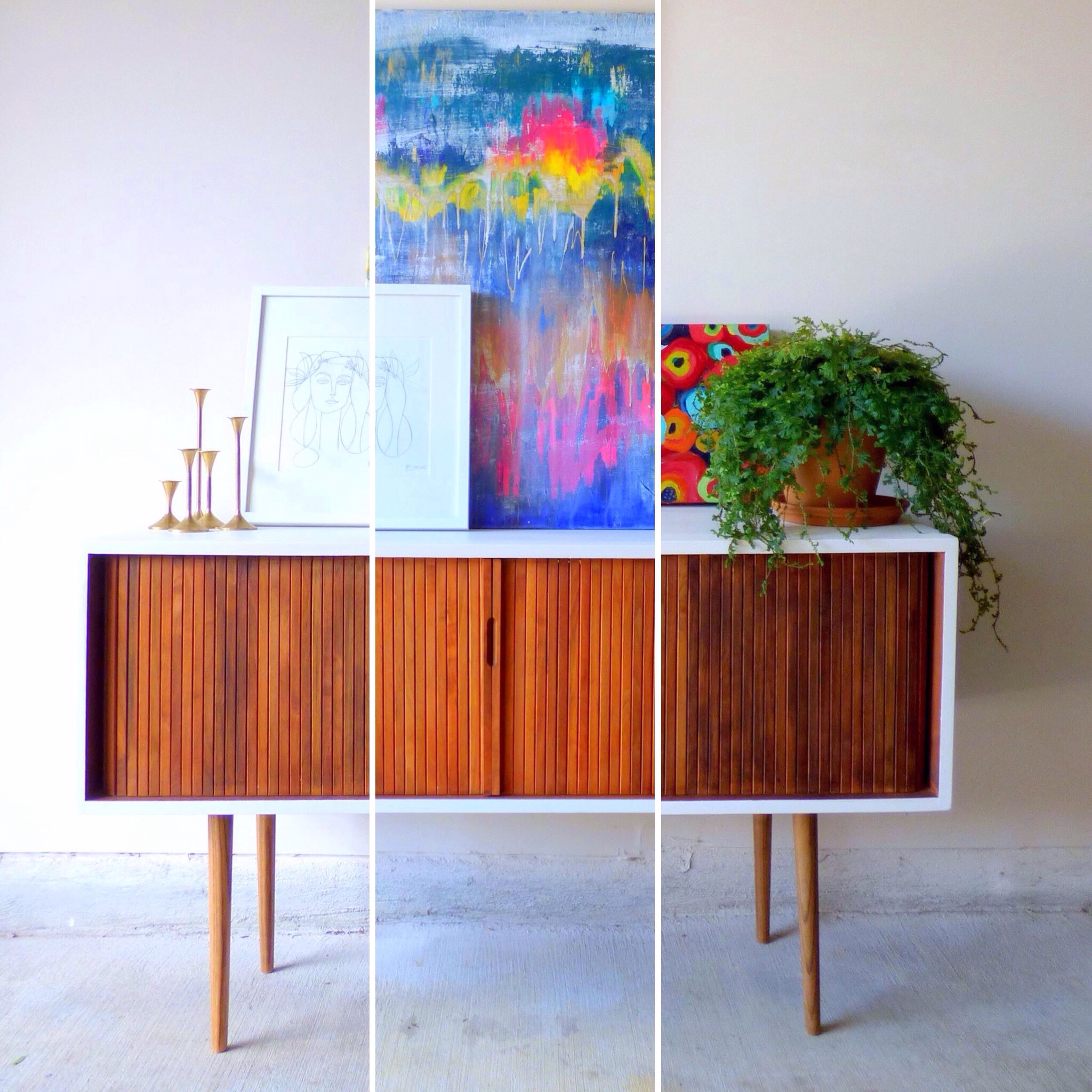
For plating purposes, I've enlisted the help of a fresh flip who'll be heading to his new home in DC soon [I removed the original toe-kick and added tapered legs with the nickle caps cut off and painted the top and sides a glossy white].

P1010468-001b.JPG
image.jpg
image.jpg

Art Recipe No.1:

image.jpg

Playful "Les Ales Camps" with a side of "Picasso" garnished with plant, brass candlesticks and record player served on a Mid-Century Record Console Table with storage for your vintage record collection.

image.jpg

[How cool is that rolling door for space-saving storage?!  And there are four compartments inside with removable vertical dividers.] 

image.jpg

To combat my tendancy to over-saturate with color, my thought here was to pair the two "lighter colored" art pieces on a white-wall background.  The smaller graphic "Picasso" cuts the intensity of the color in "Les Ales Camps" and the record player.

Art Recipe No.2:

image.jpg

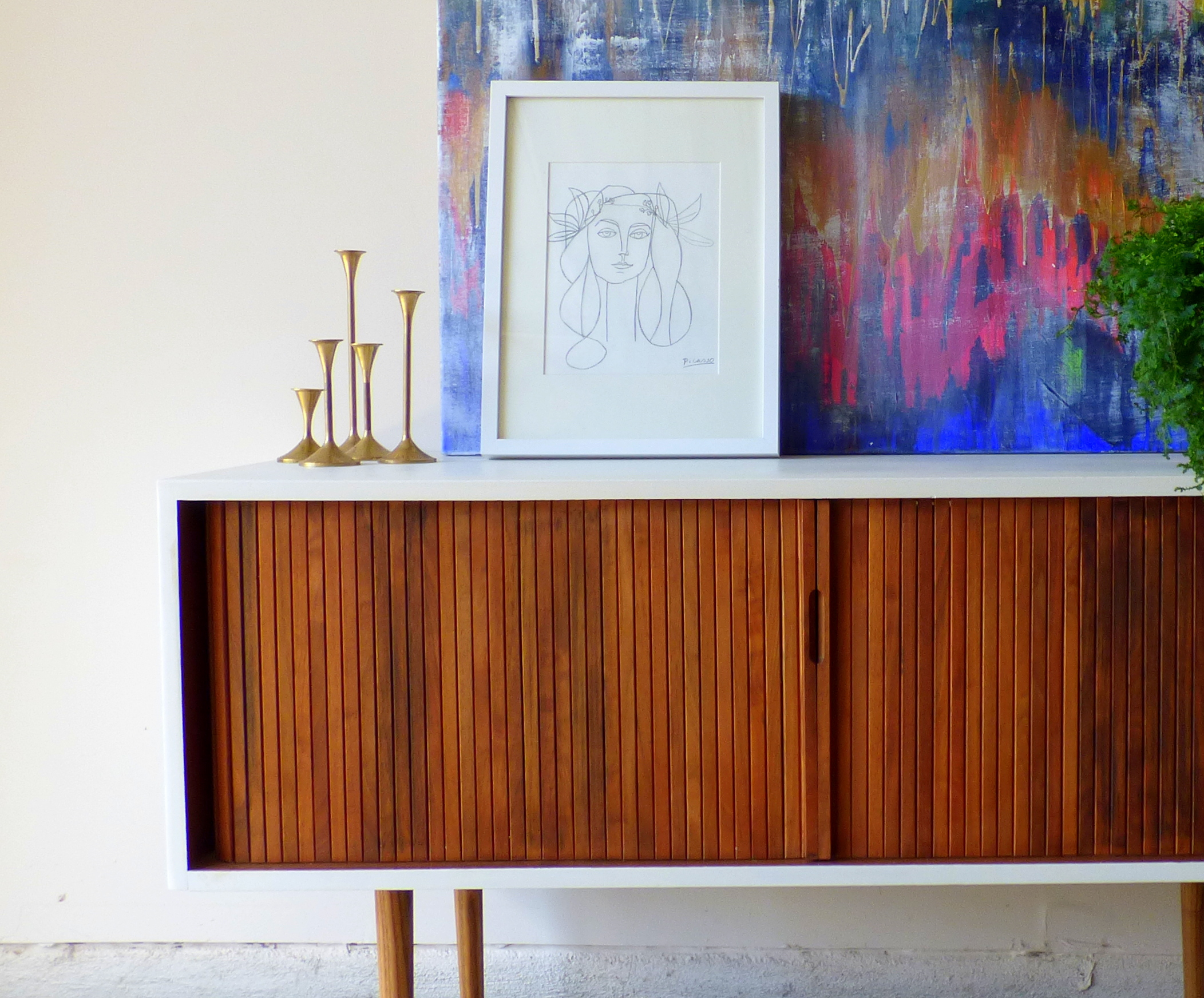
A large helping of "Unnamed" abstract with a side of "Picasso" drizzled with candle sticks and a fern for garnish.  Since "Unnamed" is such a powerful flavor, I also tried to soften it with the dainty print and anchor it with a large plant. 

Art Recipe No.3:

image.jpg

Spiced "Riot of Color" and "Hadley" with creamy "Picasso" served with natural elements encased in glass cloches and garnished with a potted fern.

image.jpg

[Look at that gorgeous wood grain in the slats of the console table's rolling front.]

image.jpg

Since I was using two bold paintings, I again employed the "Picasso"print and accented with the airiness of the glass cloches.

image.jpg

[Fun fact: the stand for the raw mineral is just one of my fluted candlesticks turned upside down].

image.jpg

Which recipe hit the spot for you?  Any suggestions on how to make my art collection more flavorful/ refined/ spicy?  Leave your tips in the comments below!

image.jpg

Mid-Century Record Console Table
48"W X 18"D X 29.5"H
SOLD
$525

If you are interested in a custom order like this piece, please contact me at  cate@stylemutthome.com

image.jpg

Check in on the progress of this year's furniture flip bucket list:

Chelsea's Updated Master Bedroom

Alternative title: Chelsea Hasn't Blogged In So Long That This One's A Doozie

Hi there, dear friends! Long time no blog. :) As you might have noticed back in January, StyleMutt Home's site took on a whole new look. We really wanted to transition from a random musings blog to a service based business, offering experienced furniture refinishing and home design not only to our local community but nation wide. This step has opened up some new doors for us which we are both excited about and also learning how to navigate as two women with other full time jobs. Balancing StyleMutt Home work with our day-to-day jobs/life has limited our time to jump on here and connect with you as frequently as we used to be able to, but we are so grateful for the other areas we can connect such as Facebook and Instagram, (@cate_stylemutthome and @chelsea_stylemutthome). These interactive extensions of StyleMutt Home have been a wonderful way to keep up with you all when the time isn't available to post on the blog.

But fortunately, today, I have a bit of time. :) I've been looking forward to getting on here again and spending a bit of time with you. Thank you for stopping by!

I'm not sure we've mentioned this yet but to fill you in a bit on what we've been doing, we are now in the home stretch of a gorgeous design job in Washington DC, (the main reason we've been quiet on the blog front), and we hope to be sharing the full makeover in April! Thought it might be fun to share this sneak peak today, though:

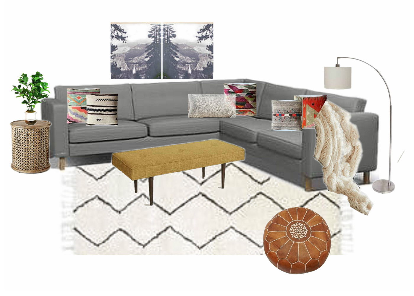
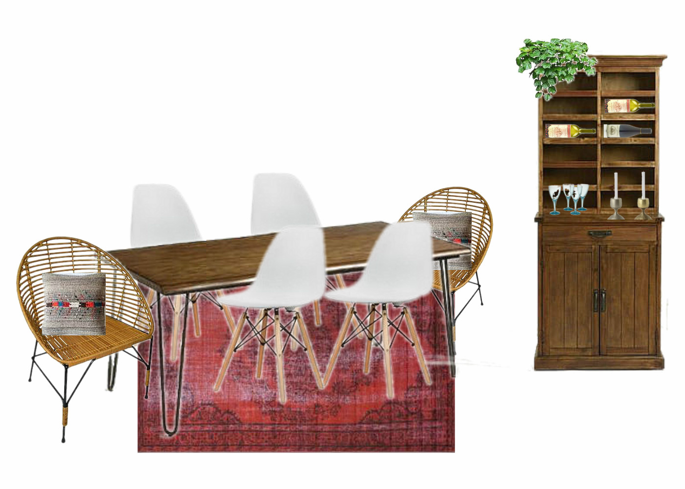
The job has included an open concept dining room and living room with the need for office space and entry way storage. It's turning out to be a real 'style mutt' space as our client is quite the eclectic lover herself! The concepts above have been tweaked a bit and we are just itching to show you the real deal!

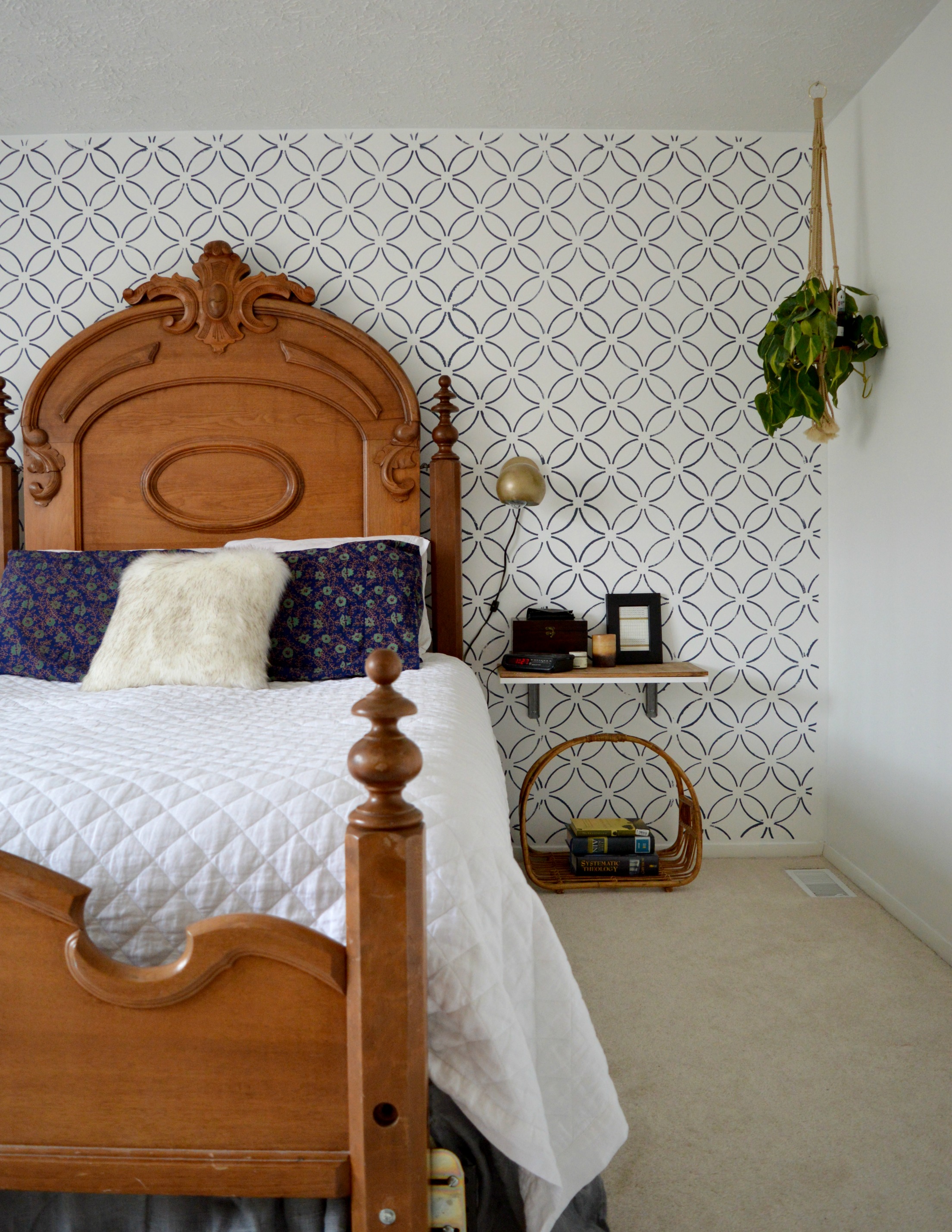
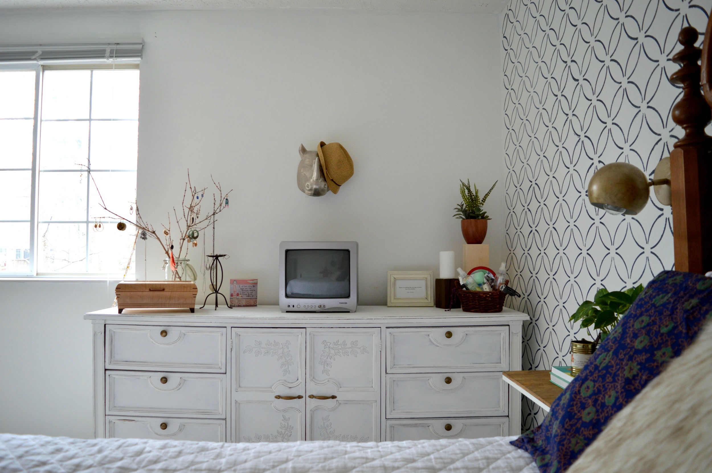
But for today, I can show you a real deal update in my own home. Our master bedroom! Before I go any further, there was nothing wrong with our bedroom before except the need for more functional clothing storage. We have been fortunate to have a family heirloom bedroom set that's been passed down through several generations, but the dressers were a pair of tall boys rather than a long and low of any kind. Since our bedroom is on the larger side, we definitely had the room for something with a larger footprint, so we stuck one of the tall boys in storage and replaced it with the ivy buffet I refinished at the beginning of the year, (and intended to sell. Oops!) We moved out excess furniture that wasn't really needed, (including a pair of leaning wall shelves, a table for the tv, and a chest at the foot of the bed). The space has really opened up, now! Take a look:

A pair of sconces, (found here), on the wall open up some space on our floating bedside tables.

If you recall from the post on the Ivy Buffet, I really despised the carved ivy on the cabinet doors at first and then ended up falling in love with it! To incorporate this sweet detail out in the room I found some ivy patterned shames, (here).

The rest of the space is pretty much what was already in the room before or shopped from around our home.

The reading corner was another flipped project I had intended to sell - I stained the old chair we had in the room previously, (found at an auto shop years ago, hah!), and gave it a fun pattern on the backrest. I wanted to give it a footstool that 'went' with it but wasn't too matchy-matchy. I used one of the seats from the pair of stools Cate and I had found last summer, and just added some legs I had on hand, (you may recall that the bases of the stools turned into this funky custom order!)
My grandma, (who's family this bedroom set is from), painted the pots on the windowsill. I love this original piece of hers and it inspired me to use our own windowsill as a makeshift bedroom library, (helpful since we moved out the old leaning shelves we previously used to store books).
This morning I sat here with a sleepy kid in my lap and watched her wake up in my arms. Glad we held on to this piece. :)

That's it for our bedroom! It's a much more calming space to me now as there aren't as many pieces competing. I'm hoping to be back over again this week with another little tour of our main living space. We haven't done anything big, but after lots of little switch-a-roos and updates here and there, it does seem to have a different vibe - plus I cleaned really well last week!

Thank you guys so much for coming by! It seems the longer I don't blog the longer my posts get. That's not a problem for you busy bees with lives and projects of your own to get to, right?! ;)