eDesign Reveal: Jess and Keith's Soulful Row House

Well this is a very special reveal, indeed! Remember last March when we welcomed a much needed addition to the StyleMutt Home design team? Well since then our girl Joy has been representing the SMH brand well, tackling jobs across the world in Australia and right here on our home turf. As we have learned since branching out to include design services, getting to actually see a finished job is a BIG deal! StyleMutt Home has been beyond blessed to work with many clients who are as passionate about seeing their homes transformed as we are, and we’ve had just the opportunity with a particularly fun client over this past year.

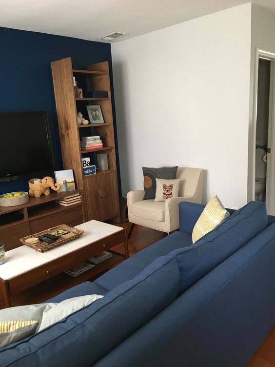
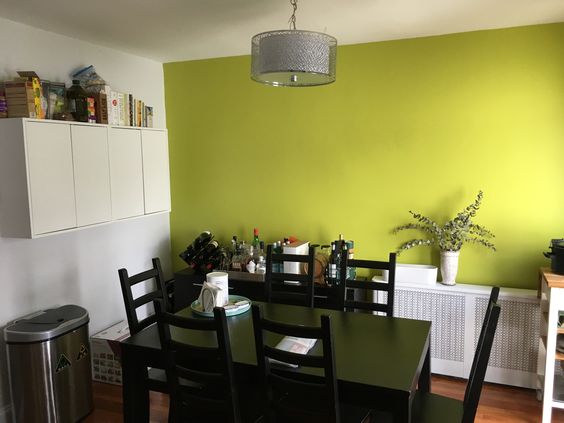
Jessica and Keith are a SUPER sweet couple living in a quaint DC row house on a street oozing with charm. When they came to us they had only been living there for a few months but had come a long way putting their style on their home. While their living room was more or less finished, (just needed some of those final details), their dining room was only just beginning. Let’s take a look at the ‘before’ shots they sent us!

Joy and I decided to divide and conquer on this project; I took the entryway and living room, and she tackled the dining room. Having two designers working on one home can be tricky because you really want to make sure that there is a consistent point of view from one room to the next. Communication from all parties involved needs to be tight, and I can honestly say this crew made it happen without a hitch. Jessica and Keith were amazing to work with, and Joy’s design for the dining room left me in awe. It was just so much fun! So let’s look around the finished home!

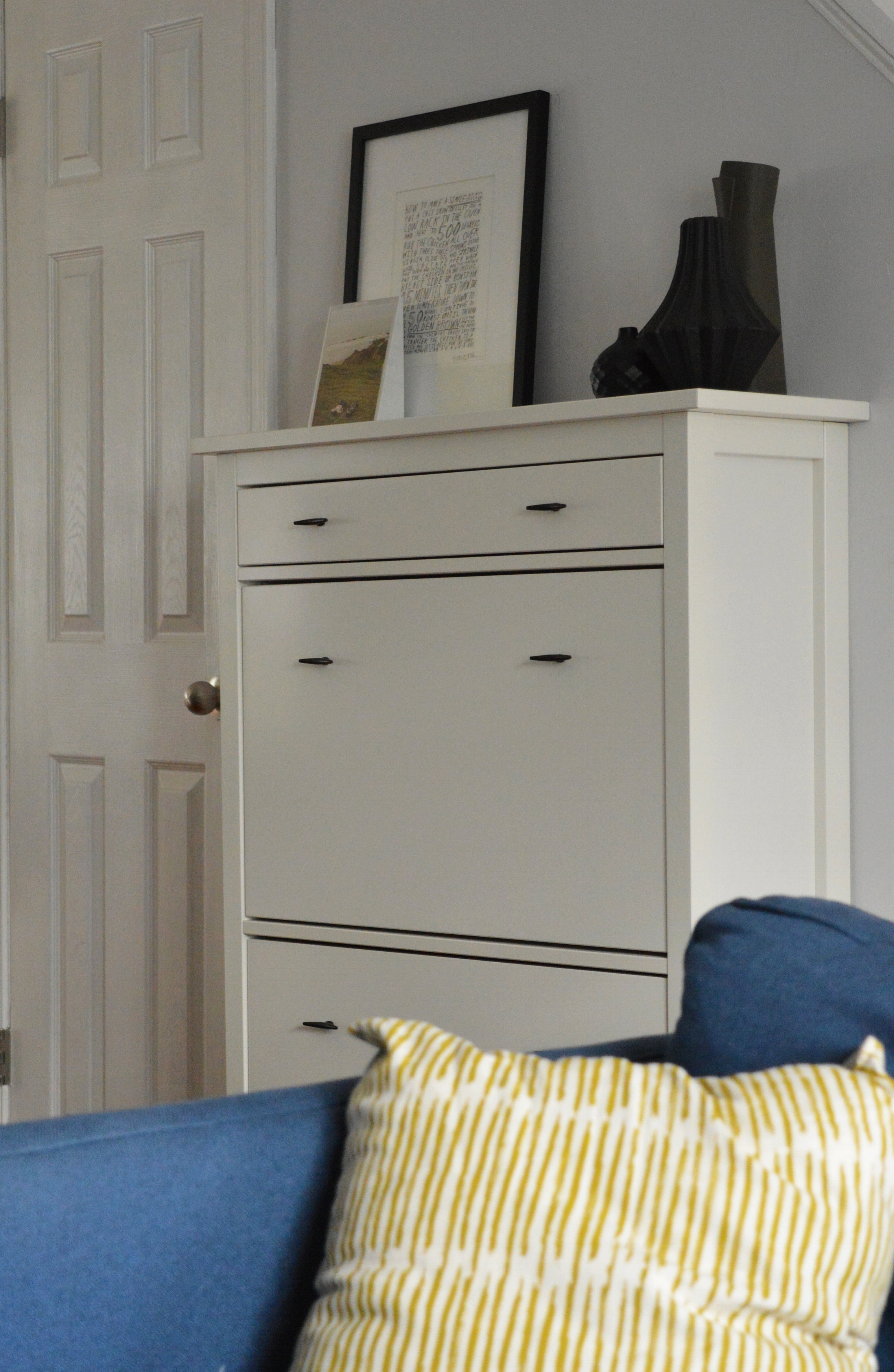
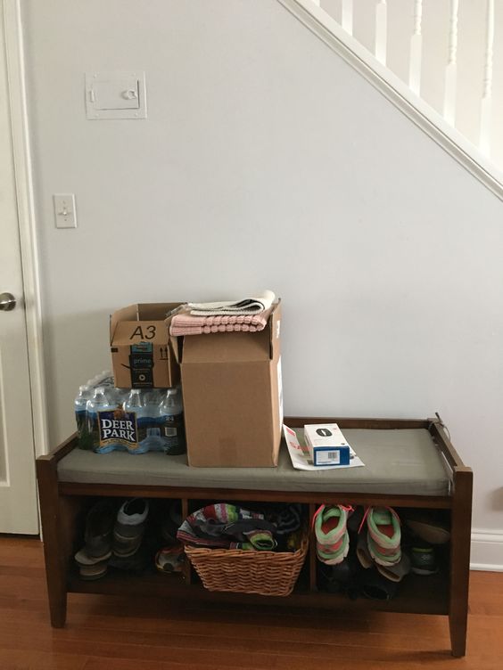
In the entryway we wanted to get things off the floor and hugging the wall. We swapped the coat tree for a hanging rack, and got all the shoes in a narrow storage cabinet on the adjoining wall.

DSC_0330.JPG
DSC_0315.JPG

The living room was so close when Jess and Keith came to us - they just needed a bit of advice for styling accessories, lighting, art and a rug! It never ceases to amaze me how a space suddenly looks awake! with just a few additions and styling!

DSC_0319.JPG
DSC_0318.JPG
DSC_0323.JPG
DSC_0321.JPG

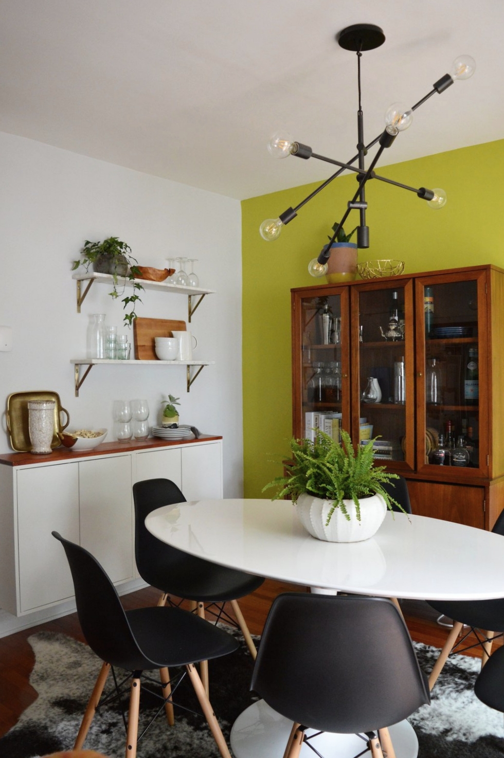
The dining room, on the other hand, was closer to the beginning of its makeover than the end! (This would be a good time to jump back up to the top and take a look at the ‘before’ picture!) The only element Jess and Keith wanted to keep was the freshly painted accent wall, SW ‘Citrine Dream’. And after Joy took the reigns in here, I don’t think I’ve ever loved an accent wall more!!!

To point out the obvious first, the use of warm woods in here mixed with stark white and black pieces makes this bright color take on a highly sophisticated personality. A punchy color works remarkably well when the remaining elements are strong and LOOK expensive, (even if they are not).

finish2.JPG
finish6.jpg
finish3.JPG

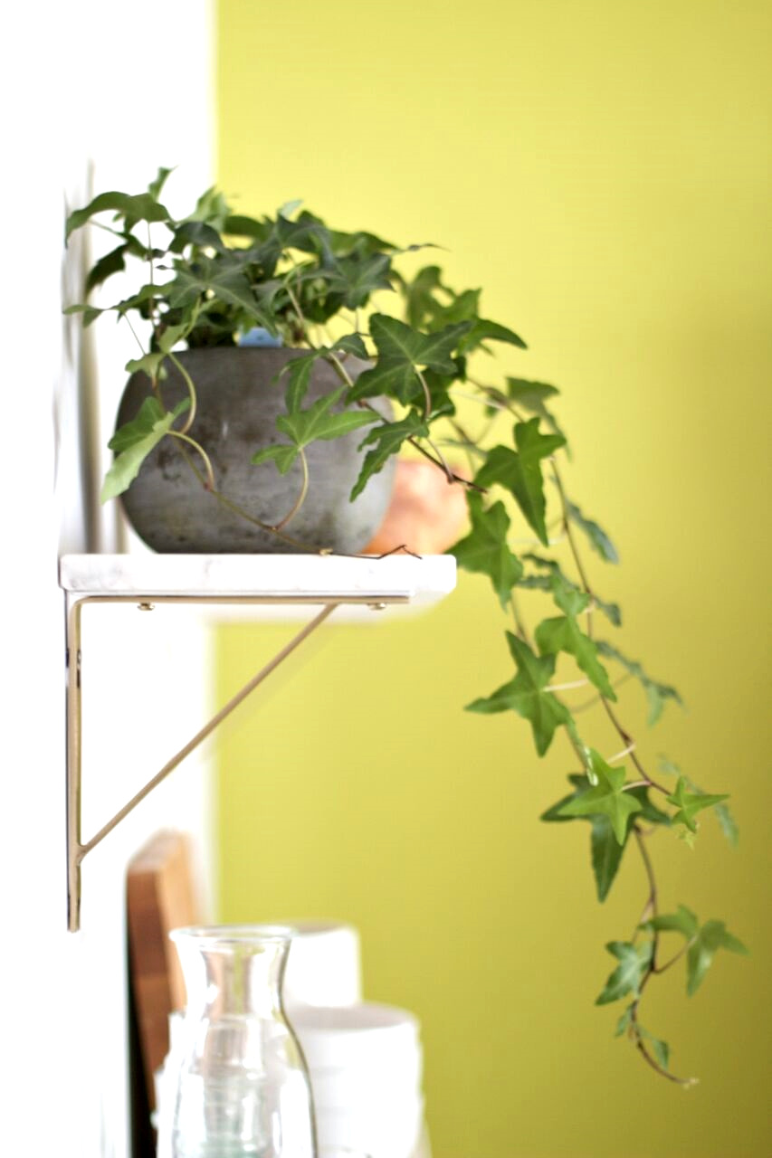
Less obvious touches of brass and marble speak volumes in this multi-functional area, and prove that small doses of these finer materials go a long way.

finish7.JPG

An intentionally selected statement art piece doesn’t cower against the statement wall - anything softer would have been absorbed by the citrine color, but this piece pops right out - exactly what it was intended for!

finish4.JPG

It has been such a treat to get to work with Joy on this amazing home with these incredible clients. Everyone put in the time and effort to see this home to the finish, and we wish Jess and Keith the very best life together here.

So ridiculously proud to get to share Joy’s hard work here! It is truly a pleasure to have her on our team and I’m still pinching myself that we are lucky enough to offer her talents to our design clients. You can see more of Joy’s work on her site, Joy Lewis Design.

Thank you all so much for stopping by!

Chelesa.jpg

SOURCE LIST

Entryway hooks, Urban Outfitters
Entryway mirror, Pottery Barn

Living room shelves, Room and Board
Living room sofa, Crate and Barrel
Living room coffee table, West Elm
Living room drink table, West Elm
Living room chair, West Elm
Living room rug, West Elm
Living room sconce, Lamps Plus
Living room art, Laura McGuigan
Living room accessories, primarily CB2 and what the client had on hand

Dining room table, Overstock
Dining room chairs, Poly and Bark
Dining room rug, Overstock
Dining room chandelier, West Elm
Dining room art, Minted
Dining room shelves, World Market
Dining room white storage, IKEA
Dining room vintage storage cabinet, Craigslist

Chelsea's Updated Master Bedroom

Alternative title: Chelsea Hasn't Blogged In So Long That This One's A Doozie

Hi there, dear friends! Long time no blog. :) As you might have noticed back in January, StyleMutt Home's site took on a whole new look. We really wanted to transition from a random musings blog to a service based business, offering experienced furniture refinishing and home design not only to our local community but nation wide. This step has opened up some new doors for us which we are both excited about and also learning how to navigate as two women with other full time jobs. Balancing StyleMutt Home work with our day-to-day jobs/life has limited our time to jump on here and connect with you as frequently as we used to be able to, but we are so grateful for the other areas we can connect such as Facebook and Instagram, (@cate_stylemutthome and @chelsea_stylemutthome). These interactive extensions of StyleMutt Home have been a wonderful way to keep up with you all when the time isn't available to post on the blog.

But fortunately, today, I have a bit of time. :) I've been looking forward to getting on here again and spending a bit of time with you. Thank you for stopping by!

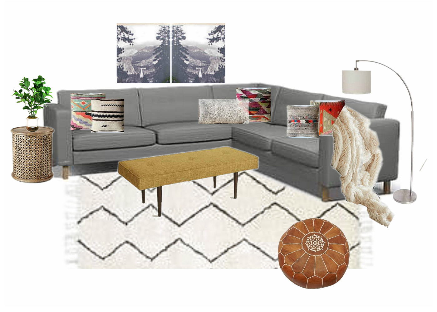
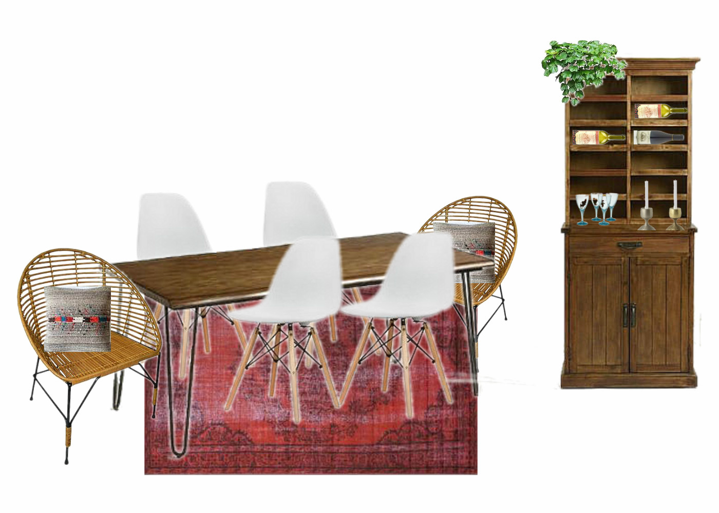
I'm not sure we've mentioned this yet but to fill you in a bit on what we've been doing, we are now in the home stretch of a gorgeous design job in Washington DC, (the main reason we've been quiet on the blog front), and we hope to be sharing the full makeover in April! Thought it might be fun to share this sneak peak today, though:

The job has included an open concept dining room and living room with the need for office space and entry way storage. It's turning out to be a real 'style mutt' space as our client is quite the eclectic lover herself! The concepts above have been tweaked a bit and we are just itching to show you the real deal!

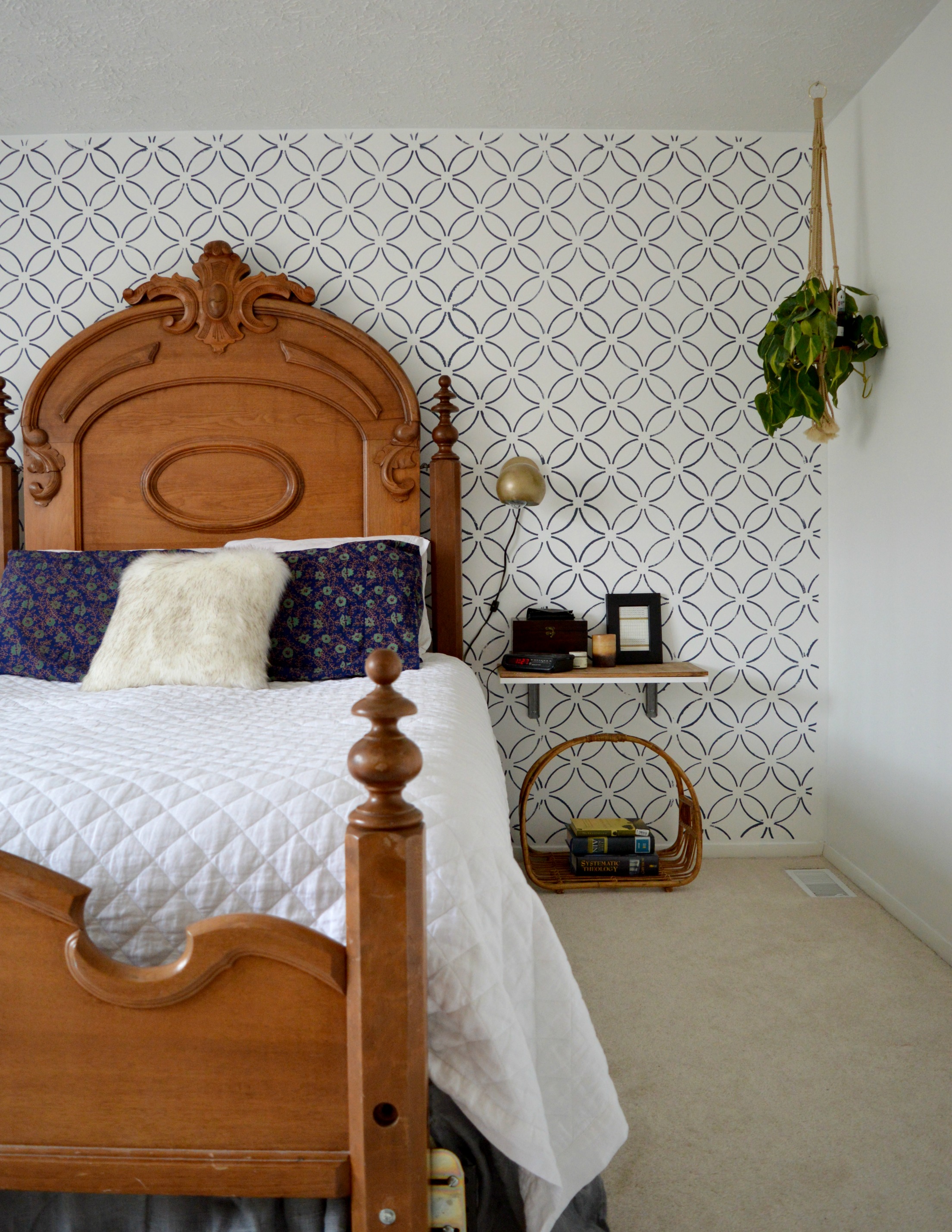
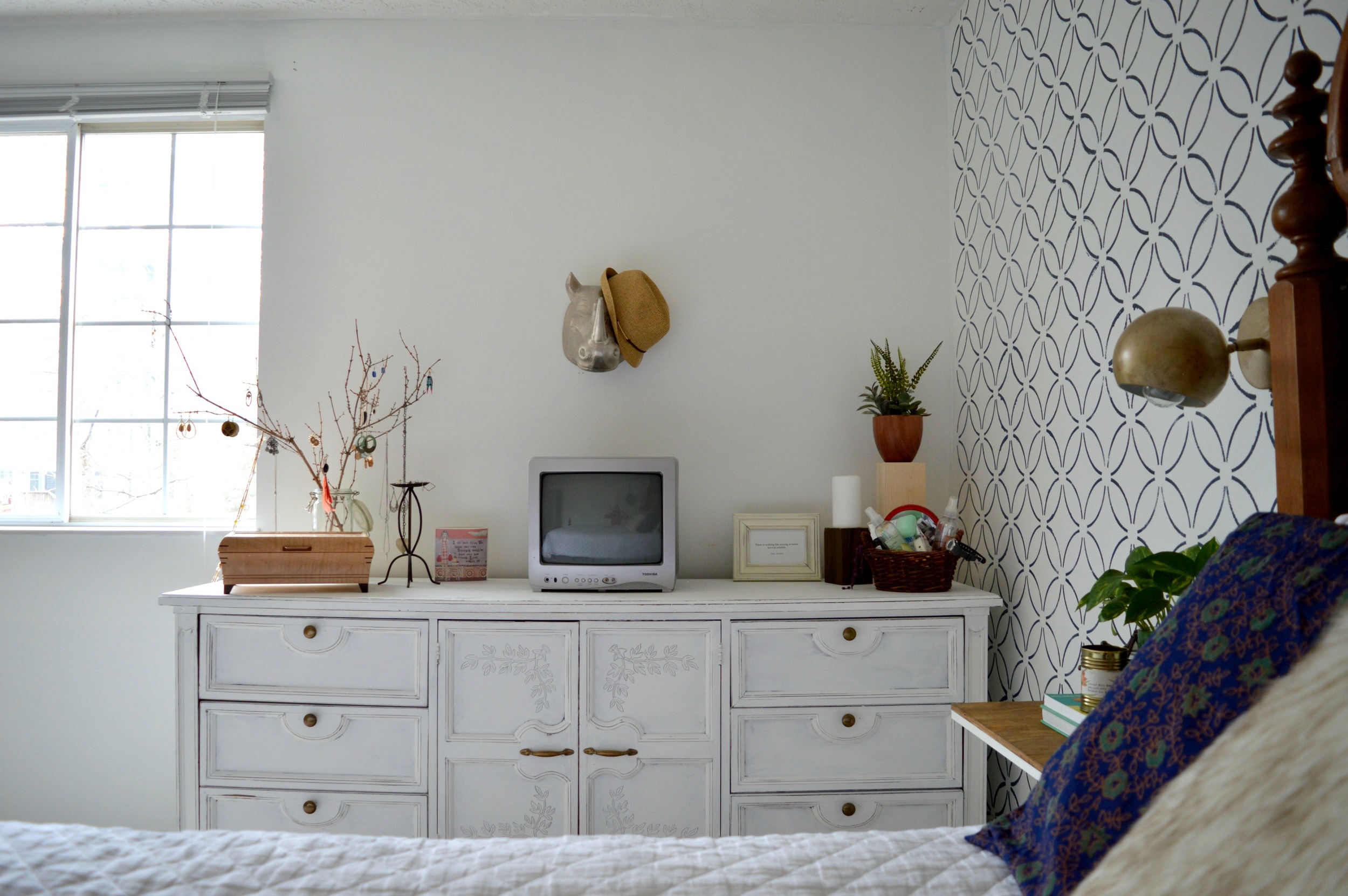
But for today, I can show you a real deal update in my own home. Our master bedroom! Before I go any further, there was nothing wrong with our bedroom before except the need for more functional clothing storage. We have been fortunate to have a family heirloom bedroom set that's been passed down through several generations, but the dressers were a pair of tall boys rather than a long and low of any kind. Since our bedroom is on the larger side, we definitely had the room for something with a larger footprint, so we stuck one of the tall boys in storage and replaced it with the ivy buffet I refinished at the beginning of the year, (and intended to sell. Oops!) We moved out excess furniture that wasn't really needed, (including a pair of leaning wall shelves, a table for the tv, and a chest at the foot of the bed). The space has really opened up, now! Take a look:

A pair of sconces, (found here), on the wall open up some space on our floating bedside tables.

If you recall from the post on the Ivy Buffet, I really despised the carved ivy on the cabinet doors at first and then ended up falling in love with it! To incorporate this sweet detail out in the room I found some ivy patterned shames, (here).

The rest of the space is pretty much what was already in the room before or shopped from around our home.

The reading corner was another flipped project I had intended to sell - I stained the old chair we had in the room previously, (found at an auto shop years ago, hah!), and gave it a fun pattern on the backrest. I wanted to give it a footstool that 'went' with it but wasn't too matchy-matchy. I used one of the seats from the pair of stools Cate and I had found last summer, and just added some legs I had on hand, (you may recall that the bases of the stools turned into this funky custom order!)

My grandma, (who's family this bedroom set is from), painted the pots on the windowsill. I love this original piece of hers and it inspired me to use our own windowsill as a makeshift bedroom library, (helpful since we moved out the old leaning shelves we previously used to store books).

This morning I sat here with a sleepy kid in my lap and watched her wake up in my arms. Glad we held on to this piece. :)

That's it for our bedroom! It's a much more calming space to me now as there aren't as many pieces competing. I'm hoping to be back over again this week with another little tour of our main living space. We haven't done anything big, but after lots of little switch-a-roos and updates here and there, it does seem to have a different vibe - plus I cleaned really well last week!

Thank you guys so much for coming by! It seems the longer I don't blog the longer my posts get. That's not a problem for you busy bees with lives and projects of your own to get to, right?! ;)

Winner, Winner, Chicken Dinner!

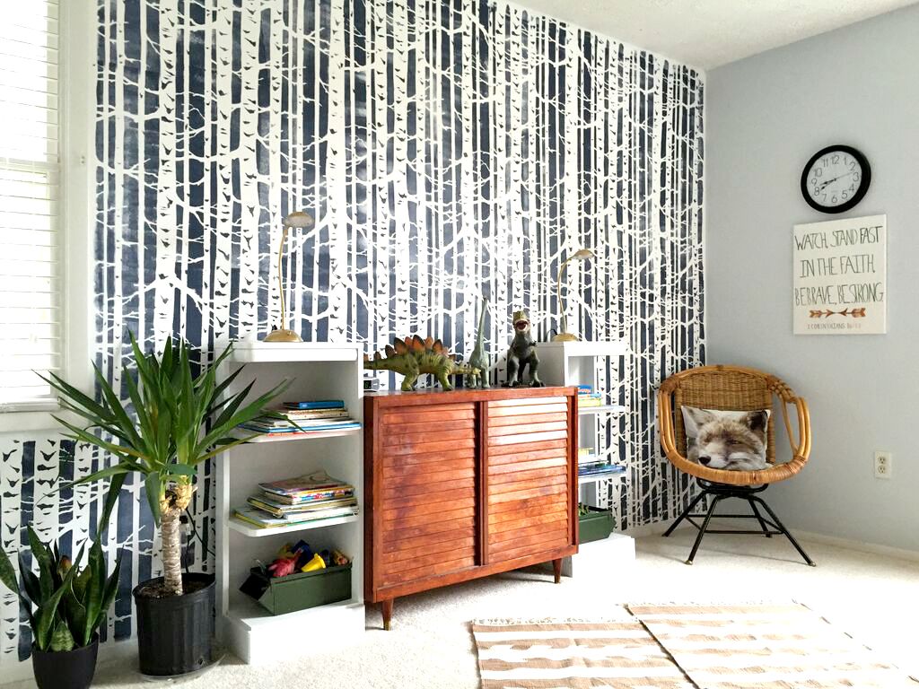
Thank you ALL for your kind and encouraging comments on the boys' room makeover! To those who entered our Cutting Edge Stencils stencil giveaway, we sure wish we could gift each of you with the stencil of your choice - we loved reading which stencils you'd use for your own projects! But alas, we could only pick one random name for the drawing.

Congratulations, Jenny!
||To claim your prize please email us at admin@stylemutthome.com||

Thank you so much to Cutting Edge Stencils for graciously offering one of our readers a complimentary stencil. It's such a pleasure to partner up with such a fantastic company and we hope you'll check them out and consider a stencil project of your own. We'll share it if you do!

Thank you all for stopping by! We adore ya~