Reader Design: Rhiannon's Family Farmhouse

We're off to a home that's right after Joanna Gaines' shiplap-lovin' heart. Side note: is anyone else mourning the final season of Fixer Upper like I am? 

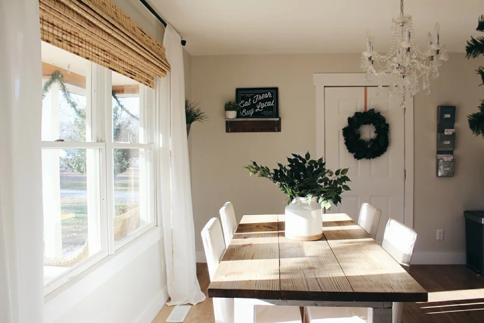
Thank goodness for Rhiannon and her Spotsylvania, Virginia home. It may help fill the void a little bit, at least for today! She calls Chip & Jo some of her biggest inspirations, so it makes sense that her home has the same lived-in, cozy comfort that we've come to love so much.

3 (1).jpg
4 (1).jpg
6 (1).jpg

They say that the kitchen is the heart of the home, and if that's true, then this heart is alive, well, and full of love. Rhiannon and her husband took on a lot of projects themselves to turn this into their dream.

From Rhiannon:

Our open shelving is my favorite. I originally wanted to make the entire wall at my sink to be windows, but the expense was going to be too much. So this was my second choice, but it makes our space feel bigger, and I can completely redecorate them at any time and create a whole new feel in the room/space with the seasons.

When redoing this space, they were conscious of anything too trendy or generic; even still, though, the heart wants what it wants.

I always joke with my husband, “are our children going to make fun of the way our house looked in pictures 30 years from now?” But I’d like to think that subway tile, oak woods, and great neutrals will never go out of style.
3.jpg

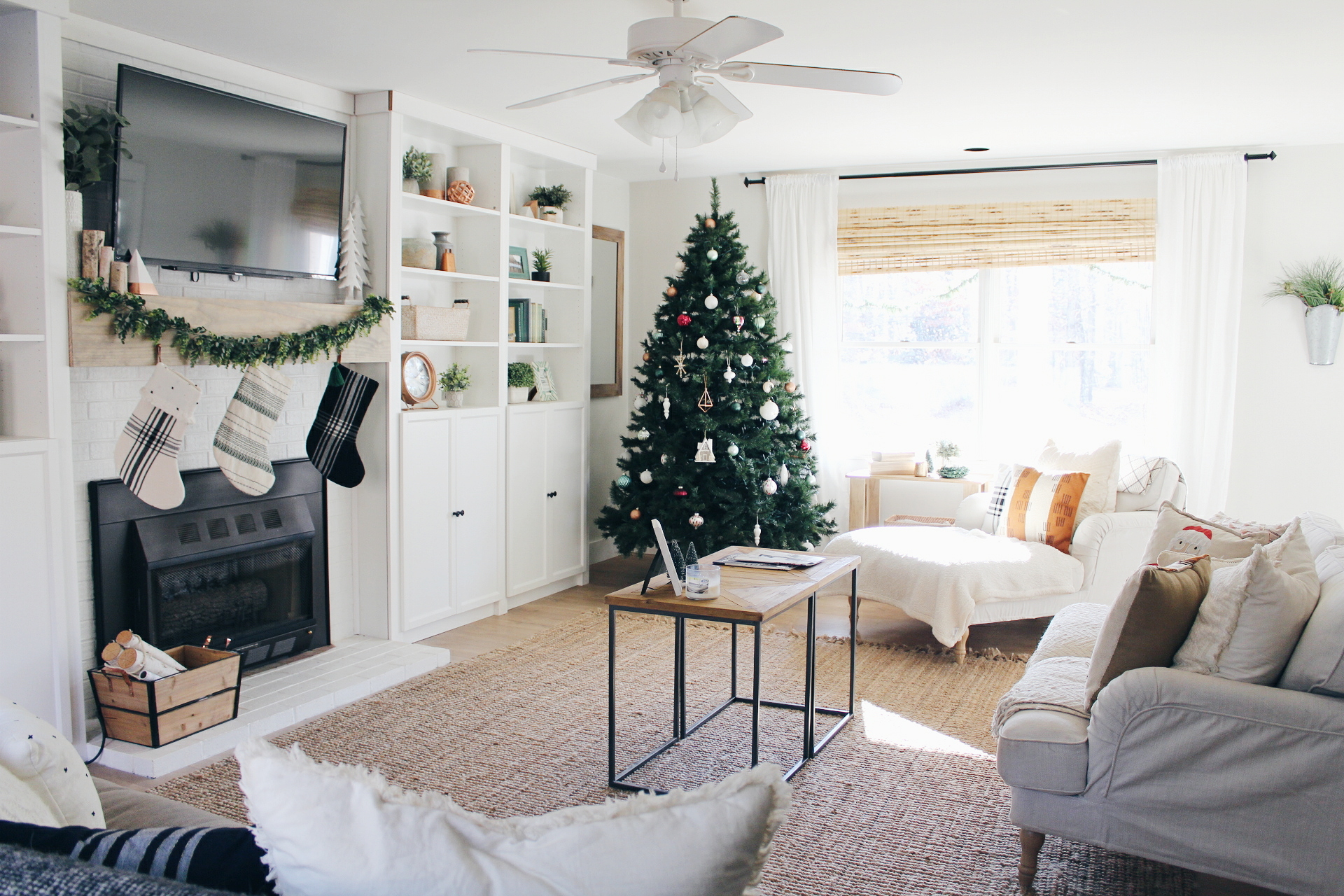
With such a beautiful, neutral backdrop, switching up the decor is something Rhiannon likes to do often - and let's be honest, I think it's something we're all guilty of. We can't stop those creative impulses! Luckily, we get to see this home decked out for the holidays; Rhiannon makes the most of every space and brings the festivity. 

1 (2).jpg
5.jpg
1 (1).jpg
2.jpg
4.jpg

Even when it's not the holiday season, this home is always a place of welcoming and peace.

I want it to feel cozy and comfortable but clean and minimalistic. I can’t relax in clutter. I’m always striving to find a good balance of simplistic but lived in. I never want my home to be the kind you walk into and your afraid to get dirty or mess up the pillows on the couch, I want people (as well as me and my husband) to feel relaxed and welcome. I think having a nice place to come home to where you genuinely enjoy your surroundings is so important and makes such an impact on day to day life!
1.jpg
2 (1).jpg

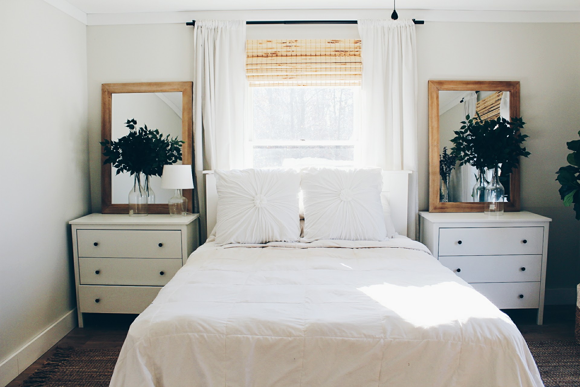
And while Rhiannon calls some areas, like the master bedroom, 'works in progress,' she has a surefire trick for instantly updating a space. Any guesses based on what you've seen?

They're fluffy, pretty, and easy to move around....

THROW PILLOWS! I think we all know that throw pillows have the power to dramatically transform spaces, and Rhiannon has that trick nailed. 

I like the ability to change the feel of a room with each season or mood I’m in, shelf decor and throw pillows are the easiest and most affordable way to do that!

Rhiannon, thank you for hosting a tour today! We're wishing you the happiest of holiday seasons in your home. Follow Rhiannon along on Instagram for more at @rhiannonmlawson.

McKenna Sig.jpg

Muted Teal Apothecary Chest

It's been a long time since I've been in touch with my shabby chic side.  In fact, I don't think I've heavily distressed a piece since this dresser .  But once-in-a-while, only for the most spectacular of clients, do you roll up your sleeve and distress the heck out of something to get that chippy-vintage-storied look.

As Chelsea hinted at with some teasers in this post, we've had the joy nay the honor of styling a hip condo for our latest client in DC.  One of the unique challenges we've faced with her space is a quirky triangular entryway with very little space and very little going on to greet you when you first walk in.  After weighing a few options, we decided that a narrow piece in a bright but sophisticated color would do the trick.

And it just so happened that I had a 12" deep faux apothecary chest in my possession ;)

image.jpg

Recognize it in our first apartment?  This skinny little piece has served us well over the years.  But the inevitable shift of my personal style combined with our lack of entryway in our new apartment meant it was time to move on to bigger better things.  I was pondering how to refinish it for resale just when our client brought up her need for some super-skinny entryway storage!  Twas meant to be.

After running some custom refinishing ideas past our client, we decided on a muted teal that played well with the rest of her newly designed home and a "weathered" look for some added character.

In my experience, it is really rare to find a storage piece as narrow as 12" - I mean just look at how thin this lady is! 

All she really needs to be for our client is a happy little place to catch her keys and store her weather-wear (scarves, mittens, and such).

Giving a nod to the piece's vintage vibes, I styled it with the replica botanical prints salvaged from our old master bathroom (which have been sitting in a box since we moved) and a blown-glass vase with foraged thistles.

I am so happy to see her go to a beautiful new home and even happier to offer our client a custom piece that I've had the chance to product-test myself!

You'll have to circle back to us to see how she'll fit into our client's digs!

Reader Design: Suzi's Shiplapped Farmhouse

It's a rainy fall day as I write this and the weather is making me want to curl up with something cozy.  It's a good thing it's Friday because we have a cozy #stylemuttspaces farmhouse tour to share!  Suzi is from Whyalla, South Australia and just LOVES the charming farm look.

From Suzi:

I think my decorating style is farmhouse/ vintage , white is a favourite colour of mine , but I’m also drawn to soft hints of green and blue, this farmhouse style has come from reading Country Home magazine when it was in publication and now my favourite magazine is Country Living, and of course lots of inspiration from Instagram.  I have a slight obsession with shiplap at the moment and want to have it in every room, it gives such a farmhouse feel, and changes a room in an instant.
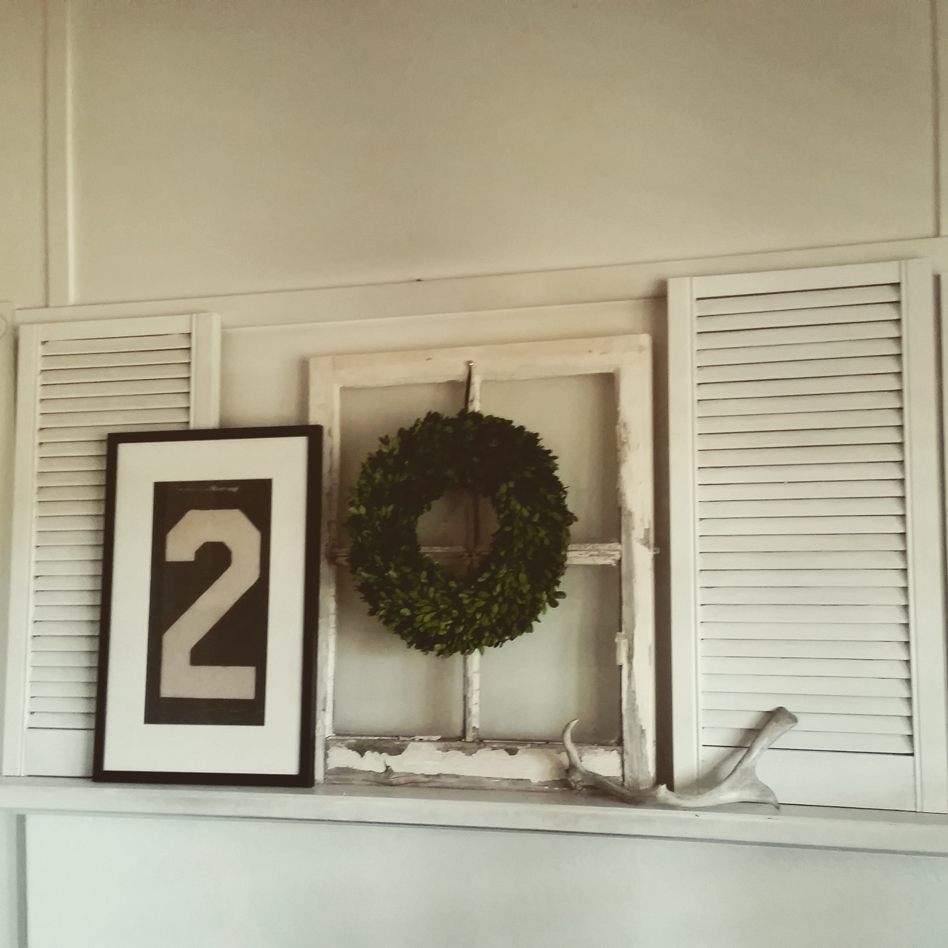
This is my mantel in my living room , I love my chippy old window that I managed to score from a house that was being demolished across the road from me.
My kitchen is a constant work in progress, we are doing it all ourselves, so it takes time, but I love how its evolving.
My family room is a great space for our family, plenty of room for us all, and it has a very relaxed feel.
We moved our big dining table into our family room, and put in a round table, I love the warmth of the wood.
I’m trying to keep things a little more simple in my rooms, so that pieces shine.

Thank you Suzi for sharing your serene space with us on StyleMutt Home.  Follow Suzi @darbystar on instagram for more farmhouse feels!

image.jpg
 

And Hey!  Consider yourself invited to the #stylemuttspaces party.  Tag your pics with the hashtag for your very own Reader Design feature right here on the blog!