Reader Design: Michelle's Suburban Escape

As anyone who has lived in a major city knows, sometimes you just need to get out. It took starting a family for Michelle and her husband to call it quits on New York City and Hoboken and make the move to the suburbs.

From MIchelle:

We spent years living in New York City and then Hoboken, but as soon as our son became a toddler, we started looking at homes in neighboring suburbs. There’s just something so calming about having your own personal space; no upstairs neighbors, your own backyard, and enough room for overnight guests! We moved into our new house exactly one year ago, and I swear, it’s taken that amount of time to really turn it into a home!
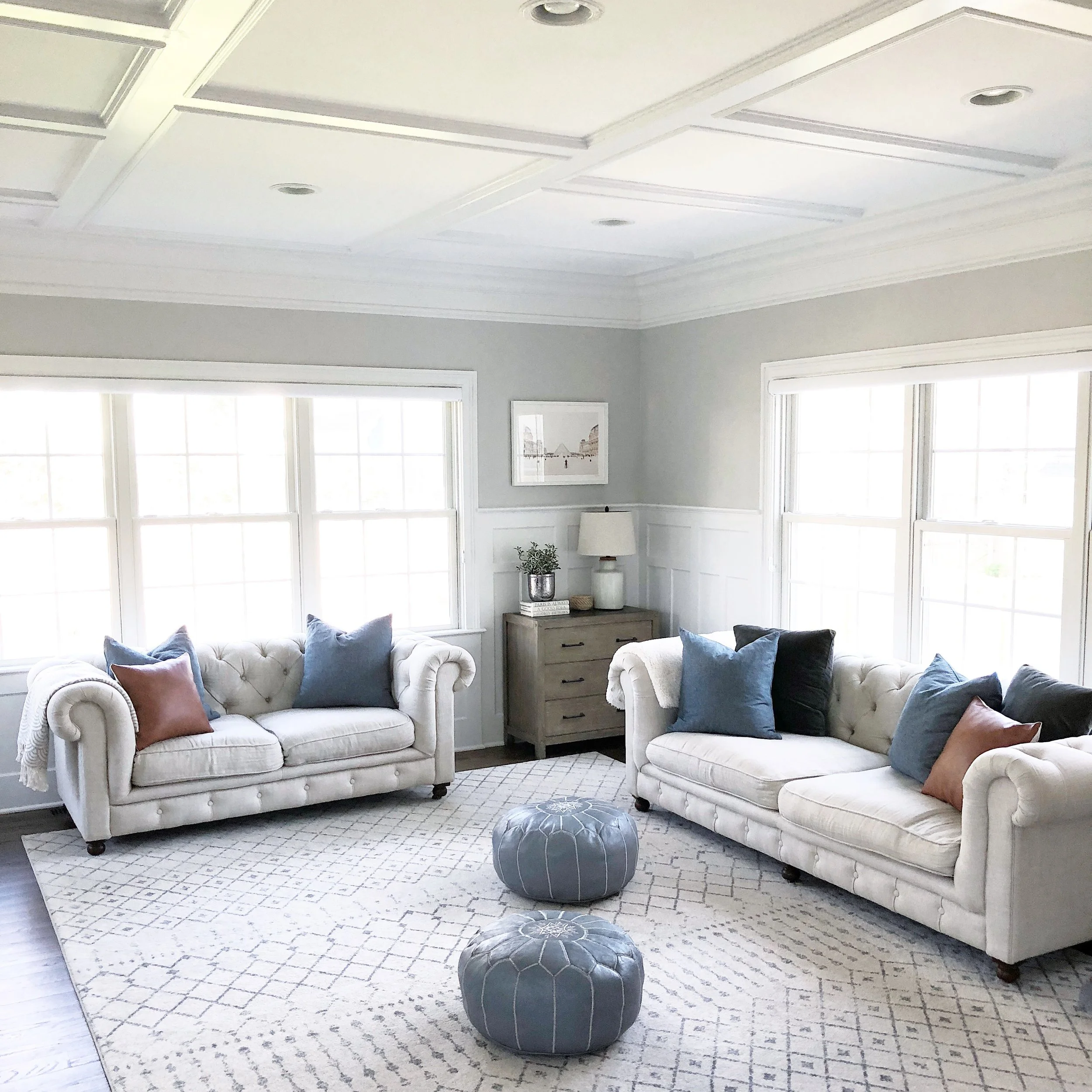
familyroom1.JPG
familyroom3.JPG
Even though we live in a suburb just outside New York City, but my style is definitely more “modern farmhouse” than anything else. I like the look of natural wood against more modern pieces, and in my opinion, you can have have too much white. I knew that I wanted our home to have a laid-back, cohesive feel. Nothing too bright or jarring, but still interesting, and most importantly, cozy. Plus, we have a 2 ½ year-old and a large dog, so it needed to be kid- and pet-friendly above all else!
diningnook2.JPG
diningnook3.JPG

Now, you all may not be seeing the family practicality in this design, but Michelle swears it's there!

When people come to visit, they usually laugh at the fact that nearly all of our furniture is white, despite having a toddler and a large, black dog — but I swear, it works for us! Everything is stain-resistant. My one tip of advice is to fill your home with pieces that you love, and to not worry too much about them being on-trend or getting destroyed. If you love the look of something, get it and keep it! I’d much rather live with a piece of furniture I love and have it fall apart after several years, vs. settling for something that never feels right.
kitchen4.JPG
Our kitchen is a simple and white, which is what I’ve always wanted. It’s bright even on a rainy day, and the closed cabinets offer tons of storage (which is good because we love to cook and have nearly every contraption you could think of!). The one thing we really insisted on when looking at houses was an open floor plan; we needed a kitchen that opened into the family room and dining area so we could prepare meals and entertain, while also keeping an eye on our son.
nursery1.JPG
nursery3.JPG
nursery2.JPG
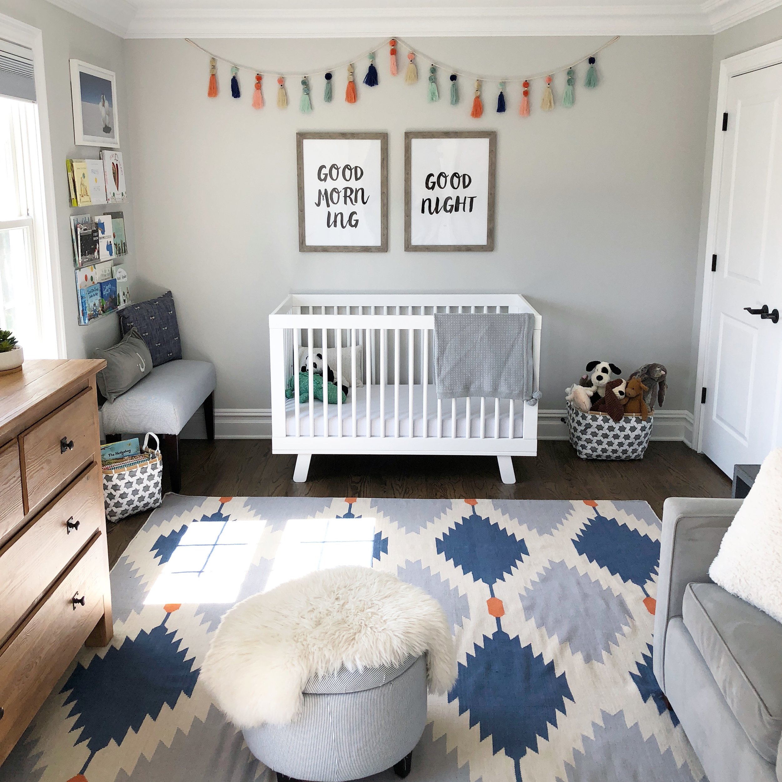
Our son’s room is probably the most colorful room in our house and I’m ok with that. The furniture is neutral, but I chose a colorful dhurrie rug and some fun garland to hang above his crib. And his toys and books add even more color.

The whole house is cozy, inviting, and classic, making it the perfect escape after years in the crowded city. Good choice, Michelle, and thank you for letting us in today!

Follow Michelle along on Instagram @girlonthehudson.

And now, I'm off to celebrate my birthday! Till next week,
McKenna Sig.jpg

Reader Design: Ashley's Cali Cool Home

Let's go to California! It's finally starting to feel like springtime, and that Los Angeles sunshine is just what the doctor is ordering. Today, we're off to tour Ashley's home in the Mid City neighborhood of LA.

ACS_0211.JPG

This home is the definition of cool, California style. It's laid back, has a healthy dose of mid-century modern design, and makes ample use of plants. 

From Ashley:

I’d say my style is a mix of California casual and eclectic bohemian. I like to collect unique pieces and style around those. In our living room it is the colorful rug from West Elm. I picked pink pillows and mustard-colored throws to accent the room, both colors pulled from the rug. I’m also embracing the millennial obsession with plants. Every open space I find gets a plant.
ACS_0194.JPG
ACS_0244.JPG
IMG_4194.JPG
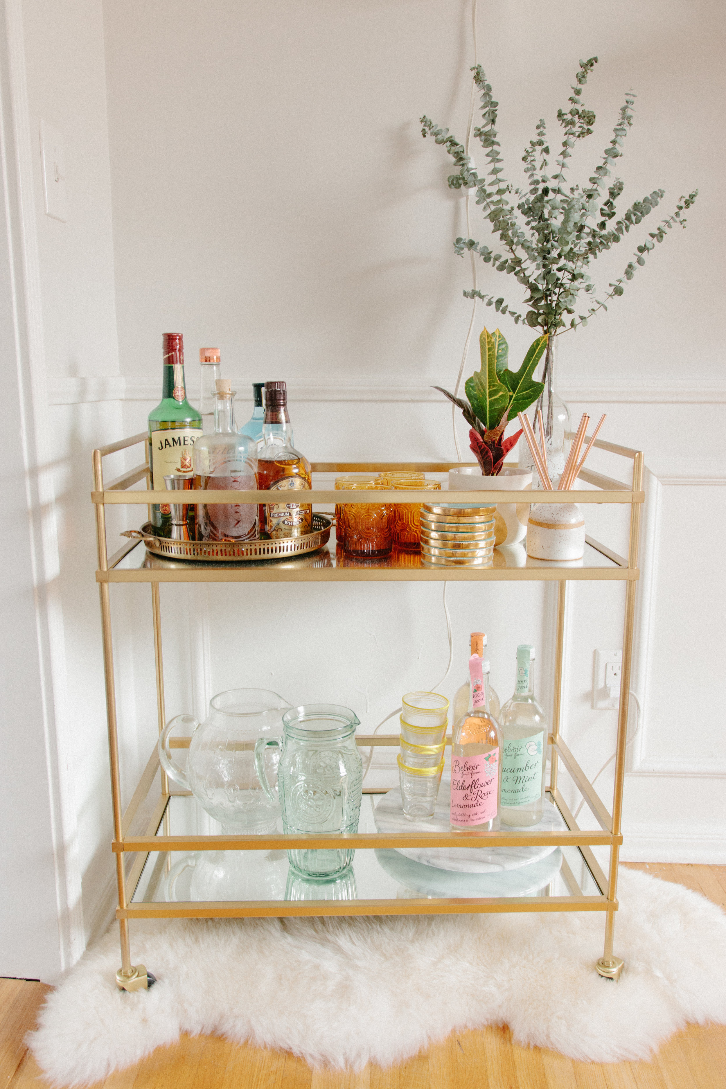
I style our home based on the seasons, changing the color of our bedding and the centerpiece of our dining room table. I’ve had people comment on my Instagram pictures saying it looks like an LA winter. I have only ever lived in LA, and I hadn’t realized the influence the city had on me until I started following other interior accounts from across the nation. I have a lot of plants and cactus that require heat and bright light, and I decorate with a lot of warm colors and I throw eucalyptus pretty much everywhere.
IMG_4180 2.JPG
IMG_2777.JPG
IMG_4183 2.JPG
I want our home to feel comfortable. Every piece of furniture was purchased based on comfort. Our couch is a dream for binge watching the latest Netflix show and our bed is my sanctuary. I have layers of pillow tops and the most comfortable linen bedding. Our bed is always the thing I miss the most when we travel. It’s also important to me that our home represents us. I want people to walk in and know immediately that this is our home. They see my husband’s collection of DVDs and the art we brought back from our travels and know this is our home; they know our interests.
ACS_0385.JPG
ACS_0386.JPG
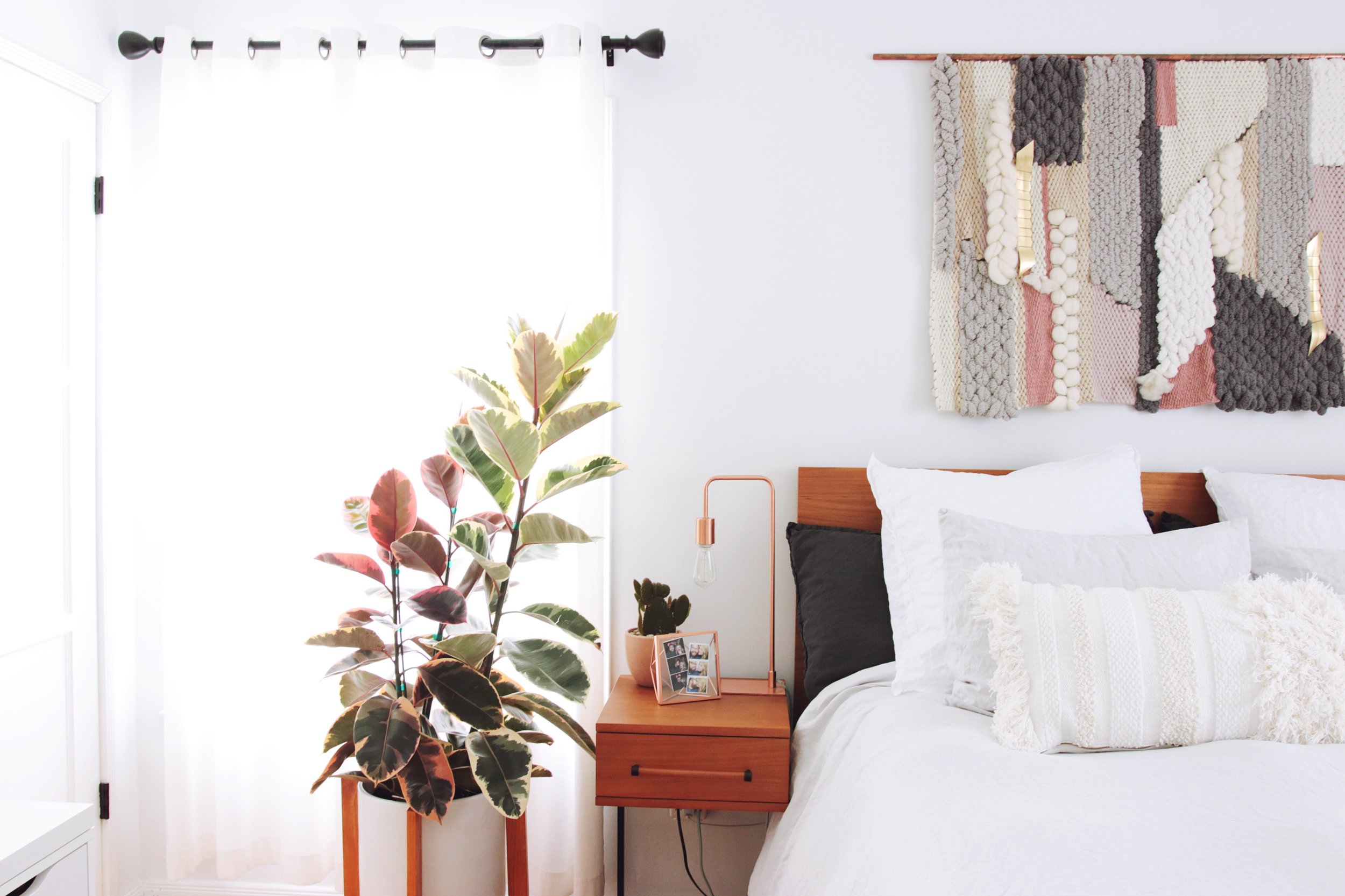
In our bedroom, the weaving over our bed is by far my favorite piece. I commissioned this from Erin of Sunwoven right when we moved in to our place. It dictates everything I bring into our room. I love the texture, the pop of gold, the copper rod; everything about it makes me happy.

(For those interested, check out Erin's work @sunwoven!)

ACS_0388.JPG
ACS_0389.JPG

We all have different items or pieces we prize in our homes, and the best to create a loving and welcoming home is to focus on those.

What's the prize for Ashley?

Anything custom by a talented creator. Those are the pieces I will cherish and bring with me to future homes.

Ashley, thank you so much for the tour! Follow Ashley on Instagram @ashleyhosmer for more!

McKenna Sig.jpg

Reader Design: Gemma's Artsy Home

Today, we're off to visit Gemma's bright and fresh home; this Boston place boasts a ton of quirky prints, color and texture, tons of natural light, and some seriously amazing art. Ready for the tour? 

IMG_20180130_144210-01-01.jpeg
IMG_20180105_132407-01-01.jpeg
IMG_20180130_135701-01.jpeg

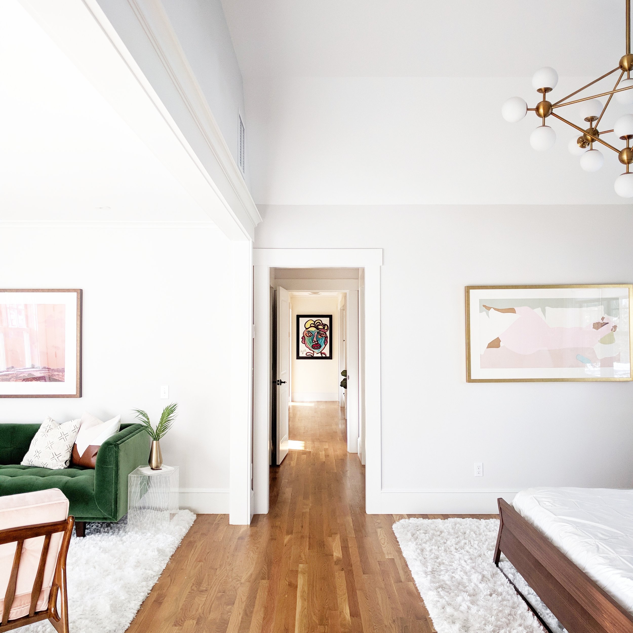
Even the entry way smacks you with style right away! From the design extraordinaire herself:

I have a hard time defining or labeling my own design style in my home; it’s more of a feeling. I definitely have certain shapes that I prefer; for example, I always pick furniture with clean simple lines, and art tends to be the same way. I prefer minimal designs, and I don’t like anything ornate which is probably why I’m attracted to mid century furniture pieces. By sticking with fairly simple shapes, it gives me a lot of room to decorate with other aspects like color, wallpaper, art, and lighting.
IMG_20171106_111700-01-01.jpeg
IMG_20171111_131552-01-01.jpeg

Each room uses that basic formula - simple, clean furniture + geometric shapes + interesting accents - and just knocks it out of the park. The use of natural elements like wood also helps each space feel incredibly balanced. 

One of my major design goals is to have the house be interesting and inviting but not cluttered. Some areas have really bold wallpapers, but I try to keep all the other elements very simple so as not to overwhelm the room.
IMG_20171231_084904-01-01.jpeg
 
IMG_20180226_112916-01.jpeg
 
IMG_20180208_132224-01.jpeg

Even the mudroom gives a major statement!

My mudroom is a good example of an over the top wall covering, balanced by very little else in the space - necessities only. But that said, the house is comfortable. We have 3 little boys and they play all over and do what little kids do, so storage is a must. Every cabinet in our family room is packed with games, toys, legos, and stuffed animals so that they can easily access stuff they want to play with, but also put it away again.
IMG_20180219_141924-01-01.jpeg
IMG_20180319_115636-01-01.jpeg
IMG_20180101_131234-01.jpeg

One of the key ways Gemma adds interest is art.

My favorite design elements in our house are our pieces of art. Looking at beautiful artwork gives me such genuine pleasure and an emotional connection. We’ve collected our art from all over the place from varying sources, and the pieces are all very different. Many are one of a kind items we’ve found in vintage stores, others are from estate sales, and others are from galleries. Art is the one place we are willing to splurge.
 
IMG_20171114_091903_688.jpg
 

In the bathroom, the star of the show (other than that tub...wow!) is the iconic Slim Aarons Palm Springs photograph (he's a personal favorite of mine). 

Two other ways to add detail? 

Lighting is another great way to express yourself; it can be a forgotten element yet can bring so much interest into a room. And a personal favorite of mine, books - I read a ton and I love holding and having books. My next project in fact involves some serious shelving to house all of our books that are currently homeless!
IMG_20170828_161315-01.jpeg

This house has to be one of the most original ones I've seen in a while. What a place to raise and spend time with your family!

Gemma, thank you so much for the tour.  Follow Gemma along on Instagram @gemmavanderswaagh for more! 

McKenna Sig.jpg