Design Reveal: Family Home for Life to Happen

Well hello there! It is such a treat to get to share this home with you today - I got to work with the sweetest of friends and realized very quickly how kindred we are. After nearly a decade in their home, they came to the decision to stay put and continue investing in the roots they’ve sewn in their neighborhood and community. It’s a very similar story to what led Matt and I to add on to our home last year after 13 years in our house. Life is beautiful when we open ourselves up to the possibilities God has for us; I can think of no greater adventure!

My first reaction during the initial walk through was how heavy the home felt. The dark neutrals with very little contrast just made their main floor feel weighty. They desired something lighter, airier, and more conducive for their love of gathering friends and family.

Family Room

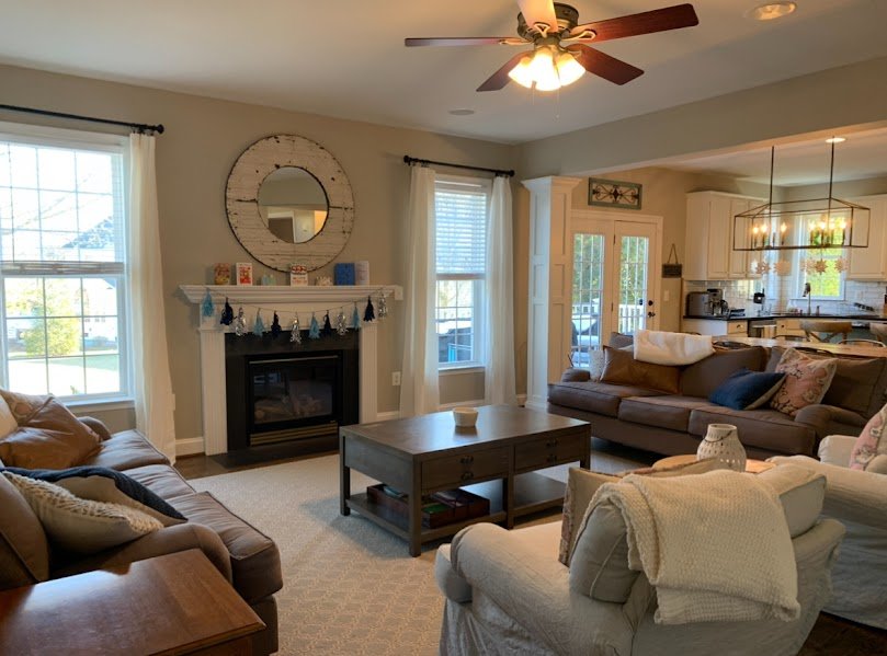
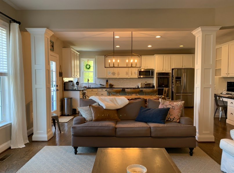
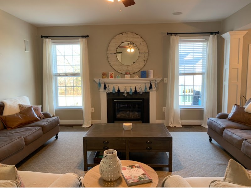
When all the elements in a home are of similar color and saturation, everything melds together and can look heavy. One of the biggest things we did was paint! Getting the walls a fresh, clean white allowed the colors we used throughout to really stand out!

Not the first fireplace I’ve re-imagined without a total overhaul. The ornate mantle was removed and replaced with gorgeous wood, and the ‘fluted’ sides were covered with a quarter strip of drywall and painted.

These clients gravitated toward a somewhat coastal color palette, specifically teal, coral, blush, mustard. To anchor this palette, the area rug makes for a vibrant element in the room that allows a lot of flexibility in branching off with surrounding textile colors.

I’ve really never gravitated to heavily filled mantles, but do enjoy using interesting pieces and balancing the visual weight!

While this family room really feels light and airy, using a variety of textures, materials and wood tones makes it feel so warm and inviting! Mixing pieces lends to such a casual vibe and I love the contrast among the main players in here.

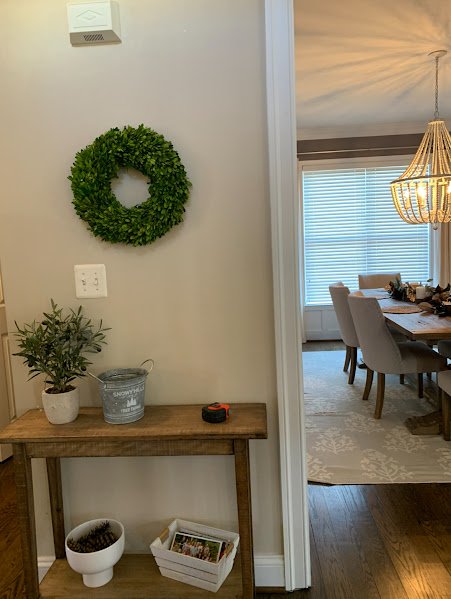
Ready to see the pink dining room peeking around the corner?

Dining Room

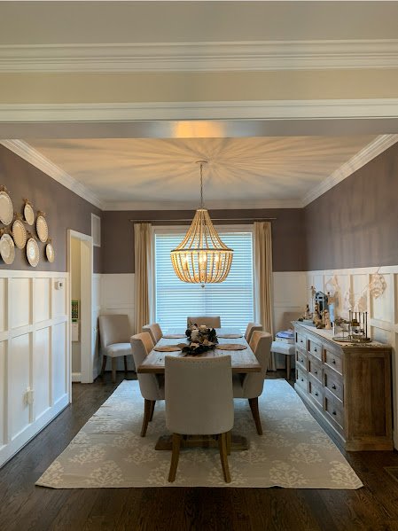
The paint alone completely transformed this space. I mean, I feel that way with the entire home, but in here it’s incredible the difference! I chose the paint color first, fully recognizing what a massive risk it might be to recommend pink. But it totally works! It’s definitely unexpected and fun. We’re not taking ourselves too seriously here, which I just love.

Living Room

In this space I essentially wanted to swap the color on the wall for color in the furnishing! As you see this room right off the front entrance, using a stunning, but neutral wallpaper, with a vibrant teal velvet sofa and rich leather ottoman couldn’t be a better mix to draw you deeper into this home!

That’s a wrap! I always feel sentimental when a project is completely finished, but my motto over the years has become ‘a finished room is a new beginning’. My part is done, and now these rooms are ready for life to happen in all its wild and beautiful forms. Thank you so very much for coming by to check this project out! I’m grateful for you.
SMH in NYC: eDesign Project Update

Today’s the day for more PROGRESS!! I told you friends last week I wanted to start sharing and celebrating design project progress with you more often on here, so here we go again!

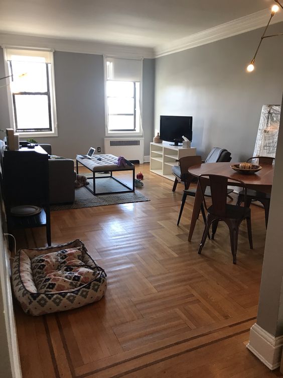
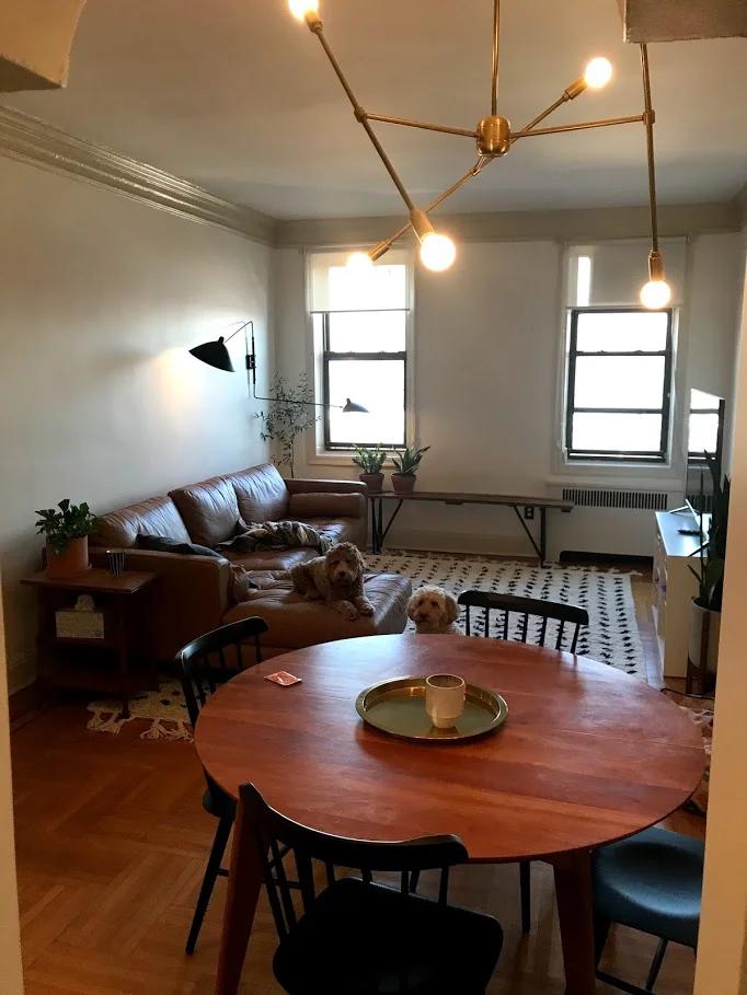
This apartment is in NYC right by Prospect Park. I can’t tell you how much I adore these clients, (and their sweet pup, who you’ll see with her friend in some of the pics)! When they gave me the initial walk through via video chat, it was love at first sight. Those arches, those windows, that molding, the floor! It’s different architecture than I’ve ever had the privilege of designing within before, so I was excited about that from the get-go. Take a look at these ‘befores’, (all photos in this post were taken by the client)!

BEFORE

d19662abb9a0f23ee8d3284c4fca7c1b.jpg
c12de709487ca9924ca7a340bbc513de.jpg
0764d5fdab278dc01bd5bd3602d24379.jpg

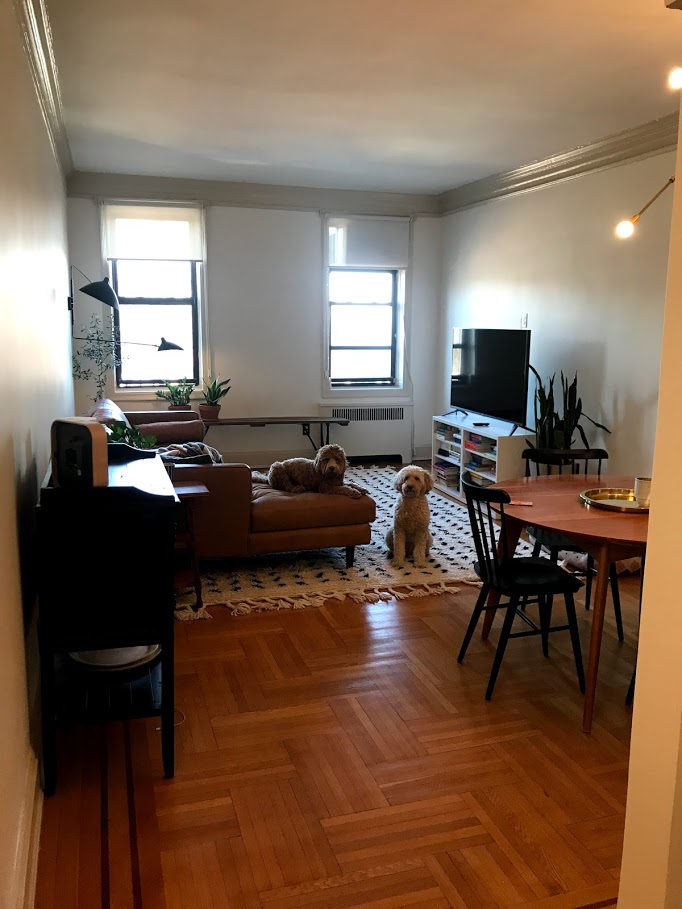
This is actually a 4-room project: Entryway, Living Room/Dining Room, Office and Master Bedroom. This fun couple has traveled quite a bit and accumulated a collection of artifacts and pieces from around the globe. They expressed interest in doing some unique things in their home which I was really excited about! It’s always fun to work with others who have a vision and enjoy wandering off the beaten path a bit, stylistically. The trim was one of the first elements we discussed as an opportunity to do something a little different! I chose Swiss Coffee for the walls, (a StyleMutt Home favorite), and Clay Beige for the trim, (both by Benjamin Moore).

I am going to wait to detail out here the pieces we’ve selected, but it’s getting there! Now the space is ready for the next phase of it’s makeover - built-ins! I’ve been in touch with their contractor working on a built-in shelving design that will work with the structure of these walls. The TV will sit in the middle of the shelves and we’ll have hidden storage cabinets under the shelves…I absolutely cannot wait, it’s going to look SO GOOD!

PROGRESS

Hi, Nala and pal! Those faces…

Hi, Nala and pal! Those faces…

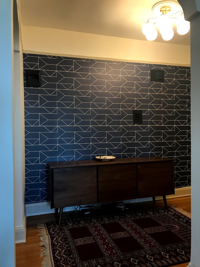
The hallway was papered by the previous owners, and while the idea was splendid, the paper was not making any particular statement, (it was white and had a grayish swirl pattern on it). We loved the idea of something really bold that you’d see beyond the living and dining area, and this navy geometric does not disappoint. In a home that does not have an open floor plan whatsoever, one way to expand the size of any room is to draw the eye beyond the walls of the space. The images below are a perfect example of this!

IMG_9813.jpg
IMG_9794.jpg
IMG_9791.jpg

We are working on selecting art, various rugs for the hallway and office, final details for the bedroom, and then we’ll have some shelves to style! We are using a very large triptych the client found from a street vendor in India over the sofa - oh my gosh, it’s going to be amazing.

IMG_9806.jpg

Here is the rendering we used to show them the vision - cool piece, huh!

Living Room Design Board.png

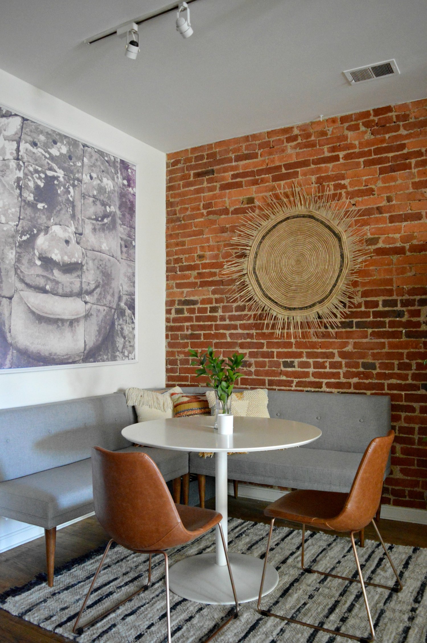
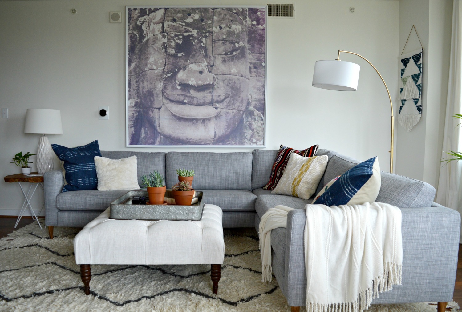
It reminds me a bit of when we used Ali’s Cambodian photograph over her own living room sofa, and then when she moved, over her dining nook banquette! I just adore large-scale pieces - especially when they have deep meaning to the client!

So we still have a ways to go, but this is some progress, isn’t it! The paint on the walls and trim is making me so ridiculously excited. I’ve never done white walls with beige trim before, and truth be told, there wasn’t a ton of inspo I could find as an example, But it just felt so right for this home and now seeing these progress shots they sent is giving me so much encouraging confirmation. I’m in love! It’s sophisticated and subtly dramatic - the perfect canvas for a home to a couple of globe trotters.

IMG_9816.jpg

We are in cahoots over here on the finishing details for this beautiful home, and I am busting to share everything with you here and now….but I’ll refrain. Gotta save some surprises! Just wanted to share this exciting project in the works now because it’s making me too giddy to keep to myself any longer! I can’t wait to visit NYC soon to hug these fabulous clients and take all the fun pictures to share the final reveal with you! It’s going to be a good one, friends.

As always, I’m so grateful to you for coming by today!

eDesign Reveal: A Fresh Start & Our Biggest Reveal Yet

Hello, sweet friends! This is a special reveal and one that’s been close to my heart for quite some time. Last April during my kids’ Spring Break I read through Chip Gaines’ book, Capital Gaines. It’s an all-around motivating, get-it-done read, but the thing that stuck with me the most was the encouragement to bet on yourself. And it got me thinking that one person betting on their own selves can’t possibly have the same power as people betting on one another. I started mulling over the idea of looking for a design job to do for peanuts for someone in need. I wanted to give someone that oomph to keep on keeping on, even if just through the simple act of improving the way they feel at home. One month later in May, we were contacted by an amazing woman who was at a point of reinvesting in her life. Gods timing astounds me.

I think most all of us can attest that life doesn’t always, (or usually!), go as expected, and this woman had just been pitched a curve ball. With two young children in toe she was starting fresh with a new home, an old sofa, and a very happy fiddle leaf fig tree. The thing that just overwhelmed me with emotion while speaking with her was the fact that she wanted to make the most of this next chapter. It was apparent that there hadn’t been joy in her home for quite some time, and that’s what she wanted to bring back. ‘Happy’ was a frequent word that came up when discussing the vision and design of her home.

So with a strict $5,000 budget, I waved more than half of my design fee and cracked down on tackling her Family Room, Dining Room, Kitchen and Living Room. And this reveal may be one of our happiest yet! :)

DSC_0406.JPG

BEFORE

b4.jpg
DSC_0397.JPG

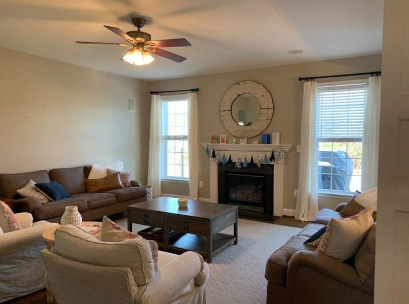
The first order of business was rotating that sofa and pushing it against the wall! This family room space is shared with the children in a big way, and the original placement of the sectional floating in the middle of the floor just made it too chopped up and separated. Also, PSA: With $40 and an 8 minute YouTube video, you, too, can update your overhead lighting.

b3.jpg
DSC_0435.JPG
DSC_0400.JPG
DSC_0439.JPG
b1.jpg

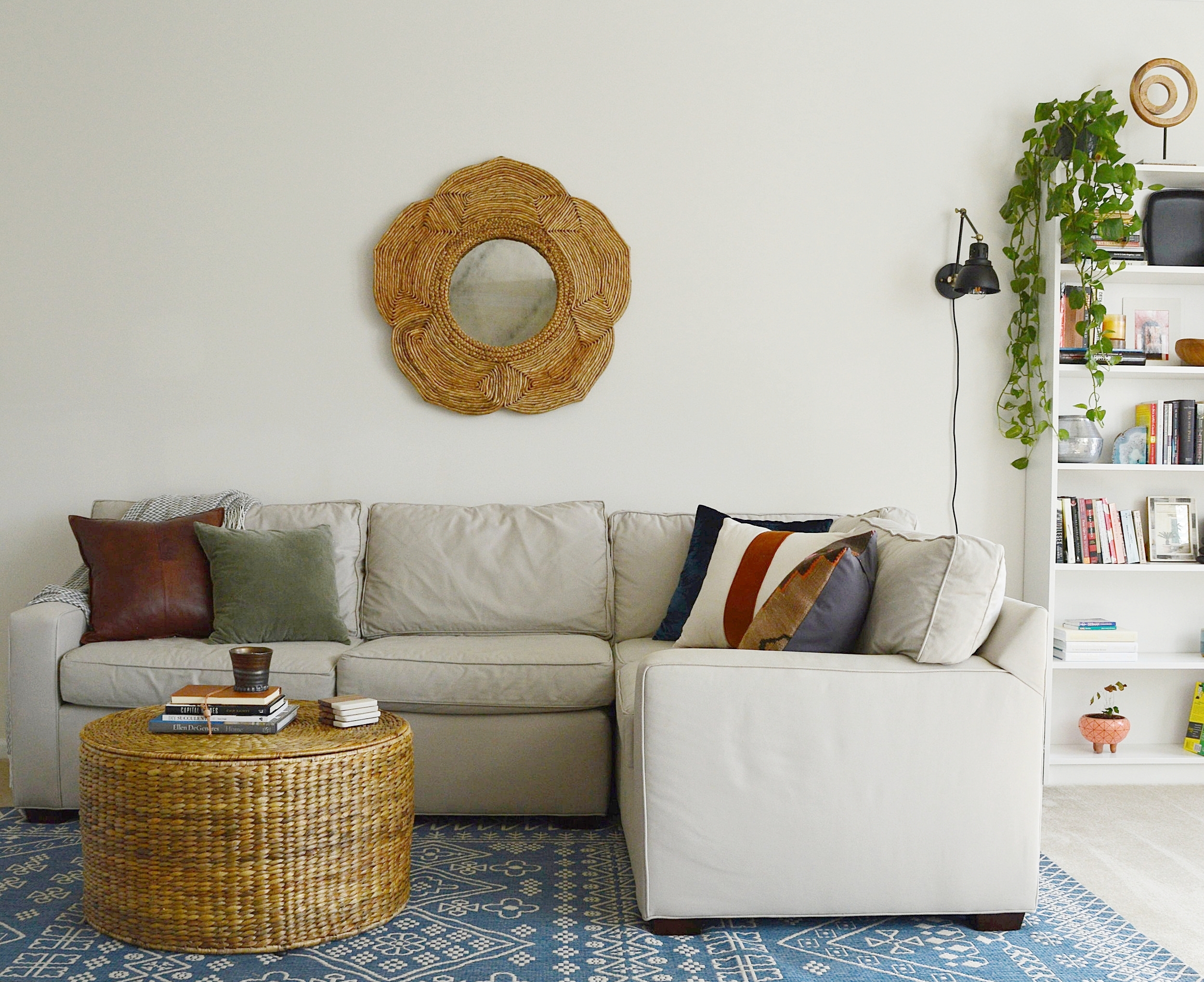
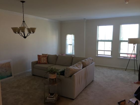
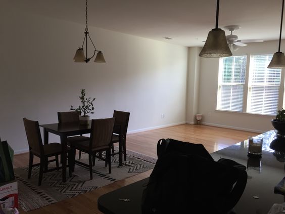
So. Much. Beige. With an emphasis on creating an environment that feels happy, color was top priority. The catch, however, was that because this is a rental, the wall color and carpet could not be updated. And because the client requested to use her sofa, (a smart move that allowed her to put her budget in SO MANY other places), that was another shade of beige to overcome.

DSC_0407.JPG
DSC_0409.JPG

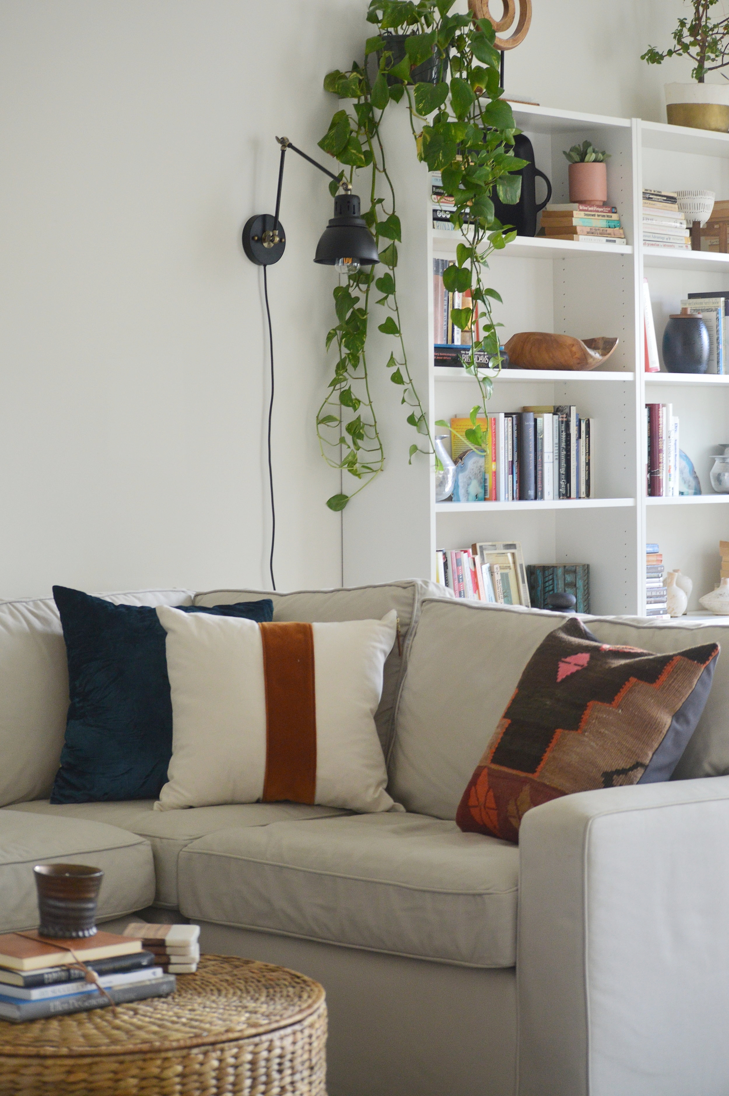
Picking pillows and accent pieces for this space was an absolute blast. With a bland canvas to work with the sky really was the limit, so I had to uncover what palette spoke to my client best. She is extremely inspired and rejuvenated by the coast, but I didn’t want to do anything too literal. Creating a relaxing vibe with pops of vibrant color was the way to go. Blue is a favorite color of hers so I peppered it around subtly.

DSC_0415.JPG
DSC_0427.JPG
DSC_0434.JPG
b2.jpg

Ah, yes - the wall mounted Ikea IVAR cabinets. This is the third design since last Spring that we used wall mounted IKEA cabinets to create a custom, clean-lined storage option, (see here and here). You can always add hardware, legs, etc to these to blend them into your own space, but my favorite way to use them is to mount them over the floor 6-8” and give them a fresh coat of paint, (they come in wood). And at just $80 per set of cabinets, that means this massive custom media storage unit cost just $240 + cheap paint.

DSC_0402.JPG

There wasn’t much to do in the kitchen but change out the pendants and add some stools - leather for the win!

DSC_0446.JPG
b5.jpg

More beige! For the particular vision and feel this client wanted, I knew the dark matching dining set had to go. A new mix of pieces pieced together from various retailers creates a one-of-a-kind dining set for the family. The first item we decided on was that rug - even prettier in person if you can believe it!

DSC_0448.JPG
b8.jpg
DSC_0453.JPG
DSC_0454.JPG
DSC_0499.JPG
b7.jpg

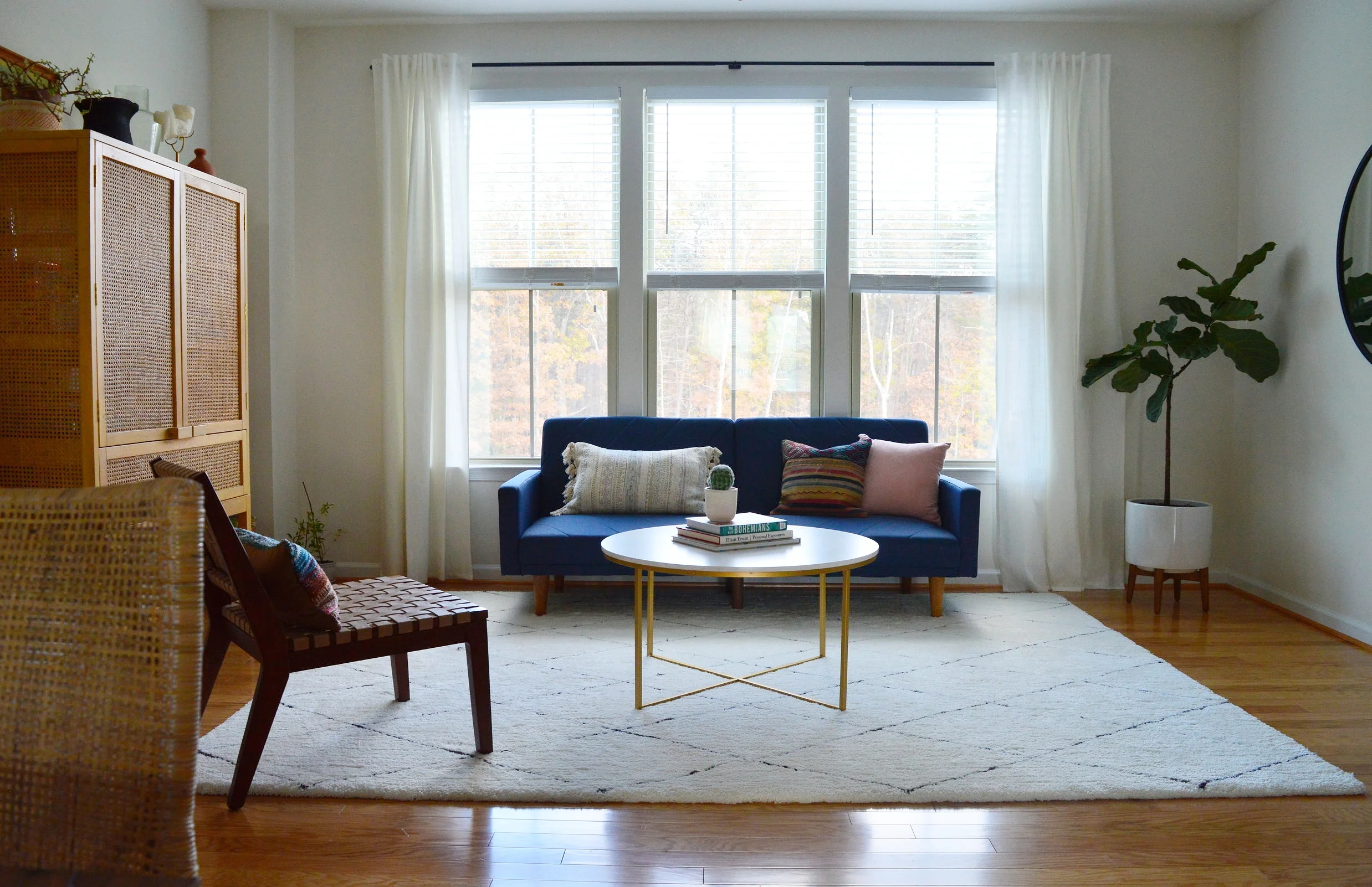
This cheery space feels special to me - the colors echo the rest of the home but there’s something about it that makes it feel set apart. It’s grown up but fun, simple but interesting, stunning but functional, (the cabinet is packed with board games)! I have never ever used a sofa in that color before but my gut was pulling for it and I was excited to fill in around it with some contrasting tones - even moodier rich and earth colors!

DSC_0459.JPG

I think the vibrancy of the sofa just adds some sophisticated drama here when surrounded by earthier tones and textures.

DSC_0456.JPG
DSC_0465.JPG

Anchoring one whole side of the room by itself is one of my favorite go-tos; an oversized black framed mirror. Not right for every home, but right for this one in this place. It’s a beast in person, and emphasizes the drama of this room.

DSC_0476.JPG
DSC_0484.JPG
DSC_0482.JPG

Well that’s a wrap! The first thing this sweet client told me when I sent her a sample of these photos was that she can’t believe this is her home and can’t wait to start on her bedroom together in the new year. I can’t wait, either!!!

You all have a wonderful Thanksgiving! It’s a treat every time I have an opportunity to jump on here and share something with you. You make this landing place so much fun and it brings me joy to get to bring finished projects here to show you. So thank you for taking the time out of your day to stop by - it really touches our hearts!
Chelesa.jpg