Living Room Feature Wall Makeover

I’m never short on ideas for our 1980s partial split level, it’s true. But they go through a rigorous filtering system, I promise! Step one: Tell Matt the idea. Ha! Over our 9+ years as homeowners, I’d say we’ve become a pretty good design team! Never thought I’d be saying that, but Matt's background and interest in basic construction has rounded out to a really creative eye as well. It’s been a lot of fun seeing this side of him come out, and I genuinely trust and depend on his opinion.

So in January of this year when I tossed out the idea of doing an electric fireplace on the main wall of our living room, I trusted it would take him some time to mull it over. Which I was prepared for! I had created a digital design of what it would look like in our space and had gathered some inspiration to get the creative juices flowing. But first, let’s take a look at what our living room looked like at the beginning of the year!

4.jpg

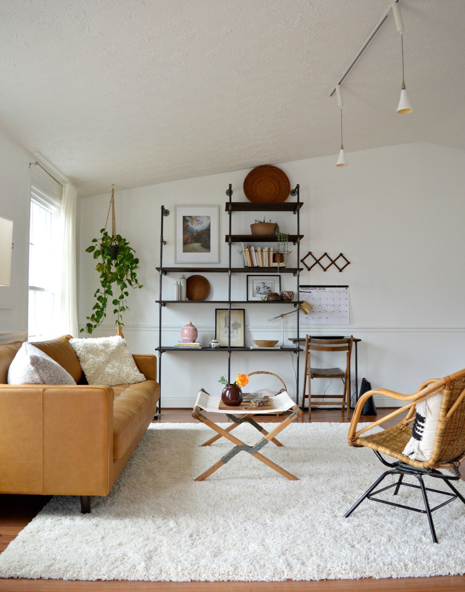
The industrial pipe shelves were one of our favorite DIY projects together, (how-to here!), but after we did our kitchen renovation last Fall, there were a lot of industrial elements in the space and these were easily the heaviest. I really love these shelves, but I have grown a strong appreciation for design that suits the space, and our home just doesn’t have that kind of industrial vibe. I love that style, personally, but I need to be careful with how to implement it. SO, I sold these at the end of the summer and made room for a new wall feature!

5.jpg
6.jpg

There were a lot of images that inspired our plan, but I narrowed down to share my top three. We will be incorporating elements of each of these in our final design!

1.jpg

This image by Carol Estes won me over the first time I laid eyes on it. The ‘nook’ created by the fireplace bump-out and the adjacent wall is the perfect size for built-in shelves. Our plan includes a similar sized nook which we will run the full length up with shelves. Carol is one of my favorite designers to follow on instagram! Her spaces are earthy but interesting, and she always peppers in some details that are unique, like the dark painted wall behind these shelves! You can follow Carol here!

2.jpg

This is the tutorial we are following almost precisely for our surround! When Erin from Kismet House shared that they built a surround for their electric fireplace, I completely hung up my idea of doing a real fireplace in favor of this maintenance-free, less invasive option for our particular home. Her tutorial is here and we followed the shopping list and step-by-step almost exactly. We have a vaulted ceiling, so our measurements and cuts were a little different, but you get the idea!

3.jpg

Amber Lewis is my absolute favorite interior designer. I have been so inspired by her story of starting from scratch, (college dropout), and hustling hard to grow her business. Her style is laid back but full of interesting pieces. This image inspired a little built-in bench we’ll be doing on the other side of our surround. We need storage on our main floor so ours will have a flip up lid, like a piano bench. You can follow Amber on Instagram here!

So our plan is a mix of other peoples designs. This is what I created and showed Matt, and what we are attempting to build! Thankfully, we have a very talented friend helping us out so it shouldn’t be too far from this when all is said and done!

70018 (2).jpg

Thank you so much for stopping by! Come back soon for the final reveal!
Chelesa.jpg

Reader Design: Adam's Charming Tudor

Today, we're off to visit a historic 1940's Tudor home in Knoxville, Tennessee. It's the loving project of Adam, a photographer, and his wife Amber and, as their first home together, is a major labor of love. 

With such a labor of love, Adam & Amber are taking their sweet time with this place, making sure things are done right the first time in a way that feels true to them and is true to the character of the home.

We have tried to spread our design process out over a longer period of time to allow us to wrestle with the overall design of the space, trends, and what the space actually needs. Our philosophy throughout the process has been to try our very best not to cut corners. I am a firm believer that you get what you pay for, and we really attempted to do it right the first time. Obviously, we have been blessed to be able to do this, and it has often meant waiting on certain purchases.


They started the process with a focus on what they were trying to achieve. Is it a specific look? Mastery of a certain trend? Or something more elusive - a feeling, perhaps? For Adam & Amber, that was it. They wanted to their home to feel joyful, calm, and captivating. 

The journey to capture those feelings also guided their style decisions. 

We do not concern ourselves with following one particular style, outside of trying to integrate the design in a seamless way with the architectural bones of the house. In our home, you will see elements of mid-century, Scandinavian, traditional, minimal, etc.


Adams & Amber composed their home piece-by-piece. In the dining room, they started with a custom, handmade table from Vermont Farm Table. 

It is perfectly proportioned, has such clean lines, and feels modern and timeless all at the same time. We wanted a table that would age well over time and become a family staple. The finish Vermont Farm Table uses strives to highlight the natural beauty of the wood and stand the test of time.

In the bedroom, they proudly display two of their favorite belongings. 

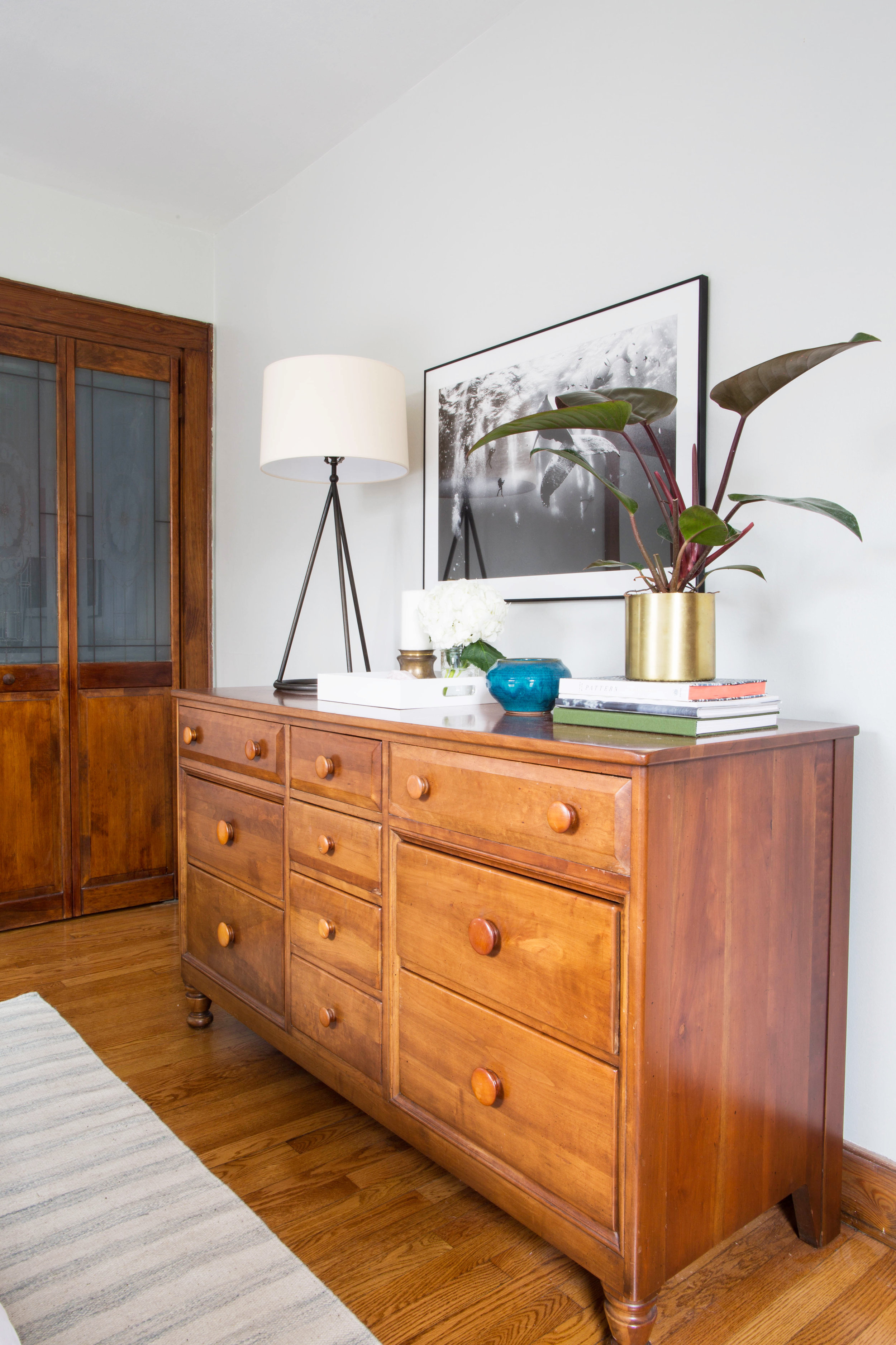
The first is our midcentury dresser, which belonged to my wife’s great-grandparents. It fits so seamlessly with the aesthetic of the rest of the room without being too matchy-matchy while also adding some extra soul. My wife remembers pulling clothes and jewelry from the piece to dress up in when she was young, and we often talk about how fun it is to think of her great-grandparents using the piece each day when they were young so many years ago.

My second favorite piece in our bedroom is our print above the dresser by Anjuar Patjane. The photo actually won the National Geographic Travel Photo Contest a few years back and captivated us so much that we new instantly we would integrate it some day into our home. We often find ourselves staring at it mesmerized.

I simply adore everything about this home and the method by which it was created - lovingly, carefully, and slowly over time, as if it were mirroring the process used almost 80 years ago to build it in the first place. 

I also adore these parting words of wisdom from Adam.

It is so easy in the age of Instagram and Pinterest to be overly critical of your work, which we find ourselves guilty of from time to time. While it is hard to know what the future will hold, we see ourselves staying in our home for a long period of time. Therefore, we try to not worry too much about what others would do, but instead choose what fits us the best as a young family.

Thank you so much for letting us in. And if all you mutts are feeling the same way I do, RUN to follow Adam along on Instagram @azford. 

Next week, I'm off for my jet set across the pond, so we'll see you in two weeks for more reader designs! 

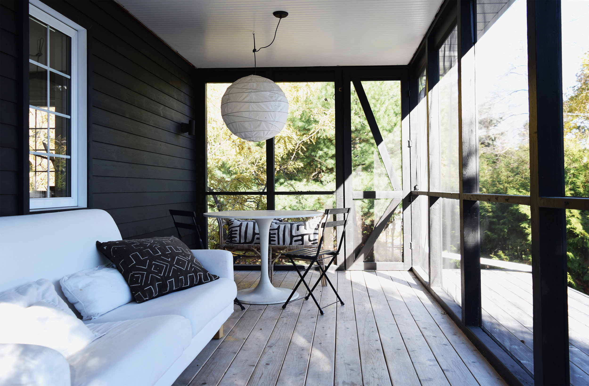
Reader Design: Johanne's Black & White Beauty

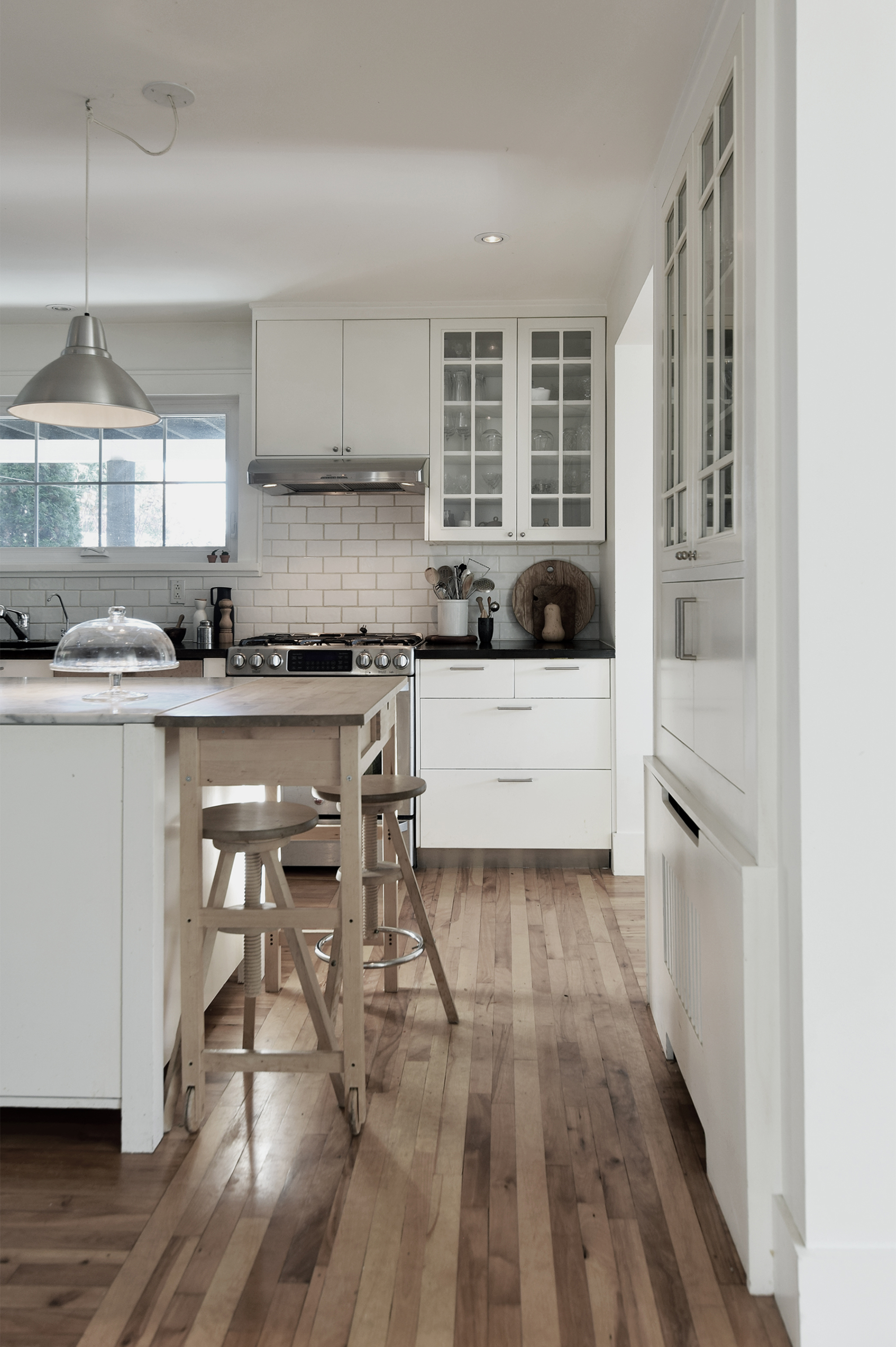
Today, we're off to Canada! Johanne, who is a professional interior designer, is welcoming us in to her Montreal home that she shares with her husband and two adult children. 

Johanne and her family moved in to this 1950's cottage 15 years ago. It sits outside Montreal in a town known for its stunning mountains and parks. Johanne doesn't use a lot of color, but that doesn't mean that her home is devoid of depth or emotion. Her neutral palette just bring other features to life - like the wood fireplace, used year-round, that Johanne calls "the best investment in the house." 

From Johanne:

Many things come into play when designing a house. The first thing I look at is the architecture. This cottage has very large windows, so our first move was to open up the space and take advantage of the ever-changing light and nature surrounding the house.

The second thing Johanne considers? Location. 

We live in a Nordic city, so I am very influence by Scandinavian design not only for its style but also for its way of life: simple, modern, warm, and practical. I love wood and try to use it as much as possible along with natural materials such as stone, straw, wool, and cotton.
Midcentury and Scandinavian furniture design offer modern furniture that blend well with many different styles. They are good quality and timeless which is always a good investment. I like to mix them with older pieces such as our tulip dining chairs with our rustic dining table, which we found in an old barn and have had for many years.

The third consideration is nature. Johanne seriously considered the world around her and took advantage of those influences in every way she could. 

Soothing grays, greens, and earth tones are always a good choice for me. Those are the colors I see when walking on the mountain, but they are also the colors I see when I go on the gorgeous beaches of Maine, USA, where I have spent every single vacation of my childhood and where we have taken our children as well since they were born.

I think we can all agree that Johanne has some incredible style. Thank you, Johanne, for letting us in and sharing your design influences with us. 

Learn more about Johanne on her website or follow along on Instagram