Hi, friends! Few things add as much pressure as taking on a custom order piece for friends or family. I've done quite a few special custom orders for those near and dear over the years and in the back of my mind I'm always thinking, "This is it. They're going to find out I'm a lying phony who's all talk and can't produce."
I know my loved ones aren't shallow people, but still. It's very humbling when friends/family invite me to tackle a piece for them and if it doesn't turn out to be everything they hoped and dreamed it can get, well, awkward. And nobody likes awkward. So I will do whatever it takes to avoid awkwardness and ensure hopes and dreams are fulfilled and that I can still go over to their homes and walk past pieces that have come from my garage and not have to look the other way and pretend it's not there. You follow?
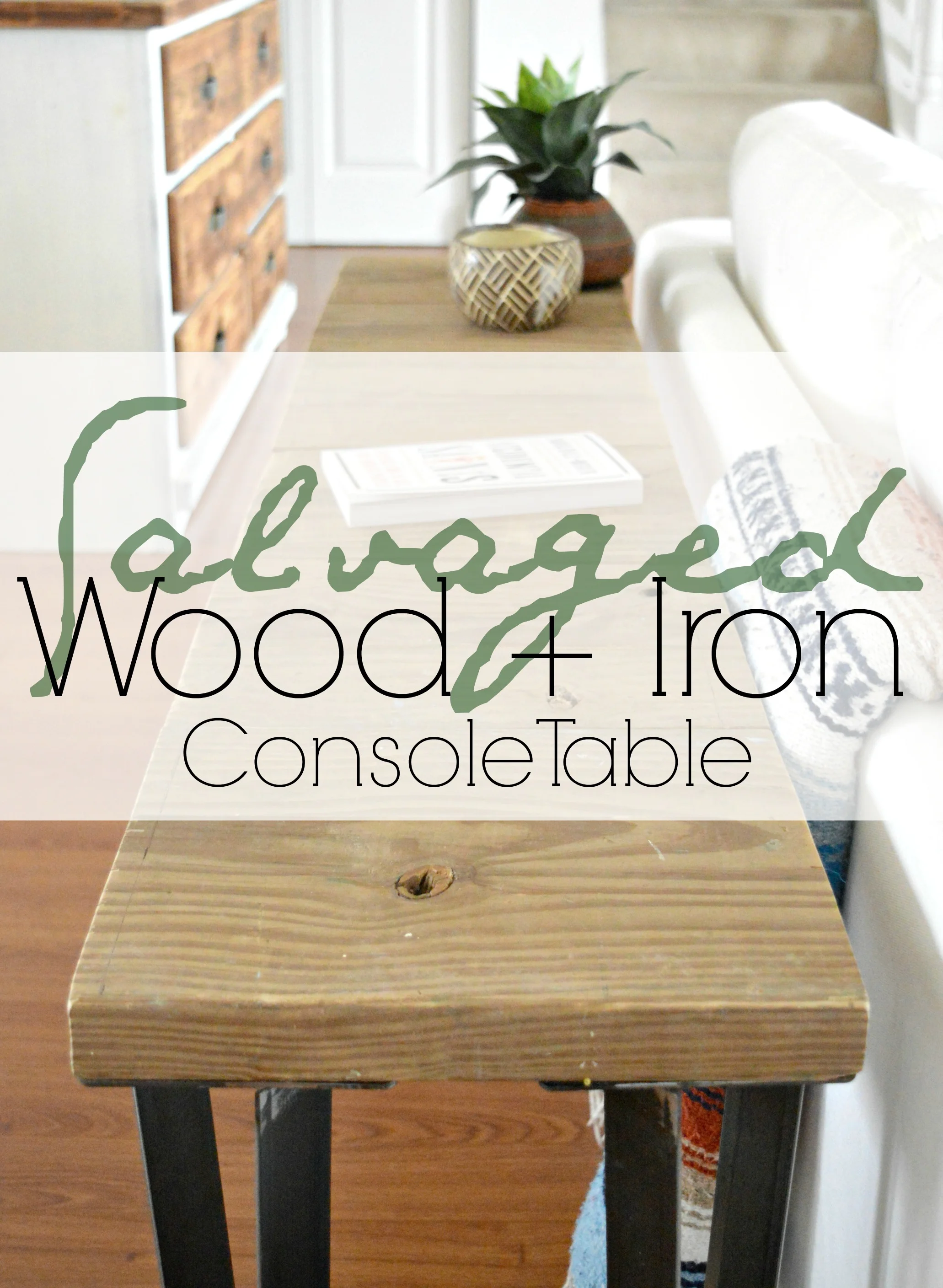
Our dear friends Morgan and Zach recently asked if I could make them a console table for their entry as a spot to toss keys, books, etc when they walk through the door. They're young and cool and like rustic decor with a dash of industrial and bit of clean lined modern. I was so excited to take on this piece for them and after finding the right pieces, this is what I came up with:
This piece was very easy to make once I had the right materials. You could make it, too! Here's what you'll need:
-1 x long piece of salvaged wood*, (mine was about 7-8 feet by 9" deep which I found at Community Forklift in Hyattsville, MD)
-1 x 4-5ft by 8" clean, solid wood board, (I used a scrap piece of poplar that was about a half inch thick)
-4 x 1.5 inch flat bar hairpin legs, (found here on eBay)
* Don't have a local source for awesome beat up wood? Here's a tutorial from Young House Love on distressing wood!
First thing I did was measured and marked every 12" on the long salvaged board and then Matt helped me make the cuts. With such a long, heavy piece, it was nice to have two pairs of hands, one to sturdy the piece while the other made the cuts. Safety, and all that. :)
Second, I lined the pieces up side by side on the floor so they were all even, then slapped some wood glue on and placed the clean piece of poplar on top. Then we screwed the clean board into each cut piece of salvaged wood.
Finally, with the table top done and upside down, I screwed the legs into each corner.
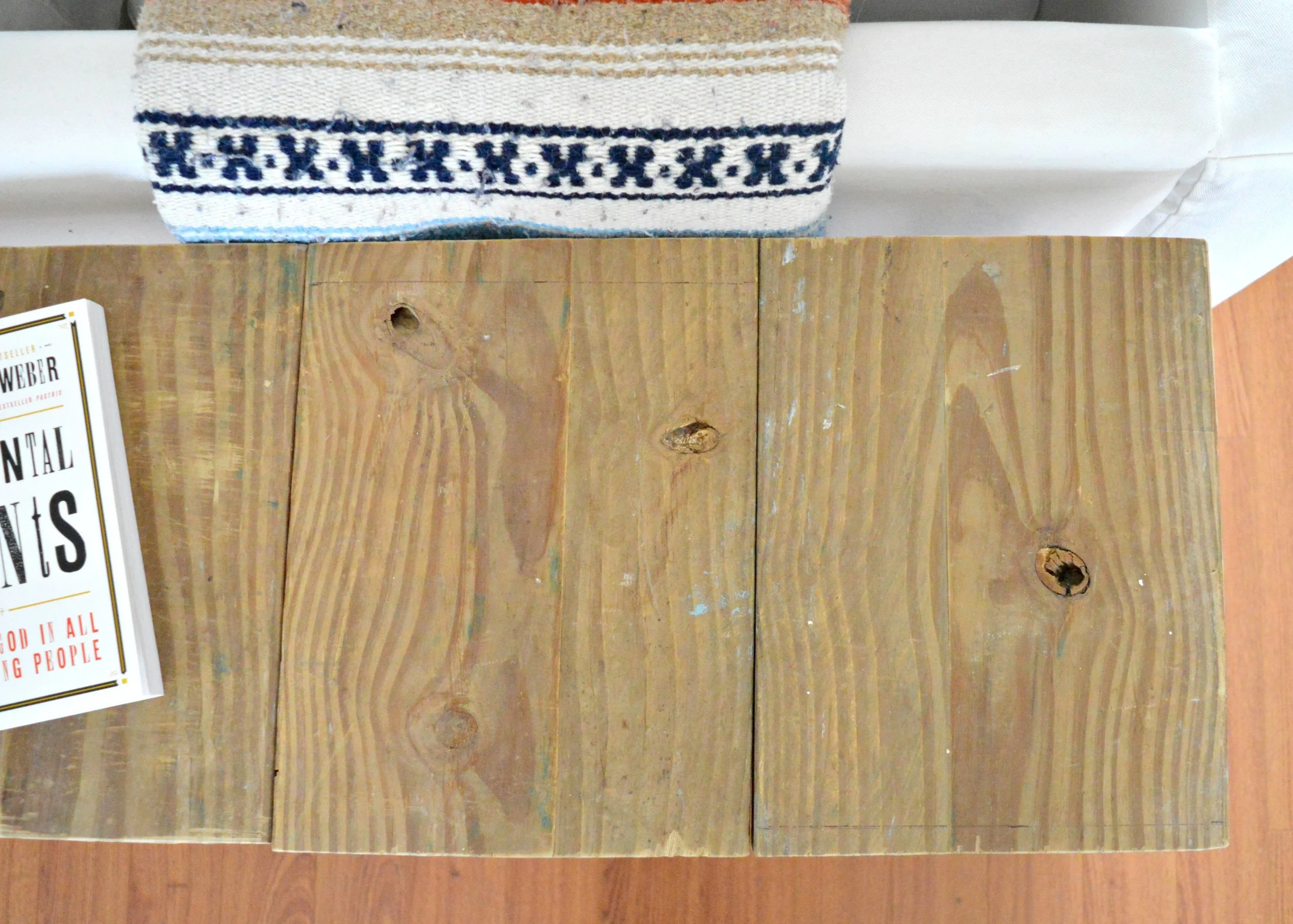
I love the texture and visual interest of taking a salvaged piece and chopping it up to make a slatted table!
The salvaged wood already had loads of character - beautiful grain, gnarly knots, splatters of faded paint from a previous life.
And one of natures' perfect art forms; the rings of the wood.
This piece was such a treat to get to create, especially for sweet friends. I hope you find the instructions easy to understand if you decide to make one of your own, but definitely don't hesitate to contact me at chelsea@stylemutthome.com if you have any questions!
Thank you so much for stopping by today!
