Hello and happy Thanksgiving week, friends! I sit here writing to you during a very soggy day when life outside seems to slow and quiet for a bit. In fact, if not for the pounding rain I likely wouldn’t have sat down to share this recent project! I so appreciate when God nudges me towards a slower day that I wouldn’t have necessarily chosen for myself. Taking the time to look over these images of work I was able to do this past year just reminds me how tethered creativity is to my Creator. I am grateful not only for this work but the passion that fuels it!
This project was attractive to me from the get-go. While the house was updated, there was charming evidence of it’s age still lingering around and I couldn’t wait to get rolling! The absolute perfect person for this home had recently bought it and as a first time home owner, wanted to invest in her new space well and thoughtfully. So we set out to work through her new home together, room by room. While each space is uniquely designed with it’s own palette, there is consistency in the depth of the colors. Sameness is not the only route to cohesion.
Let’s check it out!
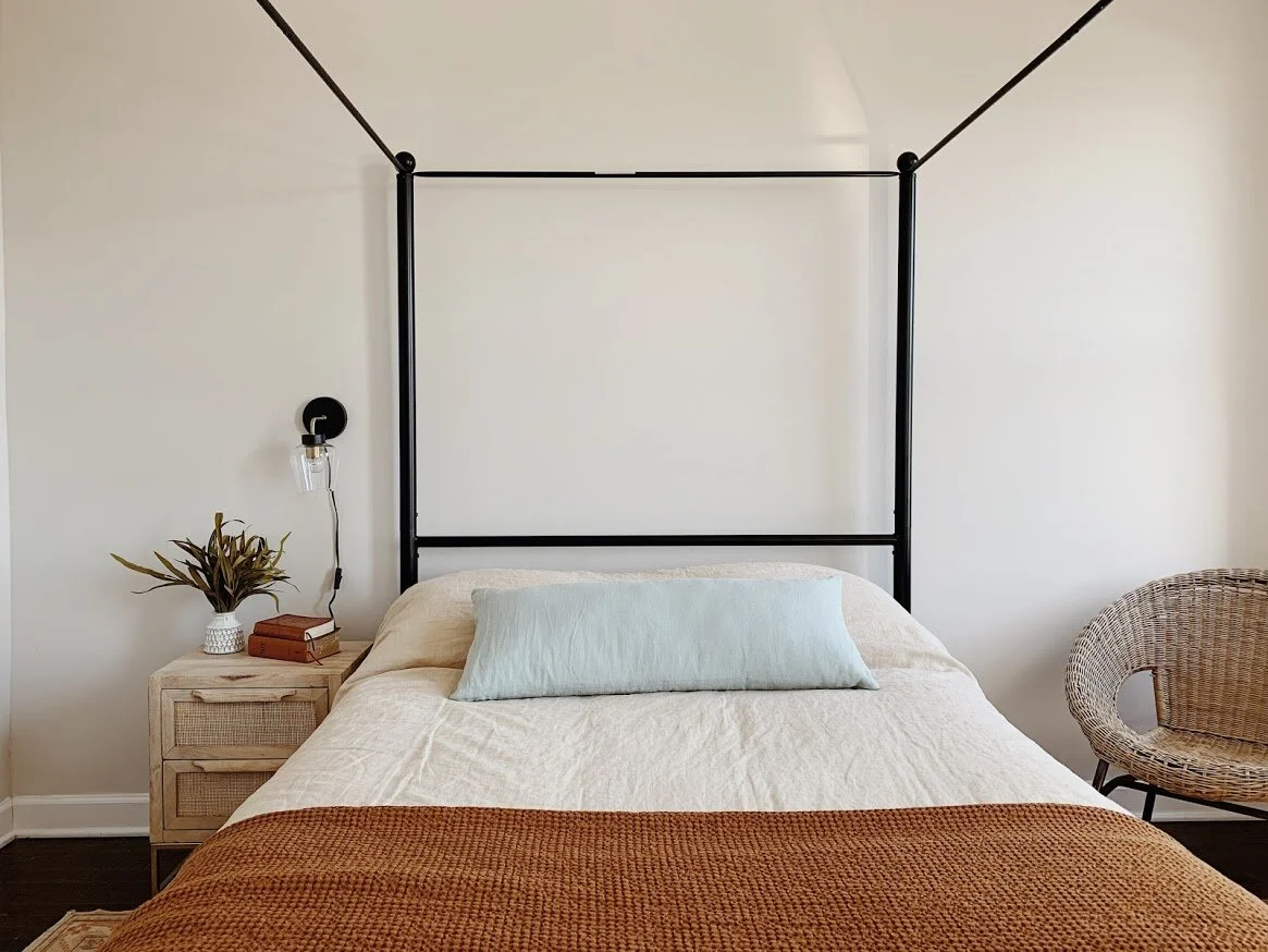
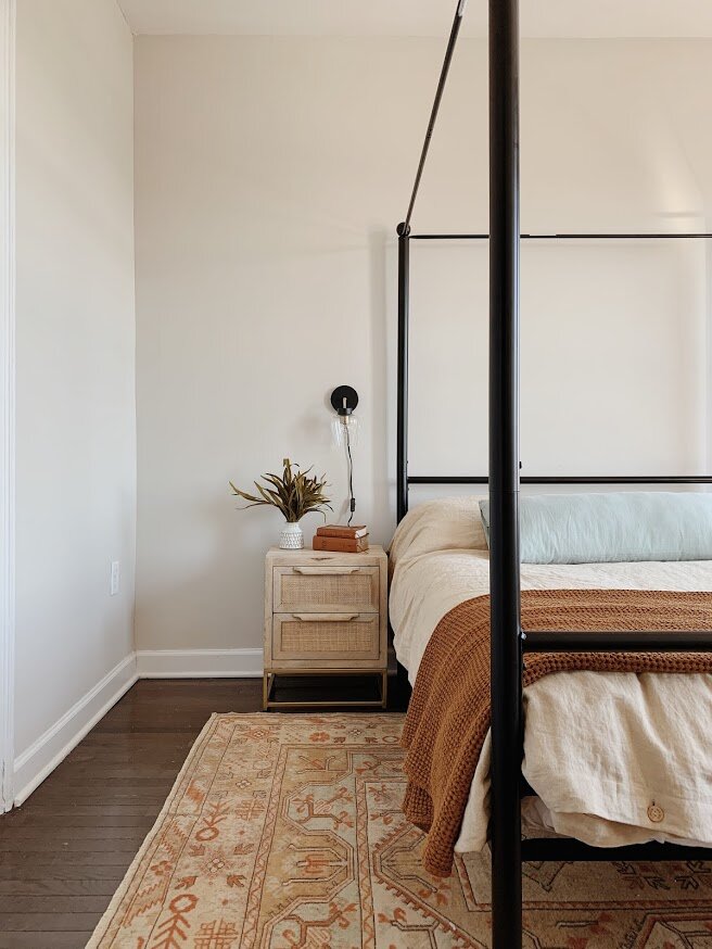
Master bedroom
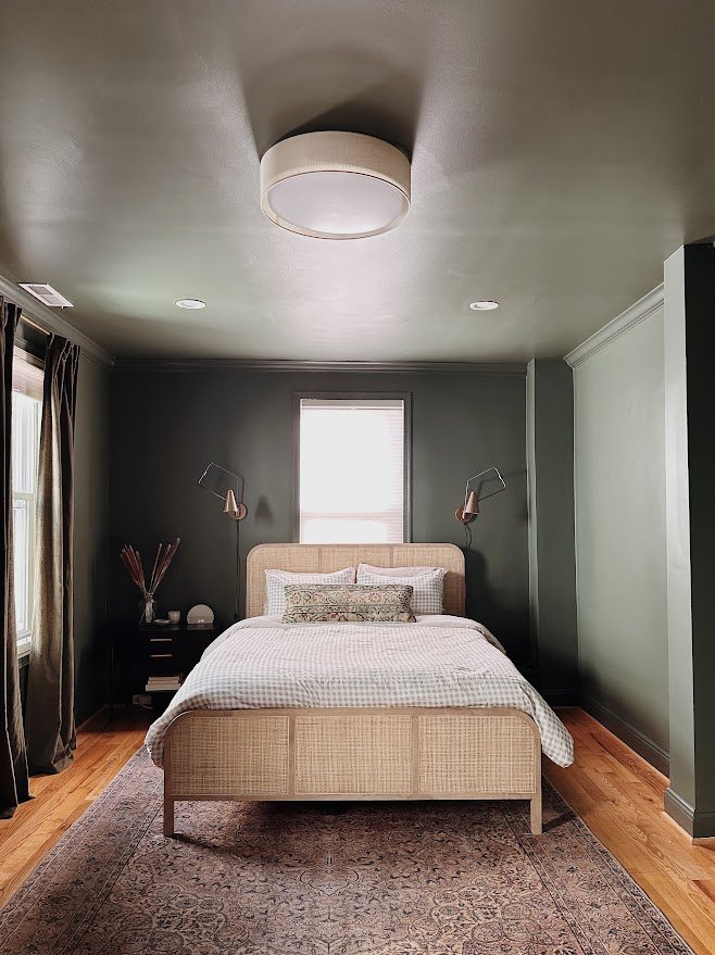
Deep green walls, ceiling and curtains - a sophisticated tone on tone display of moodiness contrasted by the white oak bed and neutral linens. I LOVE designing with contrast, and going dark on the walls and light elsewhere was really fun in here!

I had actually saved these lights long ago and then patiently waited for the right room to use them! Architectural elements are really attractive to me and I enjoy finding opportunities when they can enhance a space!
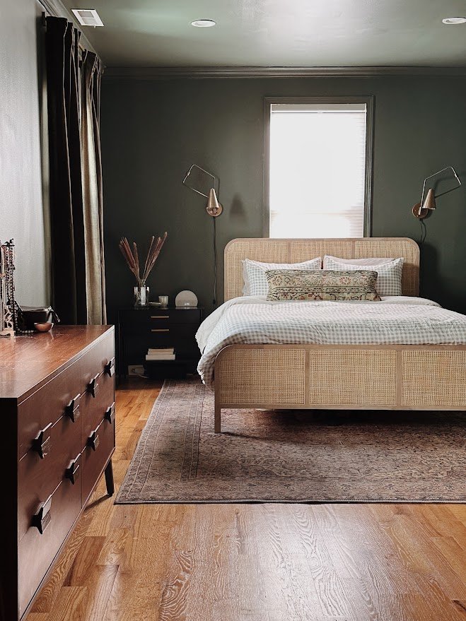

Design tip: Mix up those wood tones. When a room is full of all the same wood, it feels dated and heavy. Blending lighter tones with medium and/or darker tones gives a home a more collected feel to experience, rather than just enter.

Guest room
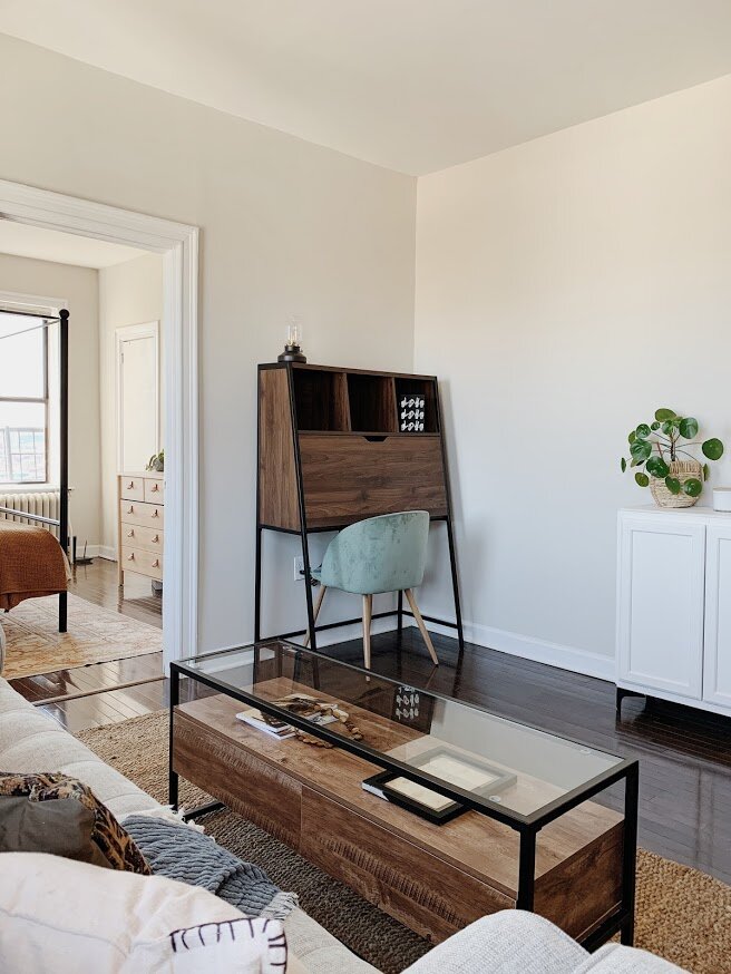
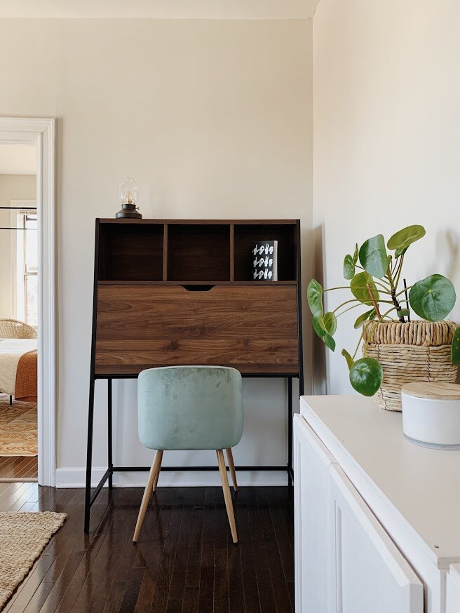
This quaint room is just large enough for the guest bed and home office on the other side. While there are no overlapping colors between this room and the master bedroom, I went with a complimentary rich, dusty blue tone and carried that all the way through. The traditional floral wallpaper is a nod to this homes age and the powder blue duvet a fun play with tone on tone.


Design tip: You don’t need a large room to create an accommodating guest space. When I put guest rooms together for clients it’s always with a light touch. Have fun with impactful elements that don’t take up a large footprint in the room, like pretty bed linens or a fun accent wall. If you’re like us, our guests usually stay in one of the kids’ rooms, so we clear what we can from surfaces to make room for them.

Kitchen
This kitchen. As a designer I have a deep love for transforming a space when there’s no budget for a renovation. The client did not love her kitchen in the least. The white walls, white cabinets she wouldn’t have chosen and the counters with their flecks of maroon were the low point for her. But those maroon flecks inspired everything that followed! Take a look below at the space before:

And after some magic with color, furnishing, lights and aged brass cabinet hardware!

I enjoy the challenge of taking an undesirable element, and not only making it work but making it look intentional - like it was meant to be there all along!


As is always the case with design, the vision comes before the view. I saw this space in mauve with a rich cranberry island and couldn’t see it any other way. My client has a really cool style and isn’t afraid to push the envelope, but of all the rooms in her home I held my breath on this design the most. I fully expected a negotiation process and was prepared to pivot…but she loved it!

Design tip: It’s fine to have brass, black and chrome all in the same kitchen or bathroom. This is one of the more common questions clients ask and my personal preference is more of a mix than everything being an exact match. This kitchen has a chrome faucet, antiqued brass cabinet hardware and a black framed dining light, and for this space in this home, it works really well.

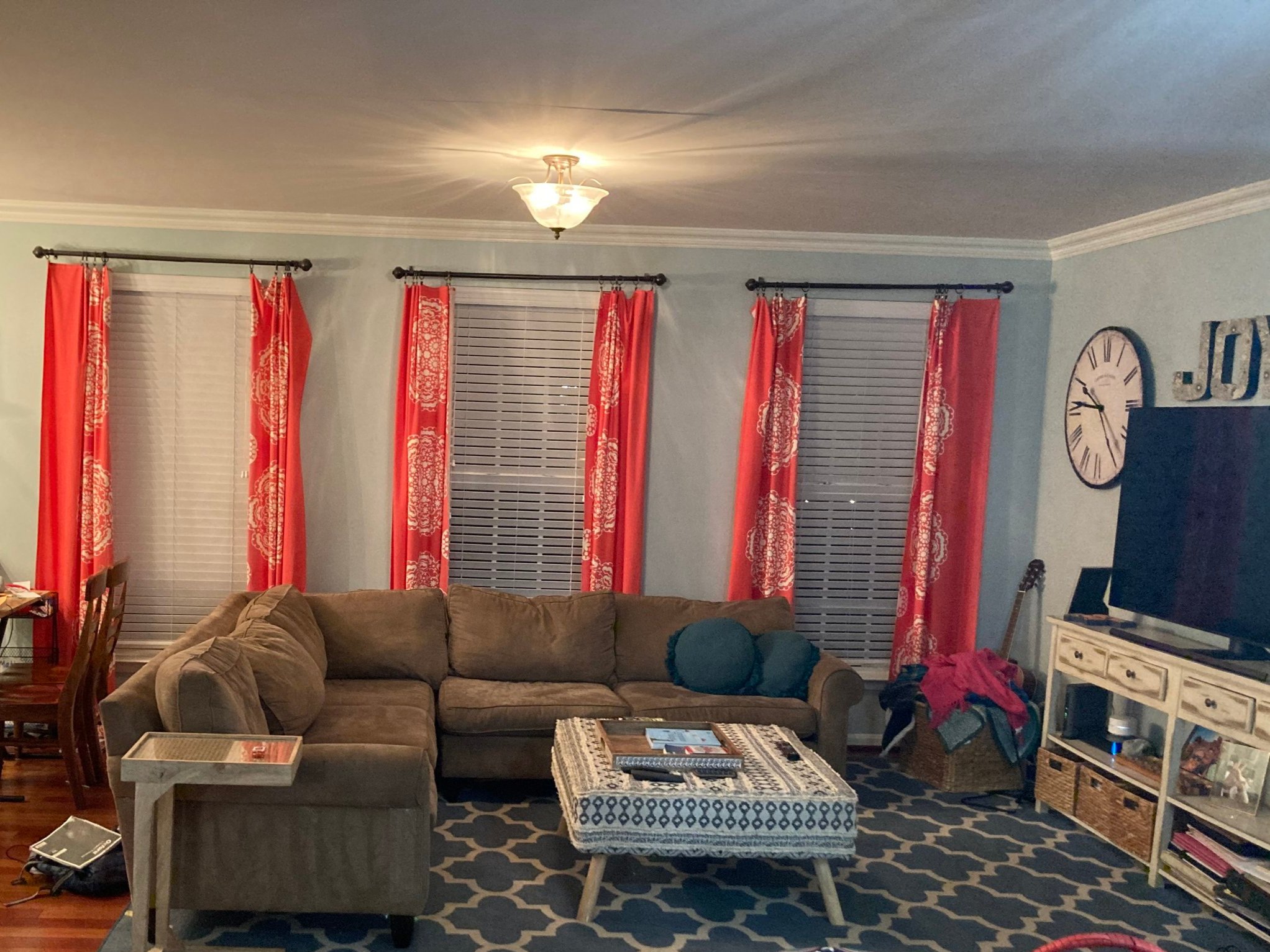
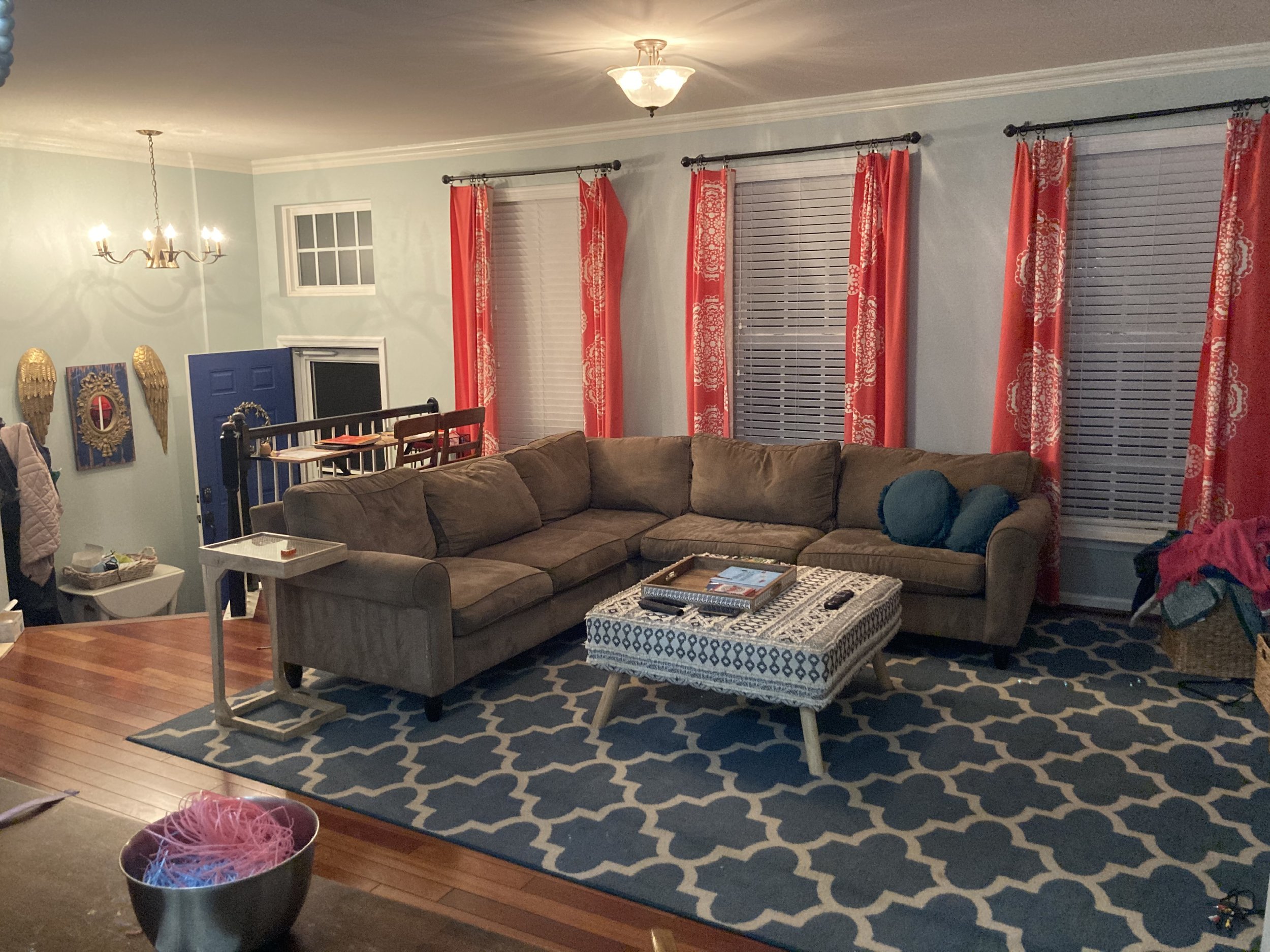
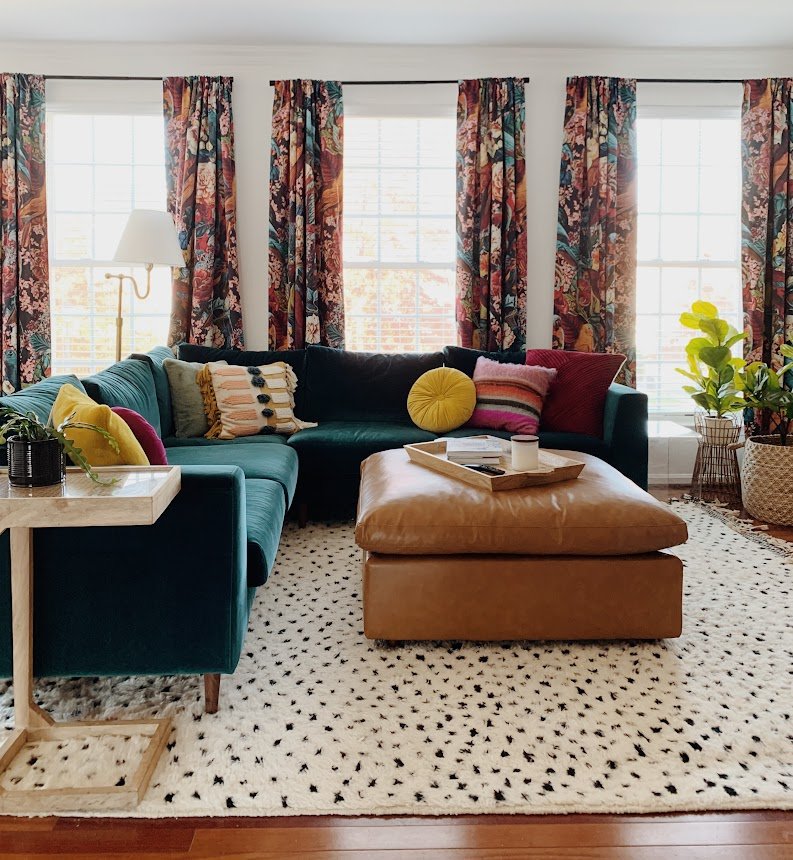
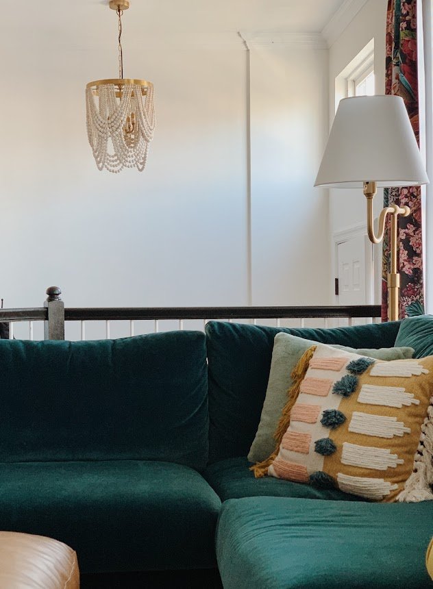
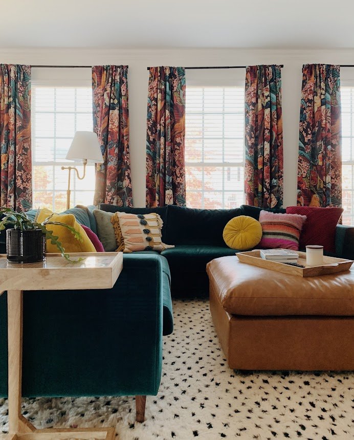
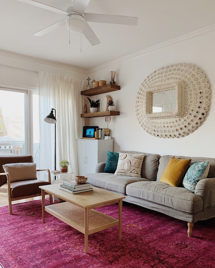
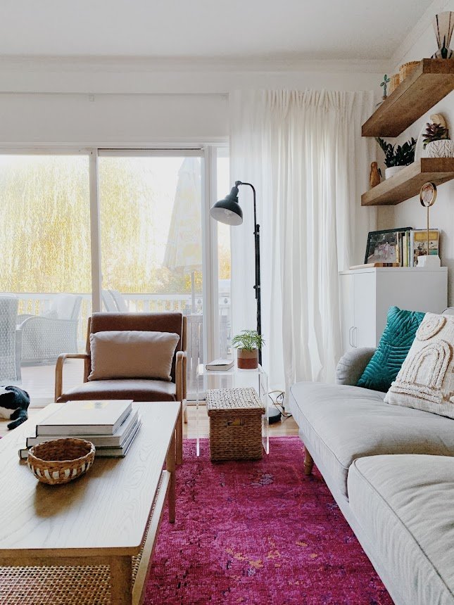
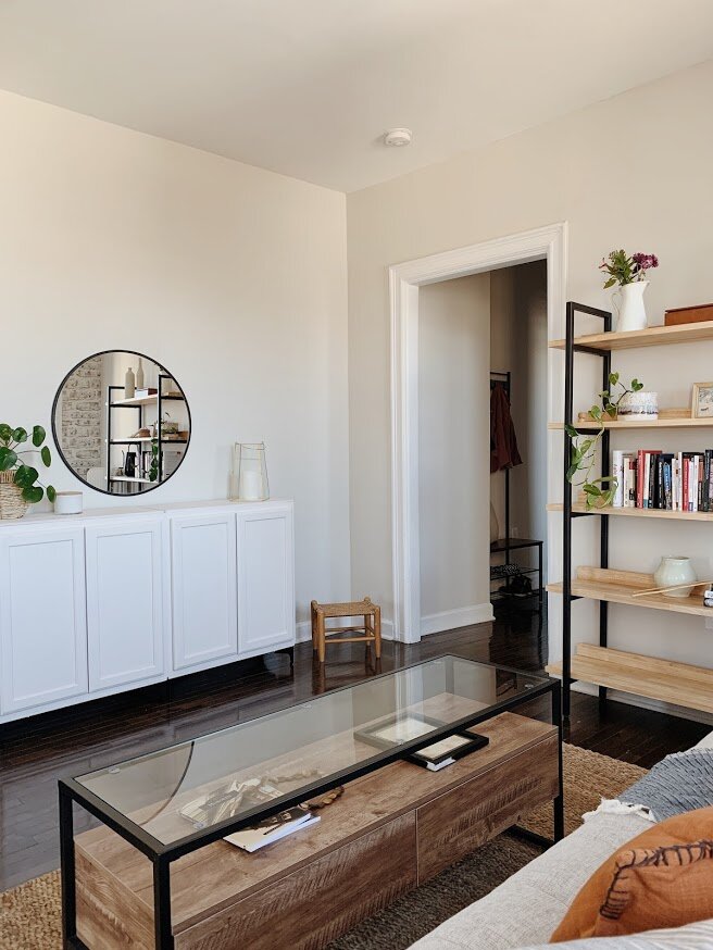
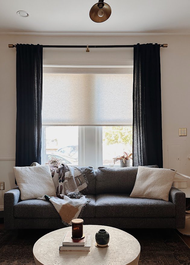
Living room
My favorite aspect of working on older homes is the asymmetry - maybe because it drives most people bananas! I tend to embrace chaos and am naturally inclined towards design challenges. Here’s how I tackle asymmetry: Balance. More often than not you’ll find symmetry nearly impossible. Maybe it’s an oddly placed window, or an off center fireplace. It’s everywhere in new homes and old; workarounds that builders just have to come up with on the spot that mock all the future homeowners.
Design Tip: Instead of worrying about the asymmetry you can’t change in your home, work towards creating visual balance. There are a variety of ways to do this and each solution will be unique to the challenge and your particular style. In the image below, the fireplace was such that we could add shelving on one side but not the other. No biggie. Angling that chair towards the center of the space brings balance on both sides of the fireplace.


That’s a wrap! Bless you if you read this far. I hope you enjoyed seeing this project and getting a peek into some of the process that went into it!