The Light Fixture Family Tree ||why I don't throw things away||

I hate throwing things away.  My husband would say that makes me a hoarder.  But I believe that makes me resourceful ;)  I will often hold on to old parts from past projects until I can find another use for them - and sometimes my... resourcefulness... pays off.  

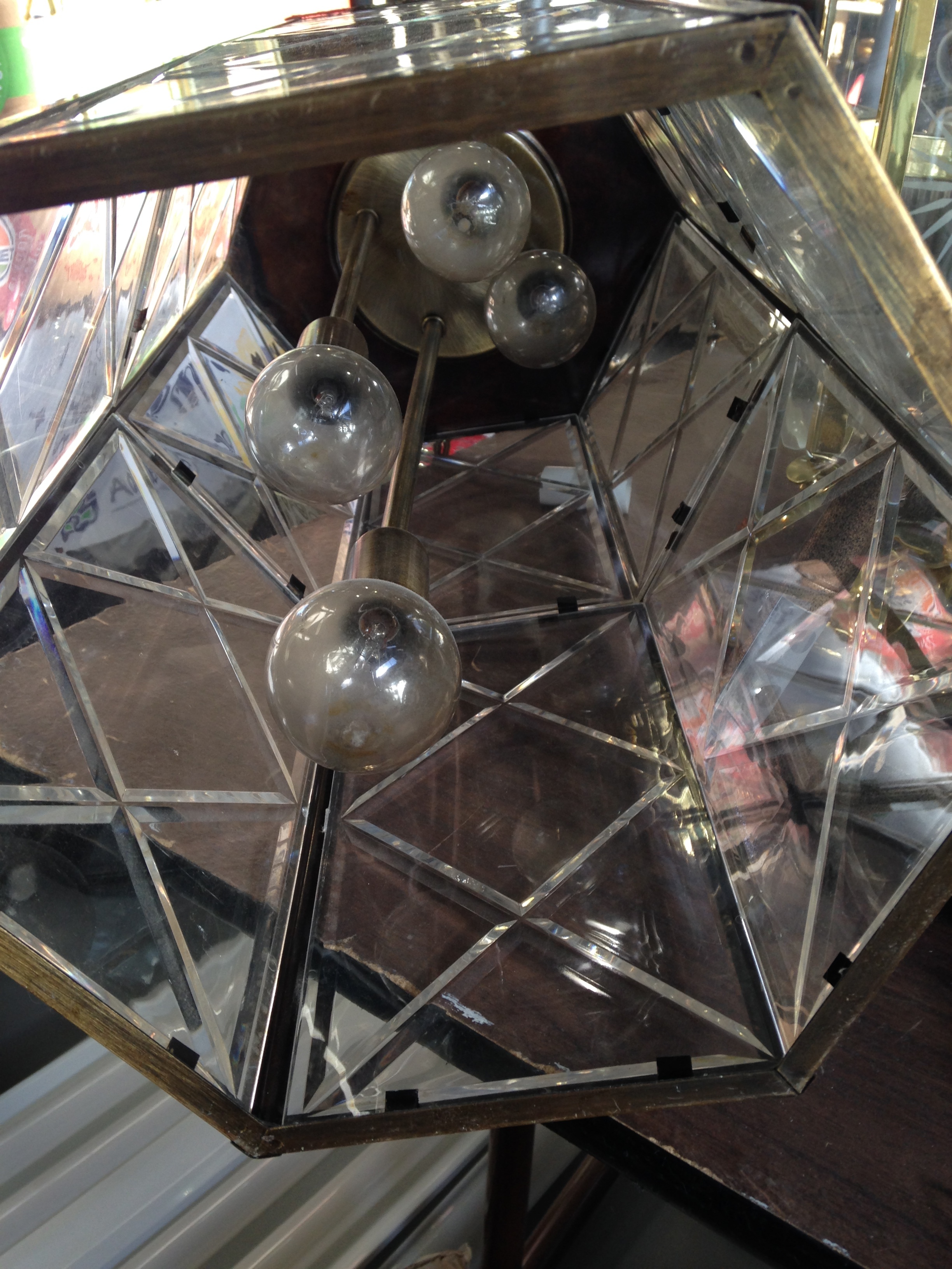
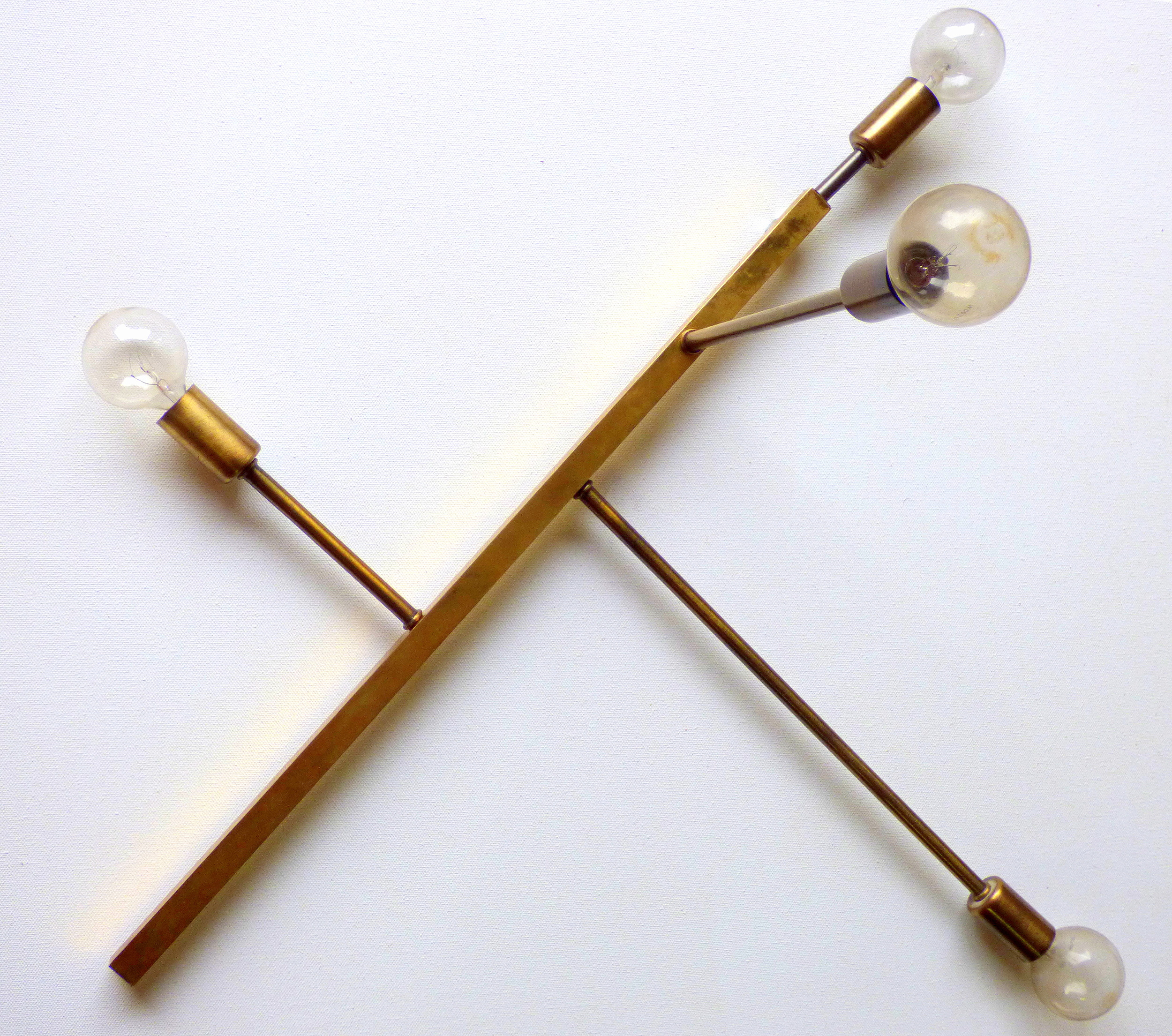
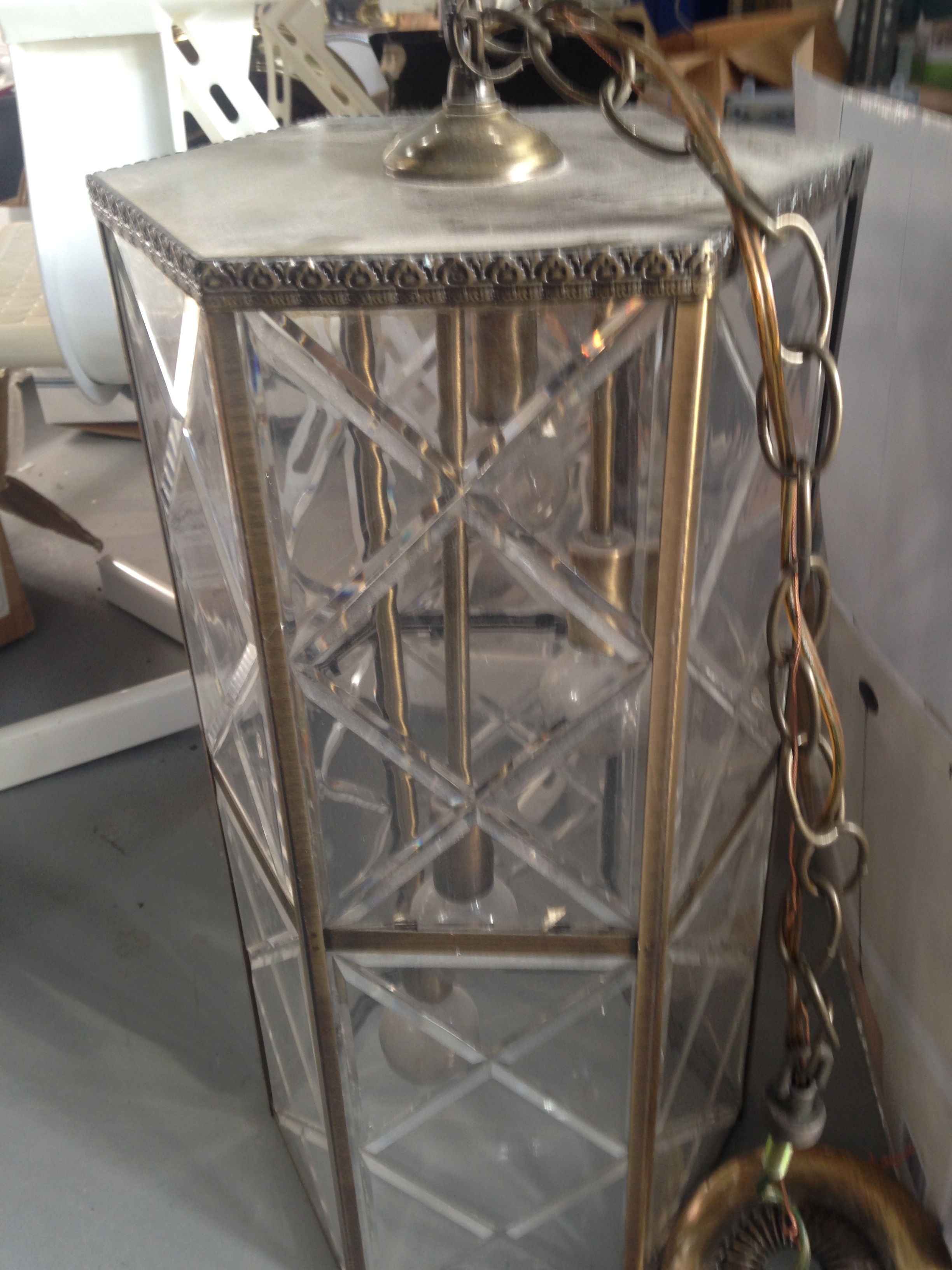
Last summer, I scooped up this faceted foyer light at my local ReStore.  I liked the look of the brass + bulb components inside and started thinking, maybe I can repurpose them into a DIY sputnik-style chandelier.  So I bought the whole kit-and-kaboodle and promptly took it apart.

After disassembling it however, I couldn't bring myself to scrap the faceted lantern.  I thought about turning it into a terrarium or a more functional table lamp again [I have a weak-spot for disassembling light fixtures apparently...] but in the end I brought it to our pop-up shop at Sweet Clover Barn and sold it as a dainty umbrella stand.

As for the original "guts" that had inspired the DIY chandelier on my 2016 furniture flip bucket list - well, I held on to those babies for almost a year [much to my minimalist-of-a-husband's dismay].  Until I found this lamp...

Behold!  That tall, handsome, square piece of brass pipe that's the perfect length.  I finally had all the pieces I needed for the frame of my sputnik light!

But after I had my hands on the brass pipe I needed, I still had the other perfectly-good components of the table lamp to play with - like the 4 decorative pieces of turned wood.  After stumbling on a $2 round wooden tray at the thrift store, I soon had a plan for those too: a mid-century modern plant stand.

So just to recap, here's a handy infographic on how one old lantern and one old table lamp came together to make 3 new beautifully functional  pieces and nothing was wasted in the process!

I'm still working on the wiring for the sputnik chandelier and [if all goes well] will be sharing the results soon!  In the meantime, I'm curious if any of you have created your own diy family trees by repurposing project left-overs.  Please share in the comments below!
Quirky MCM Nightstand

One of the perks of being the furniture flipper in my friend group is sometimes they give me er... presents...  In the form of discarded furniture.  

This asymmetrical wonder came to me when a friend got a fish tank off craigslist that came with a quirky base.  They kept the tank and were about to kick it to the curb when they probably thought, "Waste not: Cate not" and passed it off to me for some hail Mary refurbishing.  

But the good news is, being quirky has its perks.  In fact, mid-century modern furniture is iconic-ly quirky.  Besides making the piece stand out in a space, there's something... endearing about their asymmetrical lines: 

Source: 1st Dibs

Source: 1st Dibs

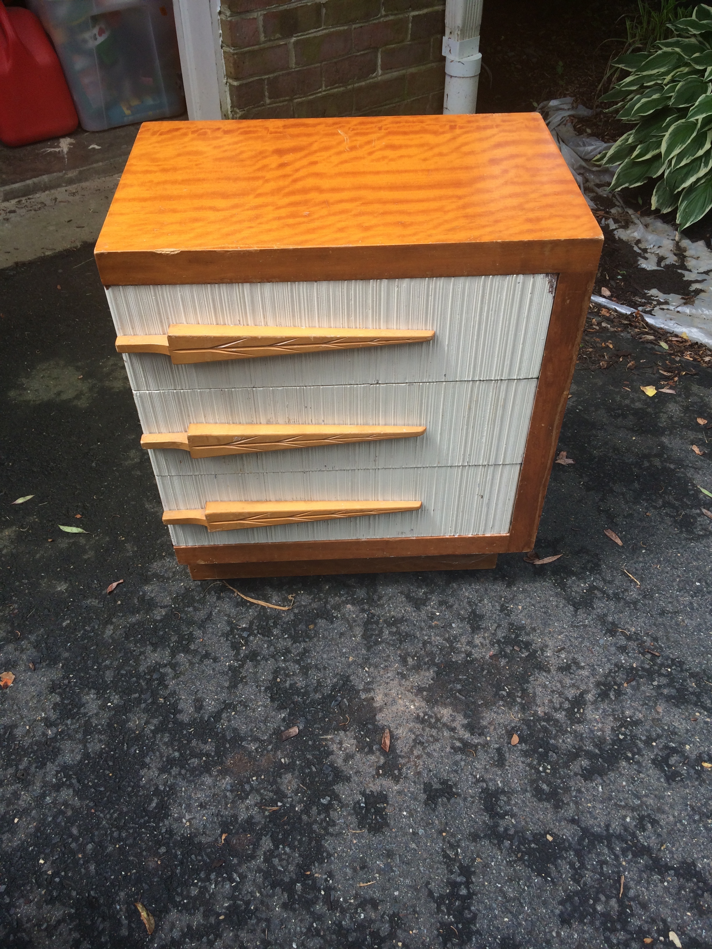
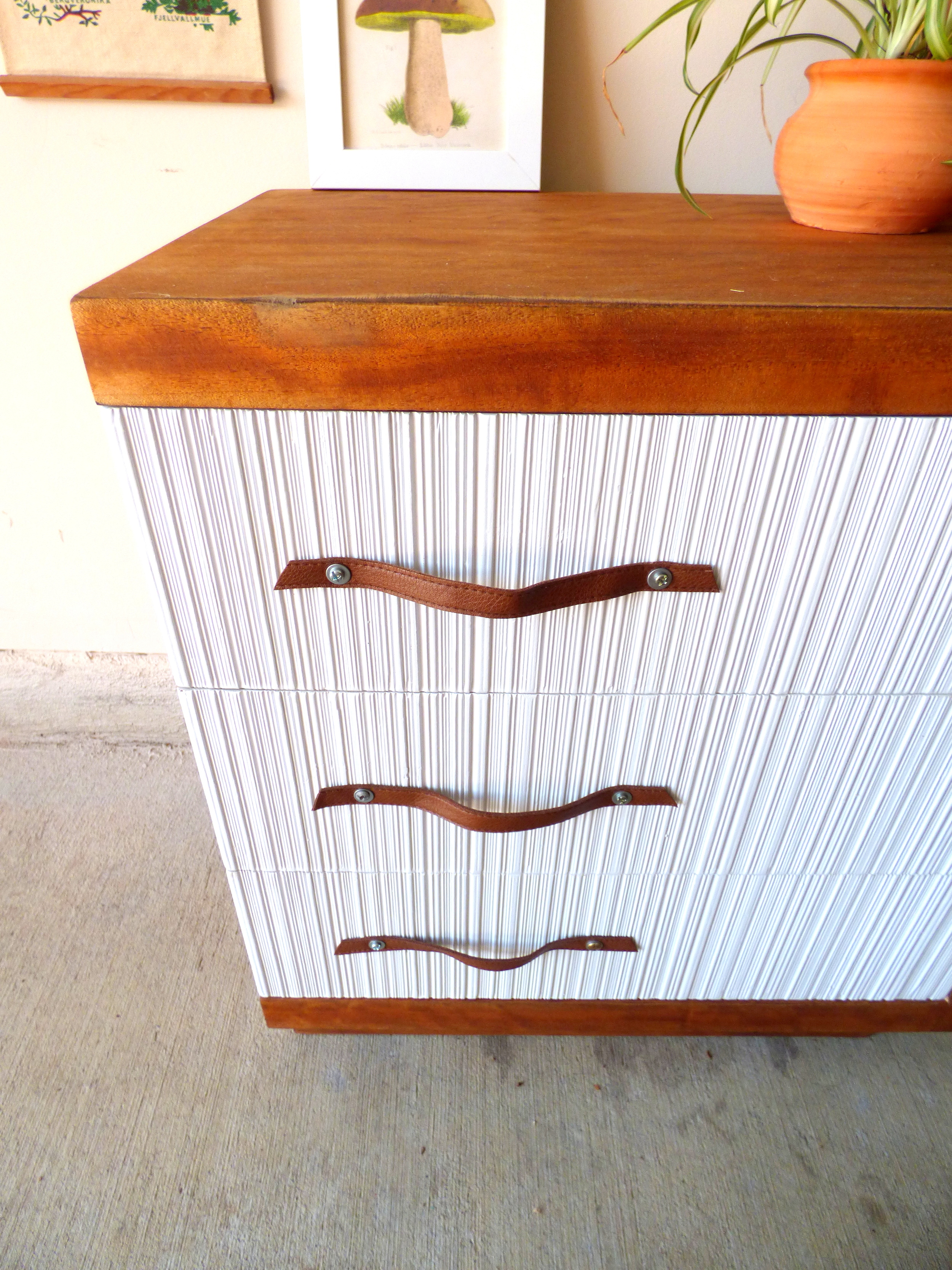
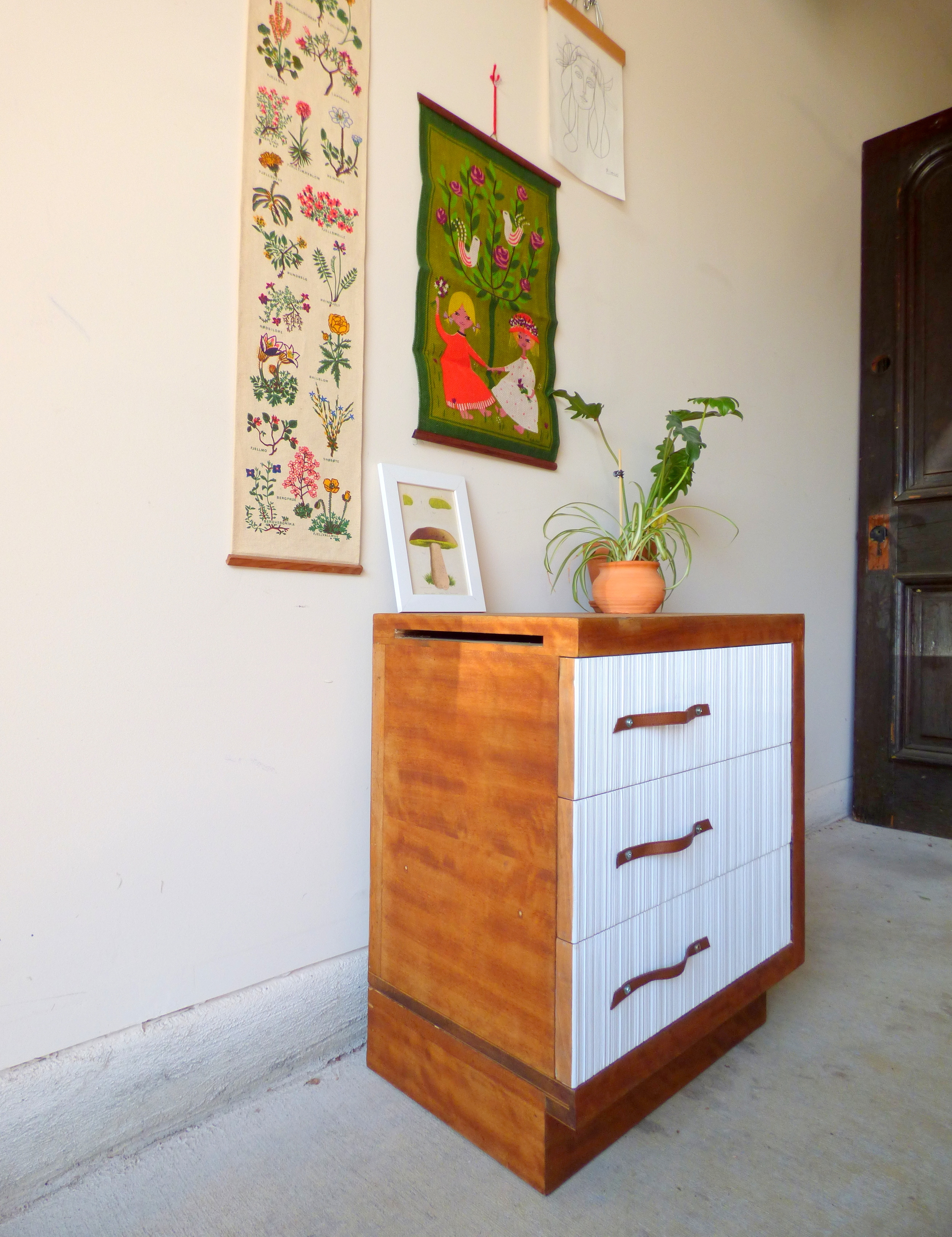
Upon closer inspection, this little odd-ball was certainly a little worse for wear: deep scratches in the finish, funky Christmas tree pulls, yellowing paint...  It would be undoubtedly be easier to paint the whole thing but that burled wood grain!  So in the end I put in the extra elbow grease and restored him with some repurposed leather pulls.

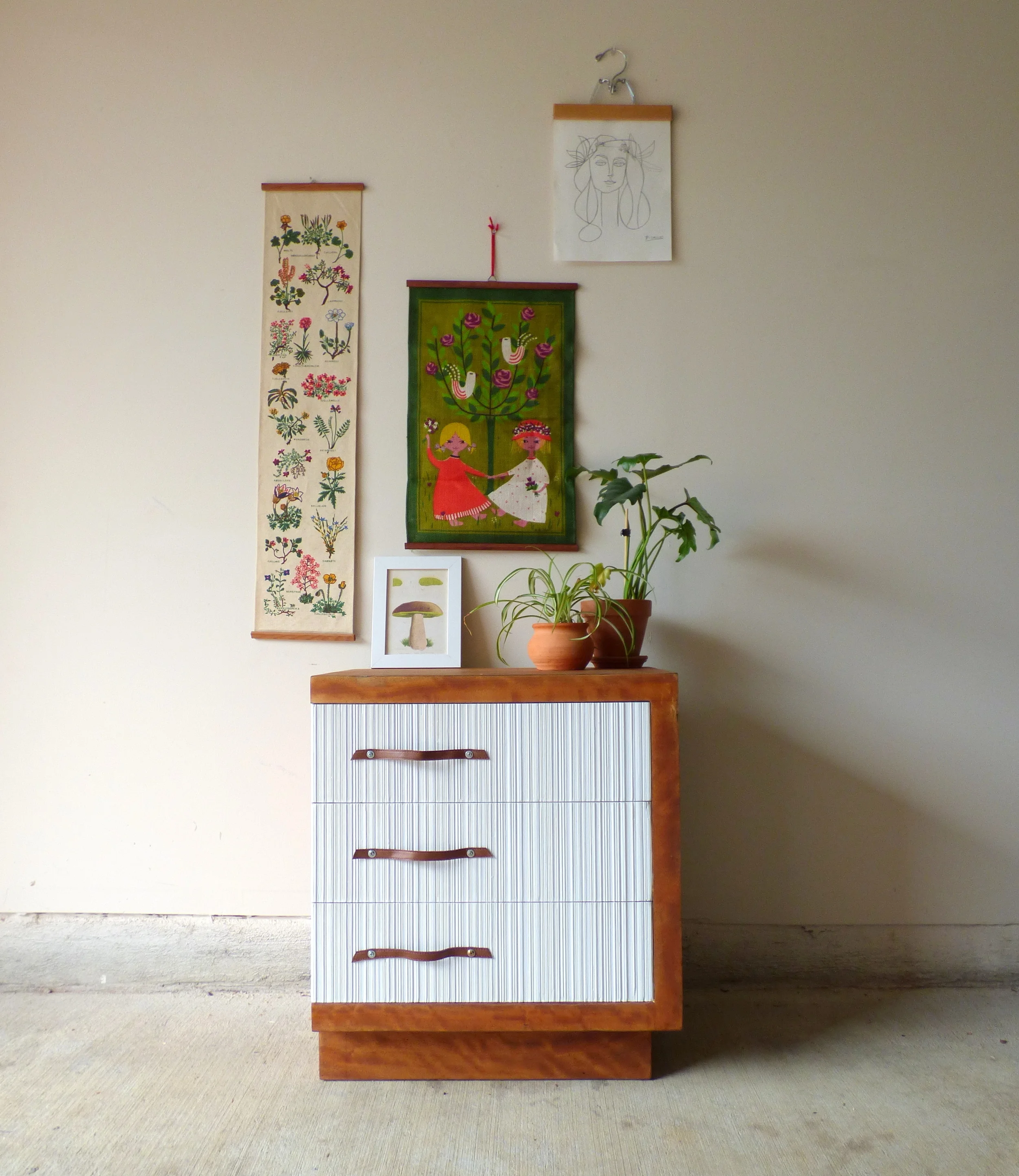
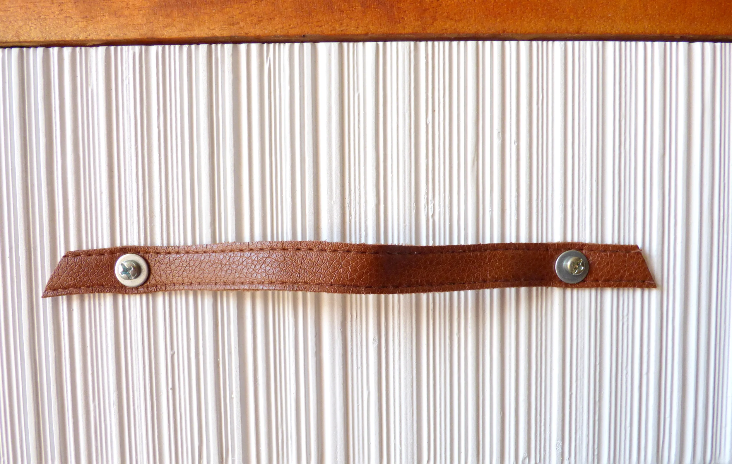
Yes those stylized tree pulls had to go.  They were easy to unscrew but the awkwardly-placed holes made finding new pulls to fit difficult.  And the textured drawer fronts made filling them in to drill holes for new pulls just as challenging.  So here's where I had to get creative with a touch resourceful: I had an old camel leather string belt lying around and cut three lengths that were long enough to fit the off-center holes with a some extra slack for easy grabbing.  

I punched holes in the belt for the cabinet screws, threaded them through with a washer for extra reinforcement, and secured them on the inside with a nut.

To add to the quirk of this piece, there is a slot cut into the left side of the nightstand.  At first I couldn't make sense of it.  I mean, was the nightstand designer so lazy that he didn't want to have to open the top drawer to put some papers away?  But then I realized, this designer wasn't lazy - (s)he's tech savvy!  This slot turns the top drawer into a charging hub for your personal electronics so instead of having a rats nest of cords cluttering up your bedside surface real estate (like I do), you can stow them away discretely!

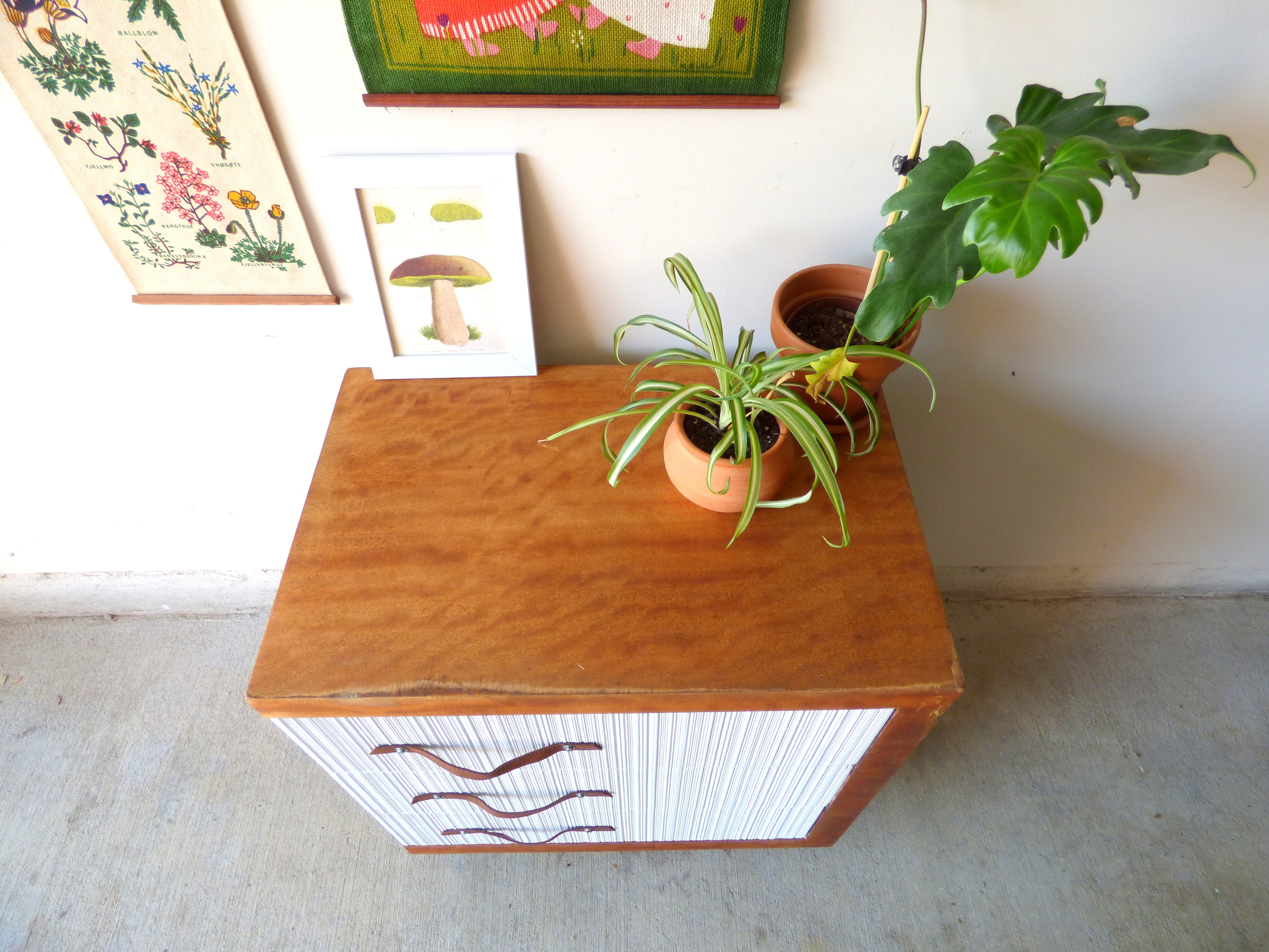
Keeping the piece two-toned lets the texture of the drawer fronts play off of the banding in the warm wood grain.

Keeping the burled wood grain did mean I couldn't mask some of the discoloration along the edges.

I'm not sure what caused the "worn" edges but they are completely flush so the surface is still baby-butt smooth.  Plus, I think the markings lend themselves well to the vintage character of the piece.  

As a beloved teacher once told me, you have to earn your wrinkles.  I think the same goes for vintage pieces: they don't get to be this old without collecting some storied markings along the way ;)  

Two-Toned Mid-Century Modern Nightstand
21.5"W x 14"D x 24.5"H
SOLD
$85

If you are interested in this piece or a custom order like it, please contact me at cate@stylemutthome.com.

Quick Flip of a Roadside Find

It was a warm, muggy day and I was walking out of the twins' elementary school with Mason and some neighbor friends who we had joined to help out with field day. My friend Alecia, with her belly about to pop with her baby girl, had locked her keys in her car. So, we all hopped in our van, drove to their house where she got the spare key, then we dropped her off at her car. It was then that I realized a few driveways up from her car was some sort of wooden object. Always worth checking out! So I pulled up and found this guy!

This piece was almost cool. The unique size, (almost square like), and tapered legs made it worth loading up to bring home for further inspection. It's not all solid wood, most surfaces were scratched up, and the back is some sort of cheap composite piece. But my biggest strike against the piece were the adjustable shelves. I'm a huge fan of adjustable shelves when they're hidden behind cabinet doors, but seeing the multiple holes drilled into the sides and those small metal bracket thingys made this particular piece look cheap. But, like I said; it was almost cool! Close enough, at least, to give it a go.

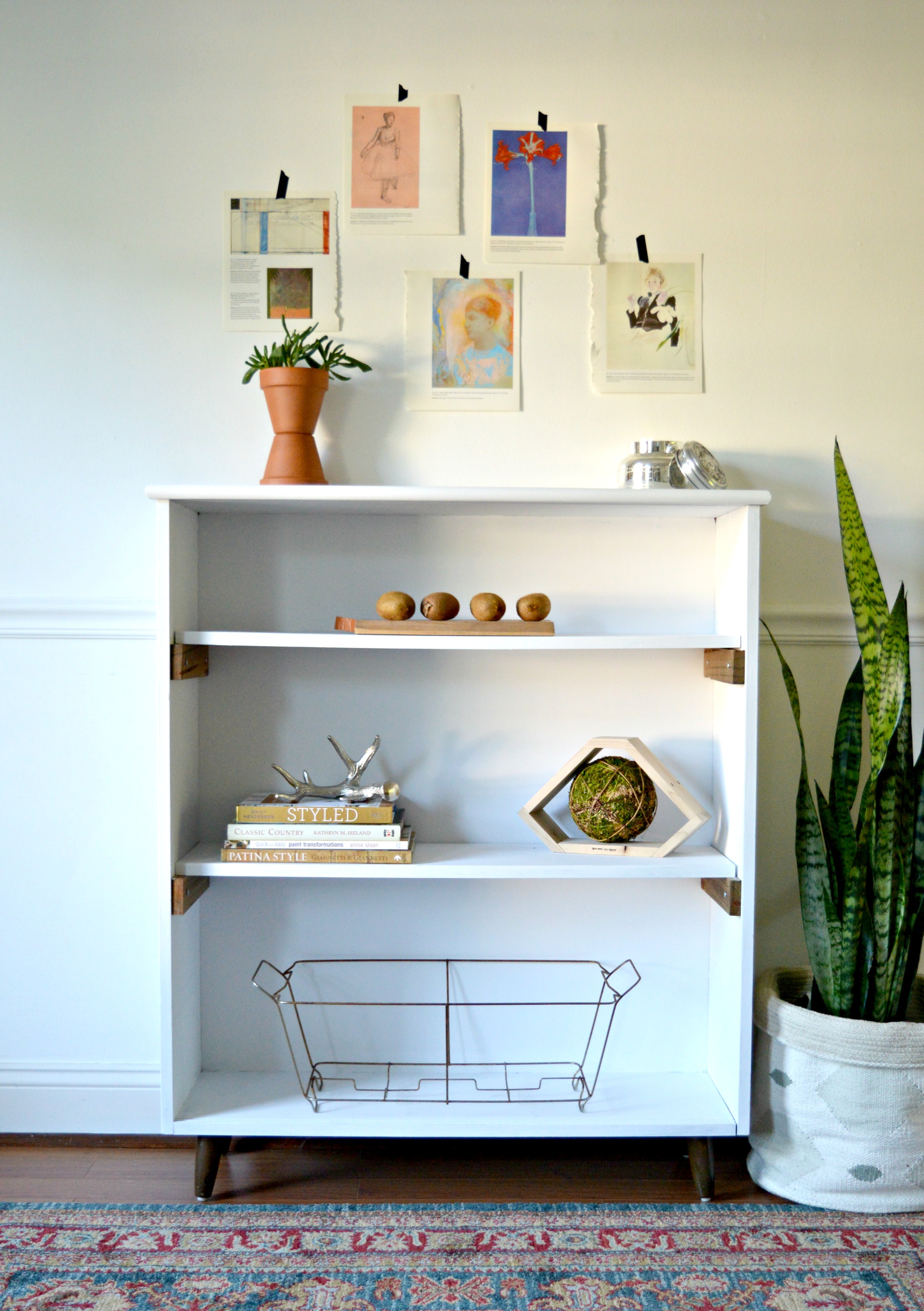
When it comes to mid-century modern furniture I always try to maintain the time period of the piece, and two-tone, (or white and wood), is a classic look that has withstood the test of time. I filled in the holes on the sides where the adjustable shelf options were and then made some simple wooden brackets to set the fresh white shelves on. Other than the wood brackets and the tapered legs, I painted the piece white.

I've always loved how items pop on white shelves! (Check out Cate's dining room campaign style shelves to see what I mean!)

Fuzzy kiwis. Adorable.

Petite MCM Bookshelf Now Available to DC Locals
43"H x 36"W x 12"D
$125

Thank you for stopping by!