Gray + Wood Dresser

I know. I know.  It’s been ages since I had a new piece to share.  But the dry spell is over mis amigos - I’ve got a fresh flip to reveal.

IMG_1755.JPG

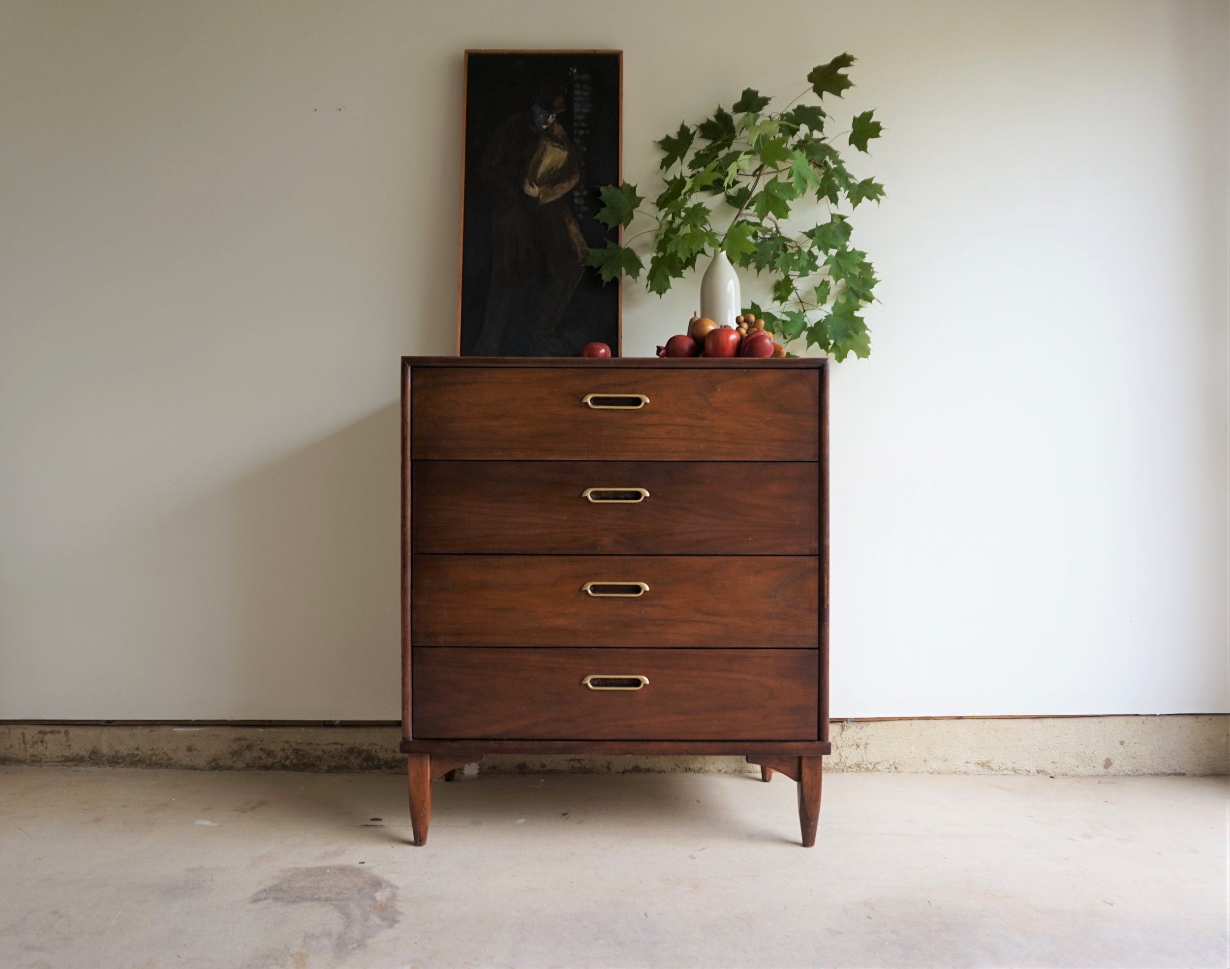
It started with a cute dresser score on facebook marketplace.  It was further out then I usually drive for a potential piece but it was a beautiful commute through some fall countryside so I didn’t mind all that much. Once I saw it in person, I was pleased to find that it really only needed some minimal repair work and an easy-to-execute fresh look:

DSC04726.jpg

The wood was mostly in great condition and I really didn’t want to paint it at all if I could help it.  But the sides and top needed a little wood filler so it was going to need at least a little paint. 

DSC04717.jpg

In my true-to-form fashion, I decided on a two-tone look to mask the repairs I had to make but still celebrate the wood.  I wrapped three sides in True Taupewood - my new favorite greige used here and here.

DSC04719.jpg

If you’ve been following along with our past projects, you’ll notice I’ve been favoring this style of two-tone (wrapping just the outer edges).  But in an effort to not seem like a one-trick pony, this time I decided for a lighter paint to contrast my go-to dark inky color.

DSC04738.jpg

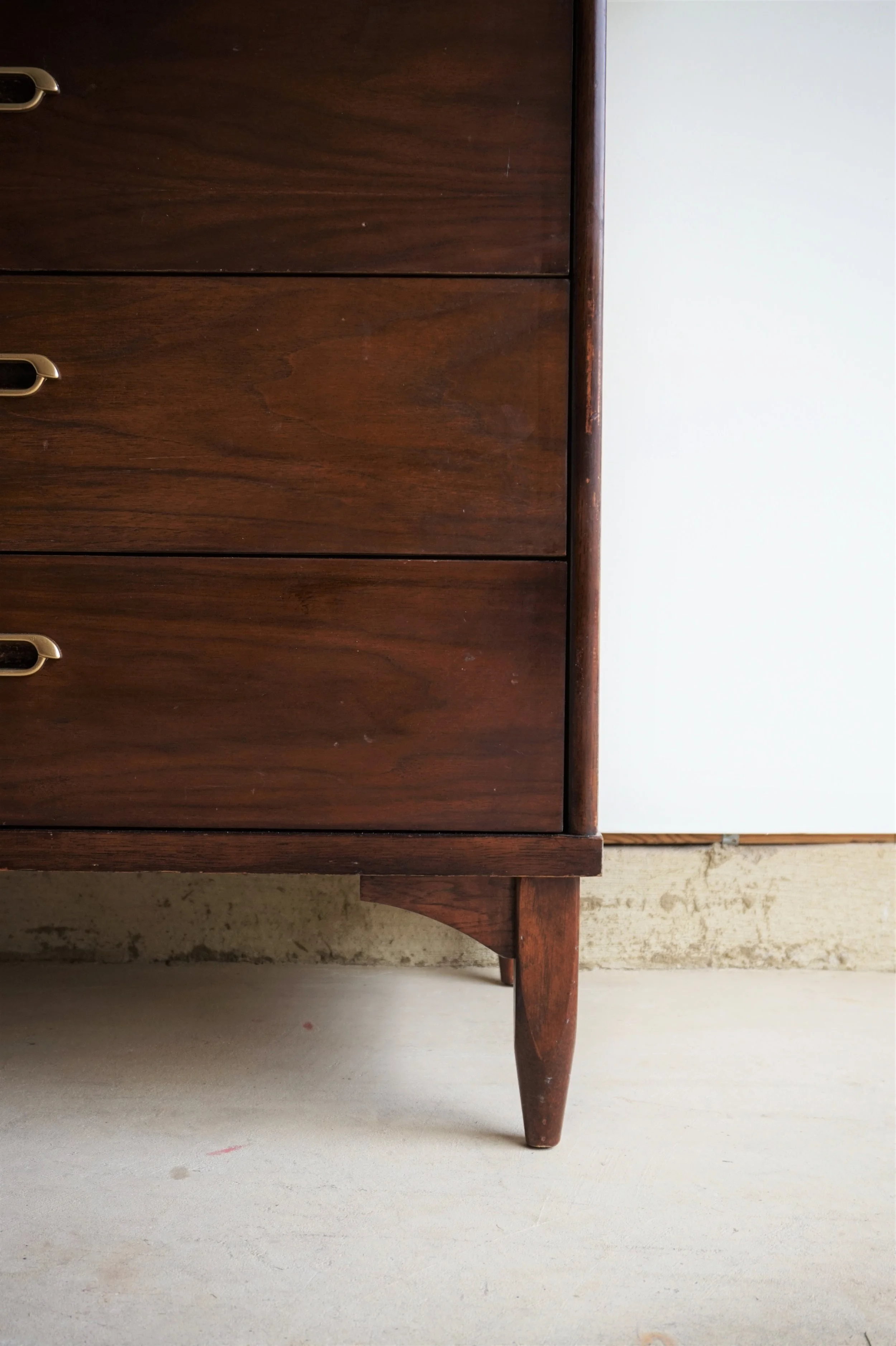
Instead of carrying the paint down the sides of the legs (like I did here), I kept the base and my beloved tapered legs in the original wood finish.

DSC04734.jpg

The original piece also has dull metal handles which I promptly refinished in  gold to bring a little sparkle back to her front.

DSC04729.jpg
DSC04739.jpg

Finally, I have a piece to style with my moody Mr. Grocery Bag Man thrift score.

DSC04731.jpg

Plus the wooden fruit collection my aunt won for me at an auction. 

DSC04732.jpg

If you’re interested in a smart new little piece, hit me up for pick up or shipping options.

DSC04713.jpg
 

Gray + Wood Dresser
Now Available for Sale
32”W x 19”D x 37”H
$495


If you are interested in this piece or a custom order like it, email me at cate@stylemutthome.com

Cate.jpg

Shire's Pink Room

Hi friends! With one day of a new school year under our belts Summer already feels like a lifetime ago. Boy did it go by fast! But even at warp speed we still managed to squeeze one itty-bitty little makeover in there. :)

There was no plan to update Shire's room, but after a pretty major home maintenance issue  forced us to toss some damaged furniture, etc, I tried to find a silver lining around the unfortunate incident. Or rather, a blush lining. After purchasing the least expensive necessities I could find, her room had lost some of it's Shire charm. And if there's one thing I know to be true, there's no bigger impact for your buck than a can of paint! Shire's style has always been different from mine. I don't even care if that's on purpose to spite me; I love her dearly for it. She is her own gal!

And this gal loves pink! Shire seems to be fully embracing her role as the only girl sandwiched between two brothers, and what's so endearing to me is that right now at age 8, being feminine to Shire means dresses and pink. To which I say, Rock it, Darlin'! So I wanted to gift her a pink room. After explaining that this is her room for the long haul and it may be wise to choose a pink that she can grow with as she gets older, we tried these samples:

17.jpg

All are Behr colors and my girl chose the middle one, Castilian Pink.

16.jpg

I never thought I could love a pink so much! Much less the kind of mauve-y pink I've stayed away from my whole life because it washes me out. Haha!!!

1.jpg

I didn't really do much else! The bed and bedding were a new necessary purchase but the other items have been around for a while. I love how the various wood tones, hits of black, and especially the subtle touches of red stand out against the dusty rose backdrop!

2.jpg
4.jpg
6.jpg
3.jpg

The List of Countries chart was a fun collaboration with our friends over at Bold Tuesday! Every country is listed by shape and title, from largest span to the smallest. You get a sheet of red dot stickers to place next to countries you've visited!

7.jpg

Aaaaaand we haven't visited many. Can you find our 4 red dots? Our family consensus is that we like the shape of Brazil best, Chile is super cool too, and the United States would look way better without Alaska.

9.jpg
11.jpg

I wanted to give Shire's room a slightly more grown up feel and turned her twin bed into more of a day bed that she can lounge on with a book, (she's a major reader - another serious divide between us). Funny how a different pillow placement kind of transforms the bed! I think it makes her twin look a bit bigger!

13.jpg

Shire's room is often our guest room, and she's already hosting her first guests: Some nomadic plants that needed a place to chill out during our kitchen reno downstairs.

8.jpg

I had always wanted a cascade-y plant but this isn't what I had dreamt of. It's untamable and out of control!

112.jpg

Last stop and I almost didn't throw it in here but...Shire had dozens of pieces of art on her walls collected since Kindergarten. It was time to make some tough choices and free up some wall space, for sure. I found this handwritten note from a friend last year and tacked it right up. I want my kids to always know the significance of simple acts of kindness - and the significance of paying someone such a heartfelt compliment as Shire's friend gave to her. I hope it encourages her to keep on keeping on. :)

14.jpg

Plus, if I'm being honest, I am totally digging that shade of red against the new pink walls. Hah!

15.jpg

And that's it! Not a major reveal but it was a perfect creative itch scratcher and just in time for our girl to start 3rd grade. 3rd grade! You would be right in assuming Matt and I are NOT old enough to have 3rd graders. ;)

Thank you all so much for stopping by today!

Chelesa.jpg

Cantilever Chairs || Plus a Dining Room Reveal!

Today is the day.  I finally have a room in our new place to share: our dining room!

3. Dining Before, Tan.jpg

Ok so it didn’t look like much when we moved in.  Basically three things had to happen to get us to this reveal day: 

1) The dining room HAD to be painted something a little less light-sucking
2) We needed to find some chairs - because what is a dining room without chairs amiright? 
3) I needed to decide what art to feature in here!

We (I mean er my familial paint crew - thanks again guys!) knocked out the painting on week one but finding some chairs that could really make a statement was proving more difficult.  But eventually, I found them:

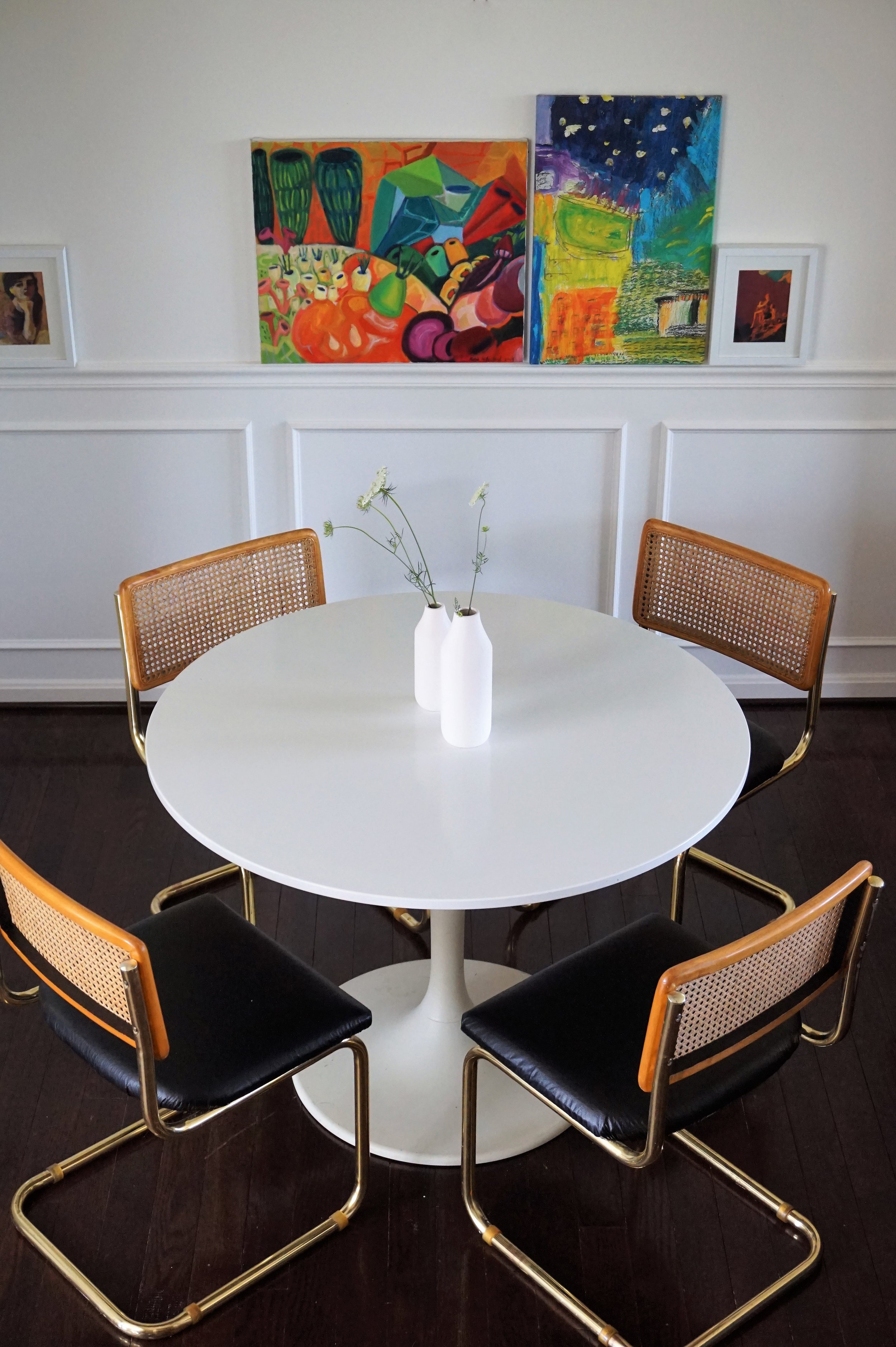
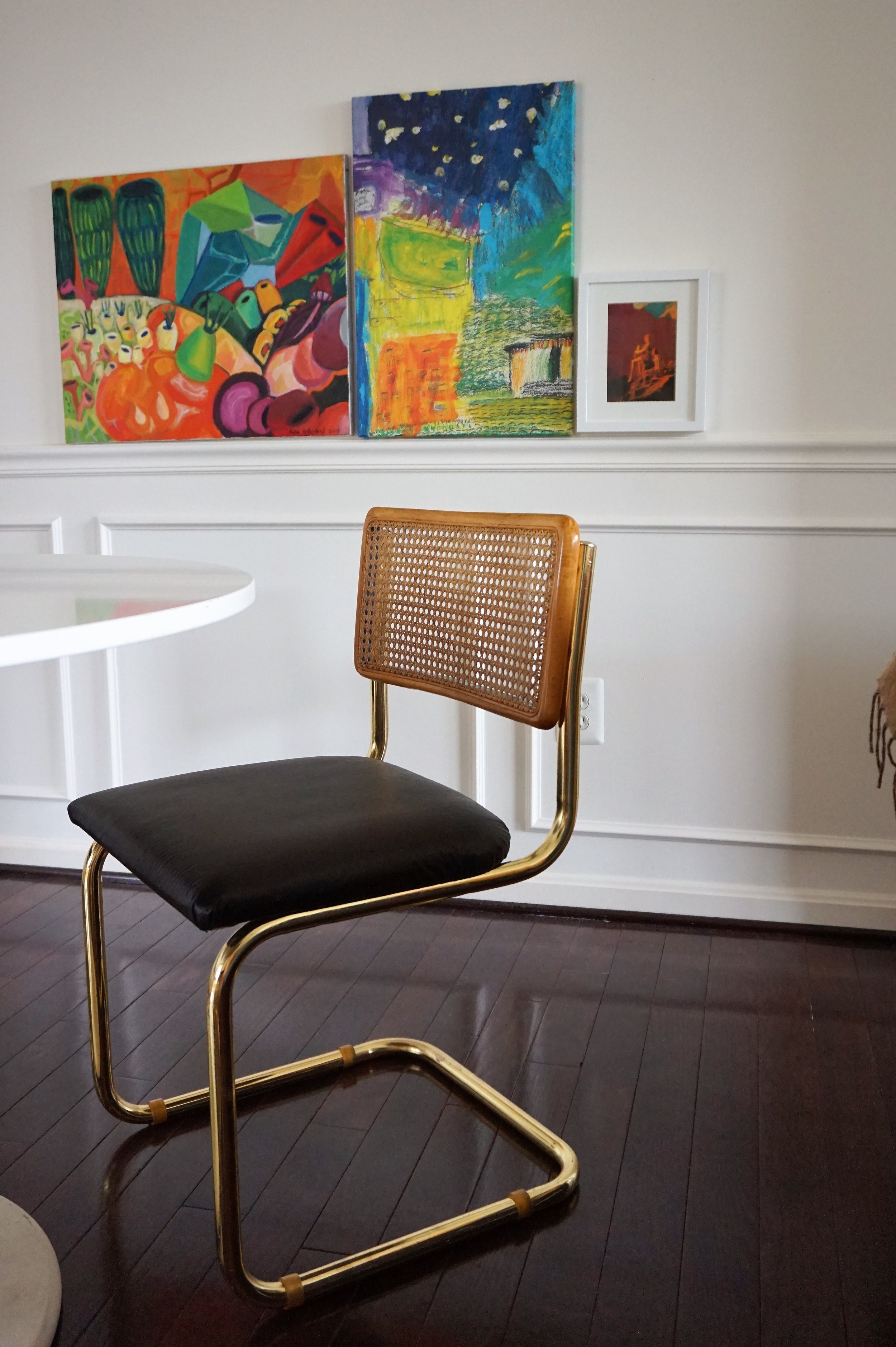
Brass... Breuer... CANE... Cantilever chairs.

Photo Jul 07, 12 15 00 PM.jpg

Up until I found these, I didn't even know Marcel Breuer chairs came in anything but chrome.  But when I saw these glittering gold chairs, I scooped them up - carrying two at a time through the maze of dusty furniture at the thrift store, slightly panicked that the other two wouldn't still be there while the check-out clerk waited for me to navigate them safely out. 

My original plan was to flip and sell them. But I wasn't sure what direction to take them in.  My gut wanted me to recover the seats in leather but I was having some doubts.  Between the warm cane and bright brass, I feared that richly-toned leather would stick out like a sore thumb.  It needed something to tie it all together.

Photo Jul 07, 12 17 05 PM.jpg

I sought council from my favorite sounding board Chelsea.  She actually suggested a soft, light velvet instead - wouldn't that be lovely?!  But after more research at the fabric store, I realized velvet was out of my price range.  Plus, I already had some yardage of leather in black and didn't want that to go to waste - but what could I do to marry the look?  

Photo Jul 14, 2 31 52 PM.jpg

Eventually, I landed on adding an unexpected touch of black on the back of the cane.  Suddenly, this discreet black lip is what I needed to realize I was in love!  Alrighty - let's see it all together shall we?

IMG_1226.JPG

Ah the paint color already makes a WORLD of difference in this space.

IMG_1222.JPG

And these chairs are the stuff my dreams are made of!

IMG_1223.JPG

Can you see the touch of black on the inside lip?

DSC04432.jpg

At certain angles it even peaks through the cane.

IMG_1218.JPG

It’s funny to me that rooms with molding used to always read really "traditional" to me.  But when we toured this rental, it was the idea of making this space a fresh take on traditional is what sold me on this house in the first place - despite the dingy tan walls.

IMG_1224.JPG
IMG_1221.JPG

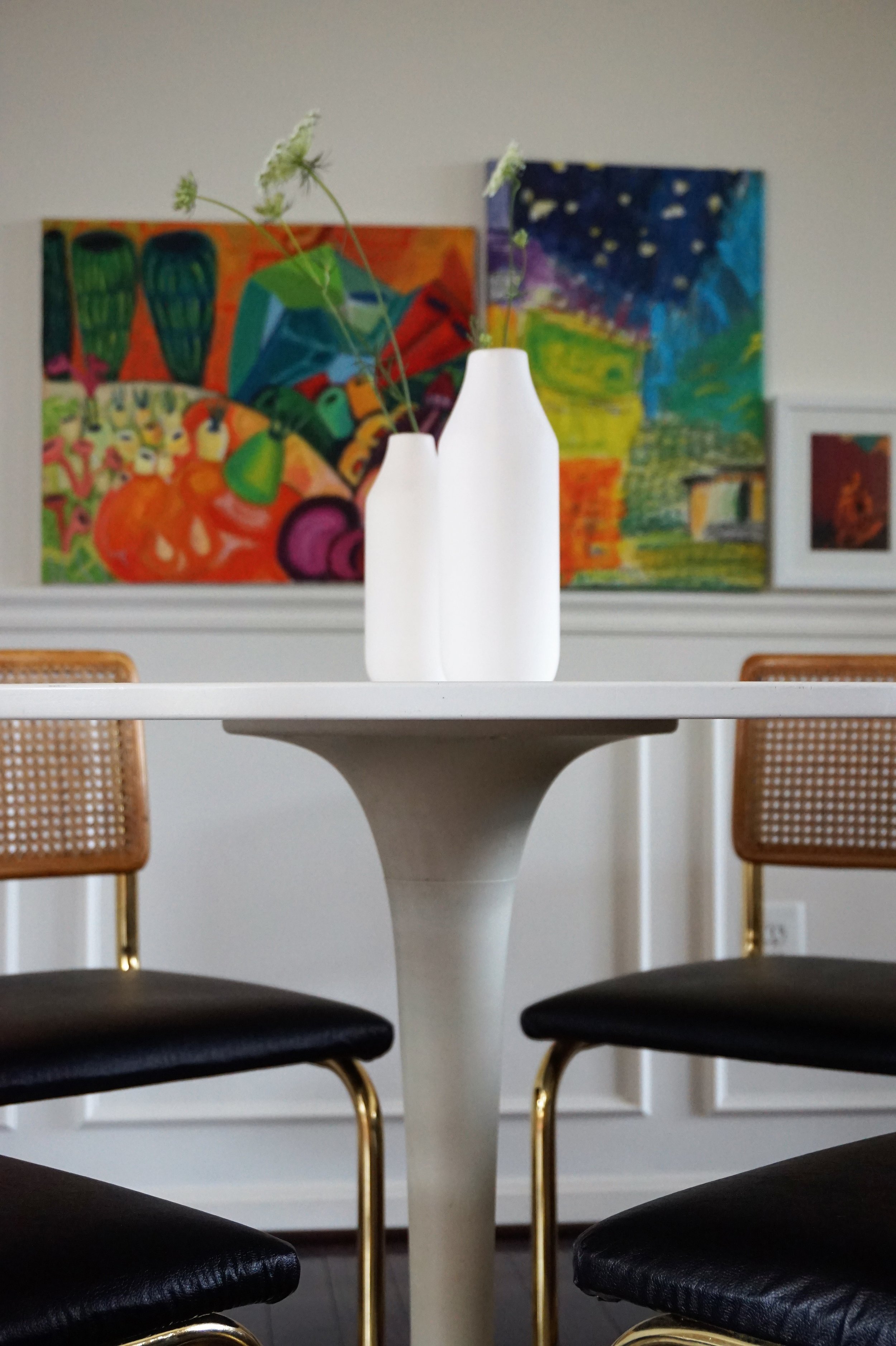
As for the art, I tried hanging all sorts of arrangements in this dining nook and was despondent to all of them.  I had wanted something long and low to lean a cluster of art on but the dining room didn't have space for a buffet or credenza.  But when I hung the art low and along the chair rail I realized it created the same effect that I love without the added furniture footprint!

IMG_1220.JPG
IMG_1228.JPG
IMG_1225.JPG
IMG_1217.JPG

Even though they were originally supposed to be for sale, once I brought them in around our table - I was done.  These babies were mine.  And the perfect crowning jewel to our freshly finished space.  Hoping to have more of our new place to share over the coming months so stay tuned friends!

IMG_4088.JPG