Lighting of My Dreams || 2019 Flip List Item No.3

I have a secret weapon when it comes to introducing Caleb to new items in our home. See, my husband isn’t what I would call a fan of sudden changes. When I want to try something new in our home I follow a strict regimen of 1) casually mention the item in conversation 1-15months in advance 2) install it when he’s not home 3) call to warn him about it 4) tell him is just for a trial period if he hates it and 5) never disclose that the “trial period” is indefinite.

This method works to a point but it does not prevent him from griping along the way. So I have a secret weapon for that. The secret is to out-vote him 2-to-1. See, the spoonful of sugar that helps the medicine go down is getting the dog to love it as much as I do. Think a living room rug is a waste of money? It’s totally worth it when the dog loves to roll around on it. Think a “decorative” old army cot is pointless? Not if the dog starts taking his afternoon naps on it. Think the old coffee table was just fine? Well now the dog can curl up at your feet under this one. Yeah, whatever I manage to drag in usually stays.

Now I have been campaigning for a better dining room light fixture for a year now but I’ve hit a bit of a snag. See, our current rental came with a mal-placed ceiling fan:

Photo Jan 12, 8 26 14 PM.jpg

To me - this would be the perfect place for the diy chandelier from our last rental. But how do you spin a chandelier as a dog-friendly addition? Needless to say I’ve come up empty.

And then we had a little swing vote this spring.

Somehow Caleb has managed to beat me at my own game. If Caleb hadn’t married me, he probably would have married a ceiling fan… and apparently like father like daughter. Huntleigh’s developing eyesight is really into high contrast these days. And a spinning fan is the equivalent of a high school quarterback. One minute she’ll be playing quietly and the next she’ll be giggling at it from across the room. The longer this flirtation goes on, the stronger Caleb’s position in the matter gets.

Well played Caleb. Well played.

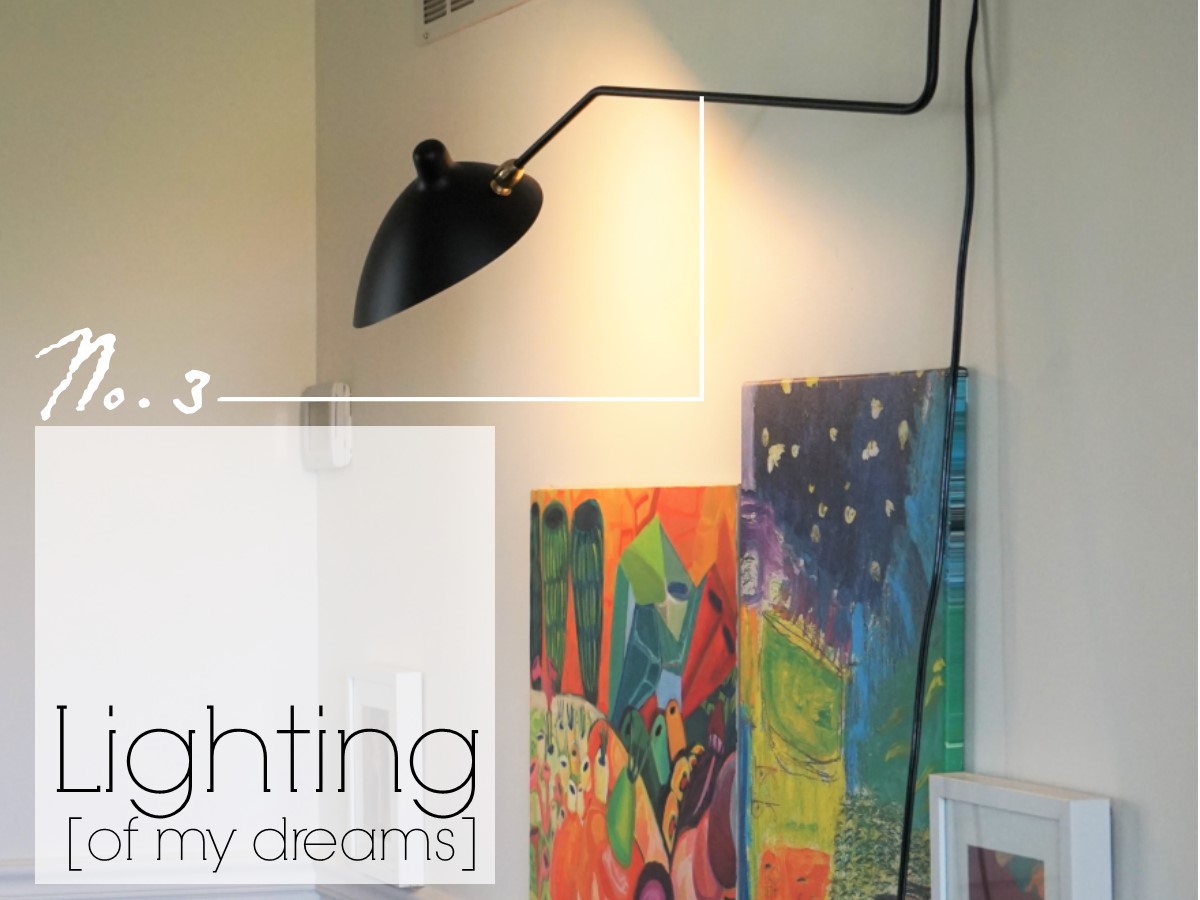
So how do you get a cool dining room light without replacing the ceiling fan? You install this bad boy:

public.jpeg
public.jpeg

I have actually admired this France & Son light fixture for a long time (did you catch that Chelsea used it in her latest eDesign reveal??). I used to sit in our last apartment and try to justify where I would use it but the scale just didn’t make sense in the bitty living room. When it became clear that this fan had to stay, I went back to imagining it in our new space and resolved to put it on my 2019 Furniture Flip Bucket List.

DSC05644.jpg

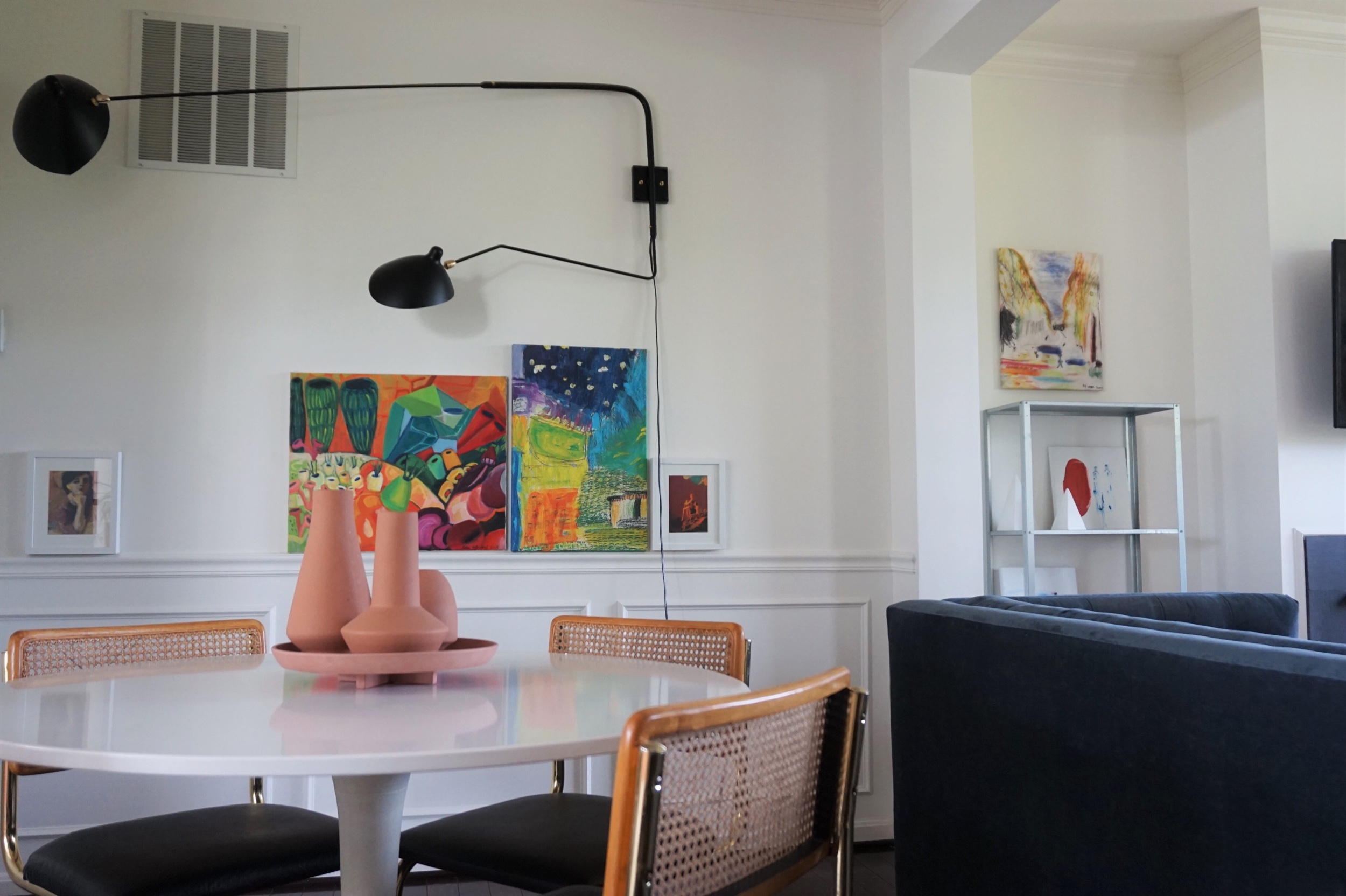
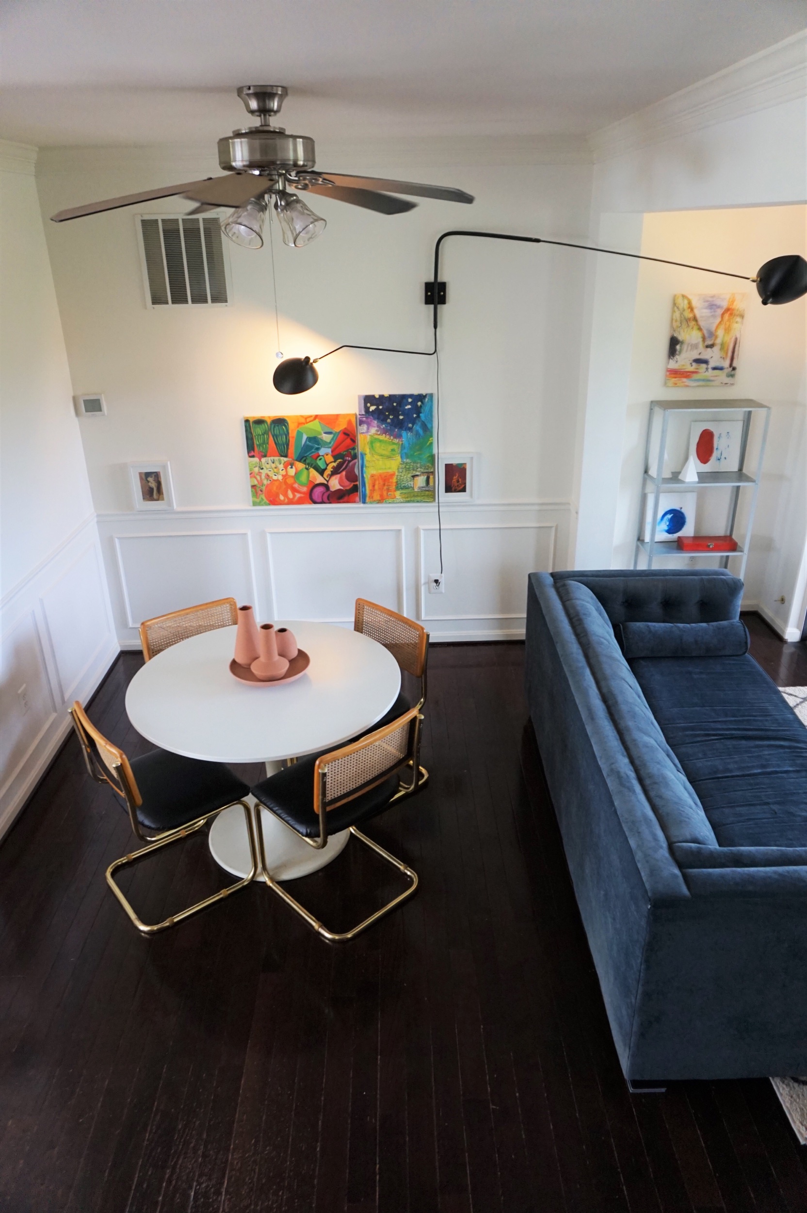
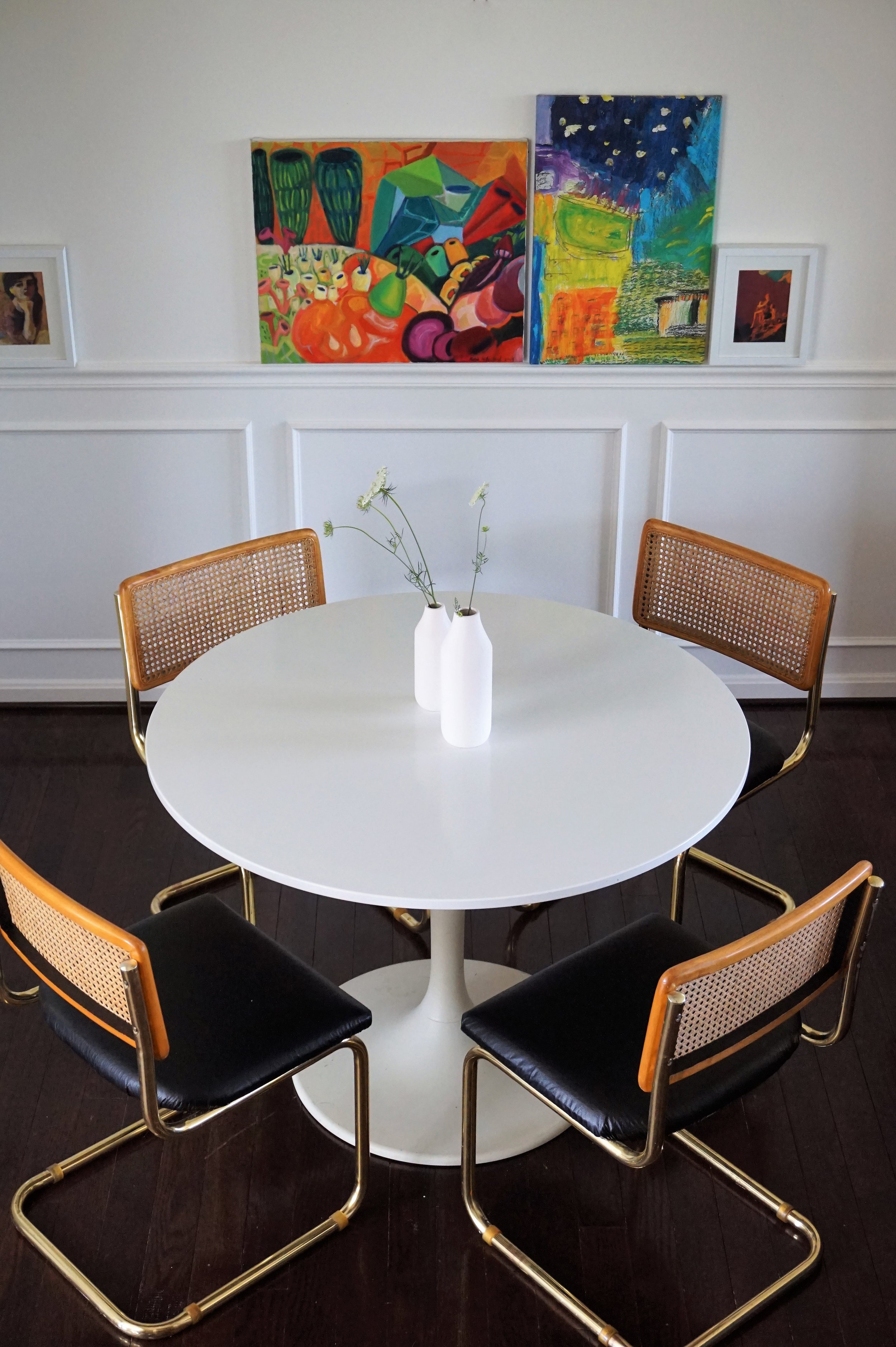
Now I wouldn’t call my style traditional in any sense, but I do have an appreciation for an old-fashioned look with a twist. We embraced the “traditional” moulding in our rental by painting it (and the walls) in a creamy flat paint and kept it fresh with our unconventional art positioning and eclectic dining set. Then juxtapose a light with odd modern shapes and our cool take on a traditional dining space is complete.

DSC05641.jpg
public.jpeg

Caleb and I often disagree over form vs function. I always seem to fall in love with pretty things that aren’t always… practical. And Caleb will fight tooth and nail to keep something butt ugly… as long as it’s comfortable. Ha! God knew what He was doing when He paired us together. A marriage of opposing forces sometimes means conflict, but mostly it means compromise. Sometimes Caleb lets me do something he has deemed crazy (like two coffee tables) and other times I try to find an option that is both beautiful (for me) and functional (for him).

DSC05691.jpg

This wall-mount light is fully articulating so I can swing it over the dining room table when I want to pretend I have a real chandelier…

DSC05693.jpg

And Caleb’s precious ceiling fan can stay.

public.jpeg

The oversized wall sconce also adds light to the adjoining living room.

public.jpeg
DSC05689.jpg

This space is where we spend the majority of our time - which means I can stare and giggle at this light fixture as much as I want (like daughter, like mother). Let me give you a quick tour:

public.jpeg

Even though our landlord let us paint the whole space, we didn’t want to wager that he’d be ok with us hardwiring a bunch of things into the wall. The swing arm sconce is a plug-in that we can take with us when we leave. And the TV is surface mounted above the fireplace with a hidden cable box. Can you spot it?

public.jpeg
DSC05651.jpg

We used a HIDEit Mount to conceal the cable box behind the TV so we wouldn’t have to live with this electrical eyesore:

 
65215020_10157600568433109_7596764915658915840_o.jpg
 

If you’re renting or don’t want to hassle with running wires through your wall, I highly recommend giving their affordable gadgets a try.

DSC05715.jpg

Across from the TV is a lucky $10 find - a mid-century arm chair with mustard vinyl cushions.

DSC05666.jpg

He’s guarded by a 20-year-old rubber plant I found on Facebook Marketplace. I knew I’d never be able to grow something this mature from seed so I’m hoping his age means he’ll mostly take care of himself. Maybe just do a load of laundry every now-and-then or need to be let in if he forgets his key?

DSC05682.jpg

Baby and dog abstained from voting on the plant, so I resorted to bribing Caleb in order to keep him. Now Caleb has the plant naming rights - and he’s been torturing me with some hilarious (and obscene) titles but mostly we just call him BAP (Big Ass Plant).

DSC05685.jpg

Behind BAP are the stairs to the top level and a pair of cabinets from the US Patent Office. I bought them off a retired employee who even had the original patent paperwork for the uniquely designed drawers!

public.jpeg

Beyond the dining room, you can see the stairs to the lower level and our sunny kitchen.

public.jpeg

And that concludes our main level tour! Like I said before - if he hadn’t married me, Caleb probably would’ve married a ceiling fan. But if I hadn’t married him, I probably would’ve married this light.

public.jpeg

That’s a wrap on this year’s bucket list - with 6 months to spare! I can’t promise I’ll be that efficient next year, but I’m already dreaming up some new goals to meet and challenges to tackle.

public.jpeg

Five down and that’s a wrap! Catch up on the 2019 Furniture Flip Bucket List.

Cantilever Chairs || Plus a Dining Room Reveal!

Today is the day.  I finally have a room in our new place to share: our dining room!

3. Dining Before, Tan.jpg

Ok so it didn’t look like much when we moved in.  Basically three things had to happen to get us to this reveal day: 

1) The dining room HAD to be painted something a little less light-sucking
2) We needed to find some chairs - because what is a dining room without chairs amiright? 
3) I needed to decide what art to feature in here!

We (I mean er my familial paint crew - thanks again guys!) knocked out the painting on week one but finding some chairs that could really make a statement was proving more difficult.  But eventually, I found them:
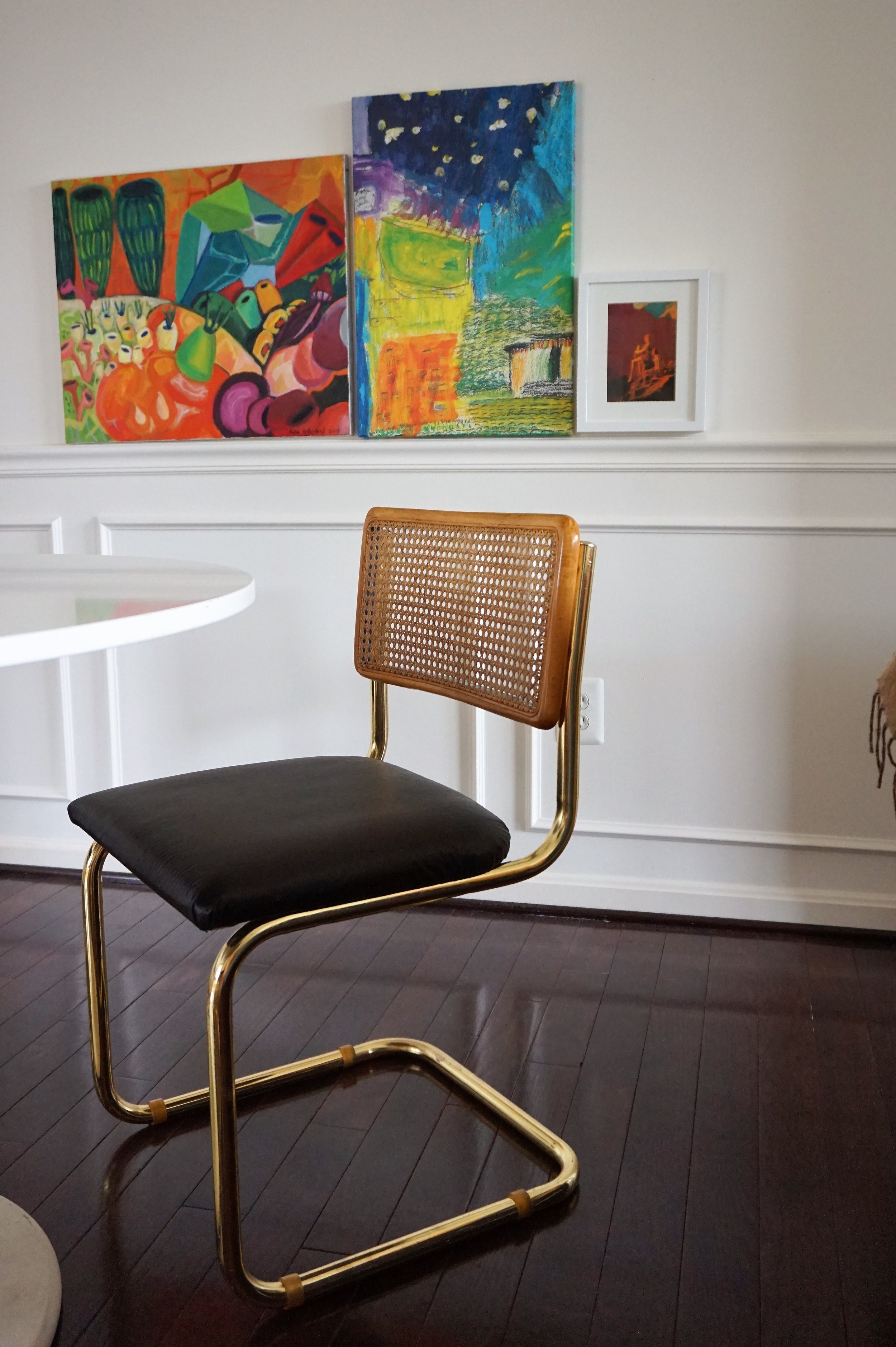
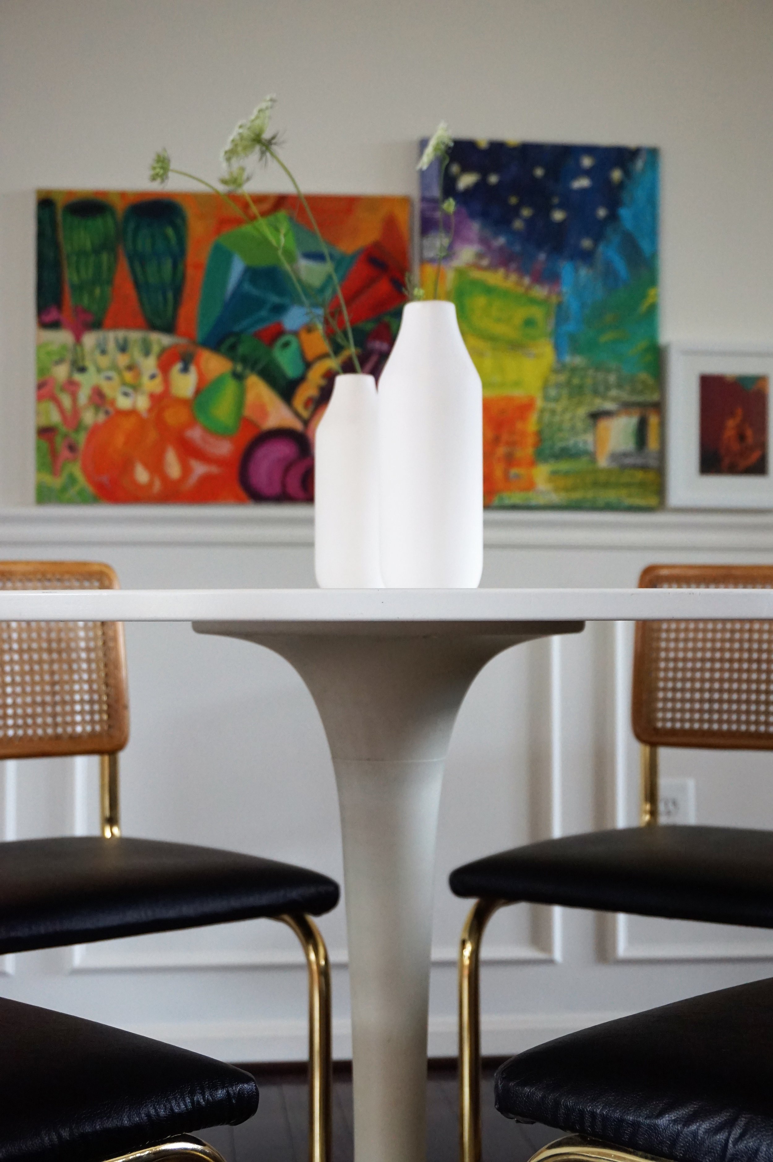
Brass... Breuer... CANE... Cantilever chairs.

Photo Jul 07, 12 15 00 PM.jpg

Up until I found these, I didn't even know Marcel Breuer chairs came in anything but chrome.  But when I saw these glittering gold chairs, I scooped them up - carrying two at a time through the maze of dusty furniture at the thrift store, slightly panicked that the other two wouldn't still be there while the check-out clerk waited for me to navigate them safely out. 

My original plan was to flip and sell them. But I wasn't sure what direction to take them in.  My gut wanted me to recover the seats in leather but I was having some doubts.  Between the warm cane and bright brass, I feared that richly-toned leather would stick out like a sore thumb.  It needed something to tie it all together.

Photo Jul 07, 12 17 05 PM.jpg

I sought council from my favorite sounding board Chelsea.  She actually suggested a soft, light velvet instead - wouldn't that be lovely?!  But after more research at the fabric store, I realized velvet was out of my price range.  Plus, I already had some yardage of leather in black and didn't want that to go to waste - but what could I do to marry the look?  

Photo Jul 14, 2 31 52 PM.jpg

Eventually, I landed on adding an unexpected touch of black on the back of the cane.  Suddenly, this discreet black lip is what I needed to realize I was in love!  Alrighty - let's see it all together shall we?

IMG_1226.JPG

Ah the paint color already makes a WORLD of difference in this space.

IMG_1222.JPG

And these chairs are the stuff my dreams are made of!

IMG_1223.JPG

Can you see the touch of black on the inside lip?

DSC04432.jpg

At certain angles it even peaks through the cane.

IMG_1218.JPG

It’s funny to me that rooms with molding used to always read really "traditional" to me.  But when we toured this rental, it was the idea of making this space a fresh take on traditional is what sold me on this house in the first place - despite the dingy tan walls.

IMG_1224.JPG
IMG_1221.JPG

As for the art, I tried hanging all sorts of arrangements in this dining nook and was despondent to all of them.  I had wanted something long and low to lean a cluster of art on but the dining room didn't have space for a buffet or credenza.  But when I hung the art low and along the chair rail I realized it created the same effect that I love without the added furniture footprint!

IMG_1220.JPG
IMG_1228.JPG
IMG_1225.JPG
IMG_1217.JPG

Even though they were originally supposed to be for sale, once I brought them in around our table - I was done.  These babies were mine.  And the perfect crowning jewel to our freshly finished space.  Hoping to have more of our new place to share over the coming months so stay tuned friends!

IMG_4088.JPG

eDesign Reveal: Dani's Dining Room

StyleMutt Home hasn't been offering design services for very long - just the past few years, with last year being a break through year that accounted for 23 individual jobs as I switched gears to follow my passion for design full time. I won't get into dull shop talk except to say, we are a small but mighty team! Each of us, Cate, Mckenna and myself, all share a passion for home, and I've discovered that we each bring unique skills to the table. The reveal that I've got for you today is such a fun example of what happens when heads and hands come together.

You may recall our reveal of our dear client, Dani's, living room and breakfast nook from last Summer. Prior to that reveal we had already begun work on her dining room which is just around the corner from those other areas of her main floor. As you can see below, it was very important to me that her home tell the same story throughout. No surprise colors or accent walls! Dani's style is soft but edgy and she's up for taking risks as long as they're practical.

Want to see a before picture for the books?

21.jpg

It's amazing, isn't it. Hah! Dani and her beau, Nate, did the hard part - they painstakingly peeled the wallpaper and painted the room before we even started working together! That's a gigantic first step for any space! So it was a fabulous white box when we arrived, except for the gorgeous Anthropologie table that Dani had already purchased, and the fancy-schmancy chandelier that they'd been instructed not to remove by the landlords, (this is a rental).

The chandelier was a stumper. It's not Dani's style but at the same time this is a formal dining room, afterall. There aren't many of those around anymore these days! So with my first formal dining room to design I was thrilled by the challenge of figuring out how to make it Dani's style and 'speak the same language' as the rest of the home, as Cate says. The three design boards below were the original ideas for the space, with the final design being a blend of 2 and 3.

Final design! I happened by my favorite local stop-in, Valerianne of D.C. to see what they had as far as storage pieces and art - it was a hoot snapping all the viable options that day and texting them to Dani for her thoughts! The piece in the board below won her heart and she snatched it up right over the phone while they wrapped it!

Dining Room design board.jpg

So the room was coming along as decisions were made regarding the larger items, but we needed a lot of things to layer in. As much as I adore those shelves for the way they're constructed, they weren't cutting it totally empty. I had an idea of what I wanted them to look like but it was fuzzy, like I couldn't make out the precise details. So I reached out to Cate and McKenna explaining how I thought a really monochromatic look with a lot of white elements and some fresh greens would complete the space really well. They proceeded to scour the internet for all the pretty, neutral things, and then Cate took those items and created a digital rendering of how to stye the shelves.

OB-Dani's Dining Room Shelves.jpg

I mean, who gets to work with someone who can produce THAT?! It's pretty special. So with the big stuff and little stuff decided, our first formal dining room was born.

Oh yes, the old man sketch was also a Valerianne of D.C. purchase, framed at Michaels. We all like him and we don't know why. That's the best art though, isn't it?

1.jpg

Oh yes, before we go any further someone would like for everyone to know who's house this is:

16.jpg

Lonny has our hearts forever. We have a stack of pics of this sweet boy, but we'll stick with the room for today. ;)

3.jpg

One week before heading up to photograph the space with Cate I wasn't quite feeling a table centerpiece. I was toying with the idea of completely setting the table for the pictures, or creating a floral arrangement that would be placed off center...but nothing was sticking out as a winning idea. I texted my Momma, (who has a very good eye for this stuff), an unstyled progress picture of the room and asked for her thoughts. She suggested a long and narrow container full of tiny plants. Bingo! With little time to shop around I went to our local Lucketts Antique Store and found a galvanized metal feeding trough. Though the finish was too rustic for the space, there are times when you just can't beat finding the perfect dimensions. So I brought it home and gave it a couple coats of Rustoleum White Enamel. It's definitely a statement centerpiece without overwhelming the space. Exactly what the room needed! Way to go, Mom!

4.jpg

I think Cate had just a little bit of fun playing with these shelves before we took pictures. She styled them out of the park! That fuzzy idea I'd had months ago of how the shelves would look finished - this was totally it. How'd she do that?!

5.jpg
6.jpg

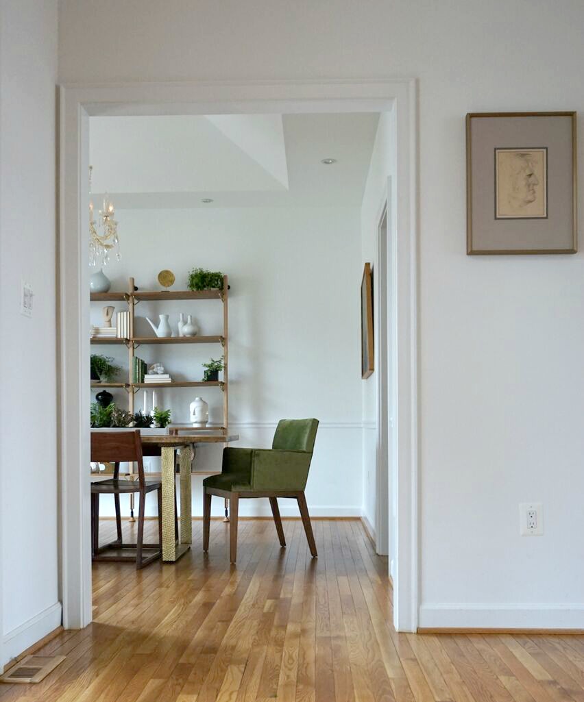
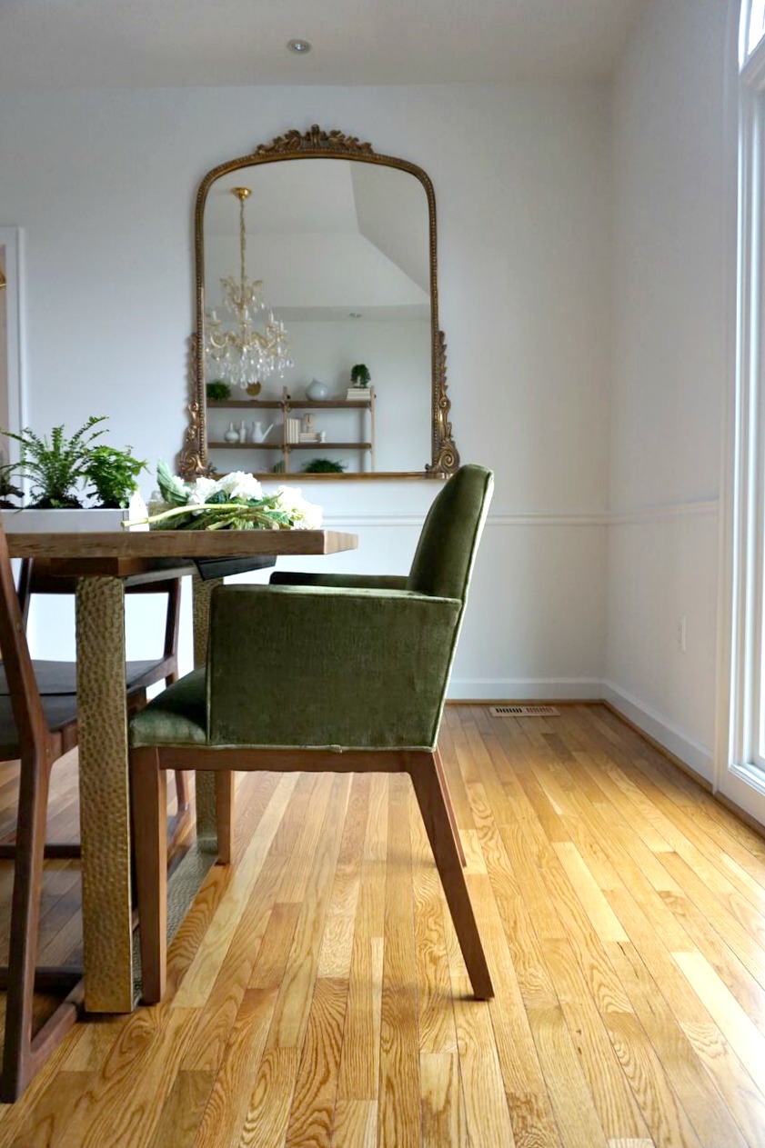
I love the peek-a-boo touch of brass on the chairs - such a subtle element but when I was looking into durable, wooden chairs that would measure up to the live edge and brass dining table, these spoke the language very well, indeed. I don't typically think of wooden chairs in a formal dining room, but these are pretty special.

8.jpg

Oh yes, and there's a gigantic mirror anchoring the entire other side of the room! It's not antique but it sure looks like it. That piece really ties the chandelier and other elements of the room together well.

9.jpg

Details for days...

15.jpg
14.jpg

Dani begged us to be in a shot where she was pretending to cut flowers. NOT! We asked her .237 seconds before snapping this if she'd mind jumping in so we could grab a living shot of the room. And guess who was right at her heels. :)

18.jpg

Well, that's a wrap! Sorry for the length today but I wanted to share a bit of the progress that went into transforming this space - it was such a fun experience! Dani just handed over her bedroom and we are thrilled to dive in and get started in there. We'll keep you posted!

Thank you so much for stopping by today!

Chelesa.jpg