Reader Design: Claire's Custom Space

Fall is officially here. It has me craving hot toddies at 4 o'clock in the afternoon, which is not quite acceptable yet - but we're almost there! It also has me keeping an eye open for perfect "trick-or-treating" homes, where parents & kids alike feel called to walk up to the front door. 

Today, I'm introducing you all to Claire from Vista, California, a small city just north of San Diego, where I can only imagine Halloween is perfect. 

Claire and her husband built this beautiful house two years ago and have been making it home with their son ever since! 
From Claire: 

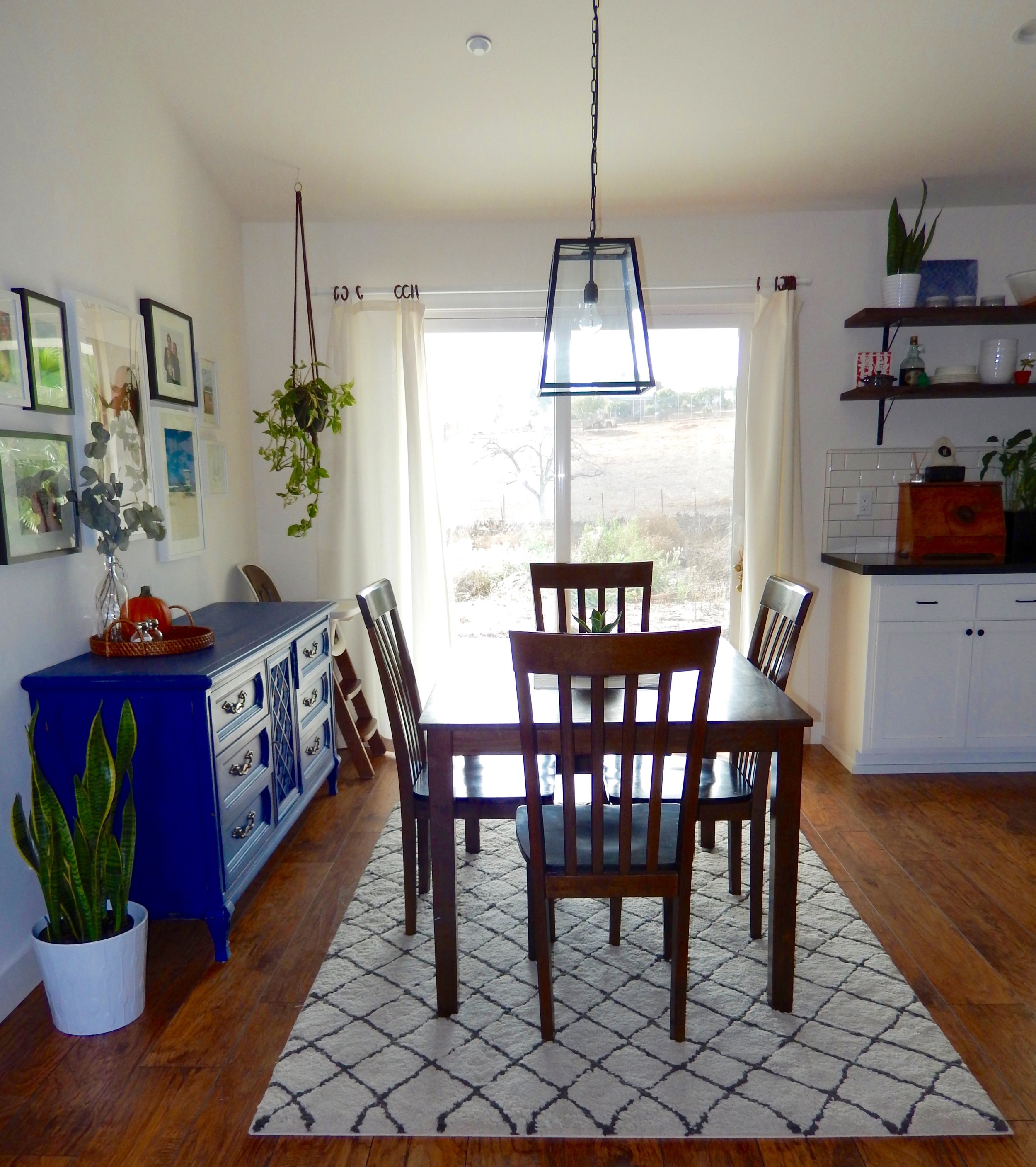
[Our home] has an open floor plan, clean lines, and tons of white, which all help in making it seem spacious and airy. I don’t know if color just terrifies me, but my home is mostly made of neutral tones. I love the mood set by natural wood against white walls. There are, however, some pops of color throughout the spaces. Anytime you see them, it is me being daring!

You all can probably tell this already, but Claire is a style mutt to the core. 

When styling my home, I drew from a plethora of styles: modern, boho, industrial, shabby, farmhouse...I could go on and on! It is just important to me that the spaces feel light, minimal, and fresh, without feeling cold. One of the easiest ways to stay away from ‘cold’ when you want a minimal look is to decorate with things that have meaning.

One of the key indicators of a mutt is a love of moving things around - art, accessories, even huge furniture. That willingness to change spaces frequently, and swap in items of totally different styles, normally indicates a willingness to take risks. Even though Claire says she's a little intimated by color, I would beg to differ judging on her favorite piece! 

A favorite piece is the blue dresser in the dinning room. This was the first piece of furniture my husband and I bought after getting married. We almost sold it a million times, because it was in our bedroom and I thought it was too ‘shabby’ for the look I wanted. However once I moved it to the dining room and coupled it with some modern pieces, I fell in love!
 
 
Another aspect of my decor is plant life. I love the freshness it brings to a room and the pops of green amongst my neutral decor. I swear, whenever you are in a decorating rut with a certain space, just add a plant and the problem is fixed! This is one design element I am always down to splurge on. That and my bed!

I'm all about beds these days {stay tuned for my bedroom refresh reveal soon!} and am totally supportive of Claire's splurge on that one!

Thank you, Claire for this insight into your beautiful home & life!
Follow Claire along on Instagram @clairealexis to get more peeks into her design and life as a mother in CA! 
Happy weekend, Mutts!

Quick Flip of a Roadside Find

It was a warm, muggy day and I was walking out of the twins' elementary school with Mason and some neighbor friends who we had joined to help out with field day. My friend Alecia, with her belly about to pop with her baby girl, had locked her keys in her car. So, we all hopped in our van, drove to their house where she got the spare key, then we dropped her off at her car. It was then that I realized a few driveways up from her car was some sort of wooden object. Always worth checking out! So I pulled up and found this guy!

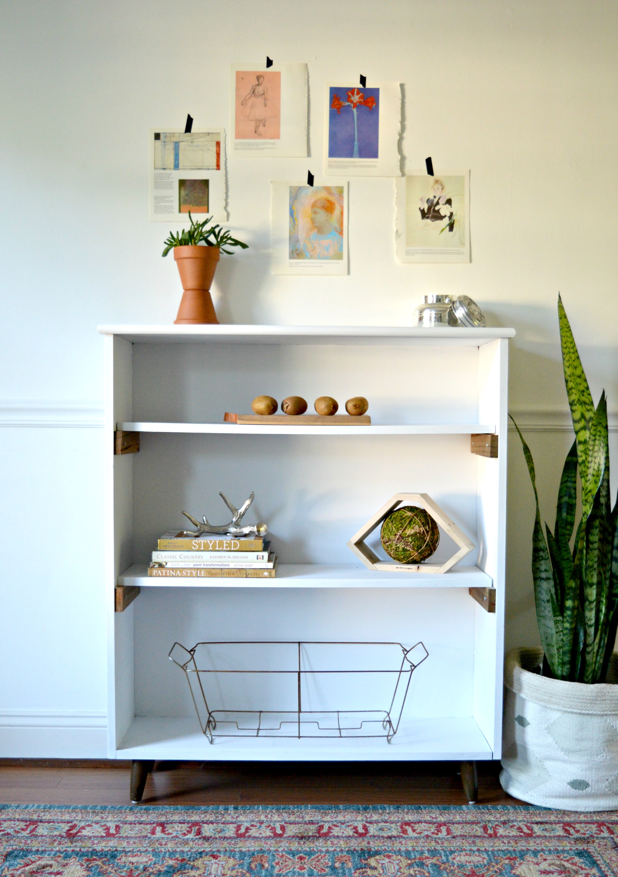
This piece was almost cool. The unique size, (almost square like), and tapered legs made it worth loading up to bring home for further inspection. It's not all solid wood, most surfaces were scratched up, and the back is some sort of cheap composite piece. But my biggest strike against the piece were the adjustable shelves. I'm a huge fan of adjustable shelves when they're hidden behind cabinet doors, but seeing the multiple holes drilled into the sides and those small metal bracket thingys made this particular piece look cheap. But, like I said; it was almost cool! Close enough, at least, to give it a go.

When it comes to mid-century modern furniture I always try to maintain the time period of the piece, and two-tone, (or white and wood), is a classic look that has withstood the test of time. I filled in the holes on the sides where the adjustable shelf options were and then made some simple wooden brackets to set the fresh white shelves on. Other than the wood brackets and the tapered legs, I painted the piece white.

I've always loved how items pop on white shelves! (Check out Cate's dining room campaign style shelves to see what I mean!)

Fuzzy kiwis. Adorable.

Petite MCM Bookshelf Now Available to DC Locals
43"H x 36"W x 12"D
$125

Thank you for stopping by!

From Drab to Dapper

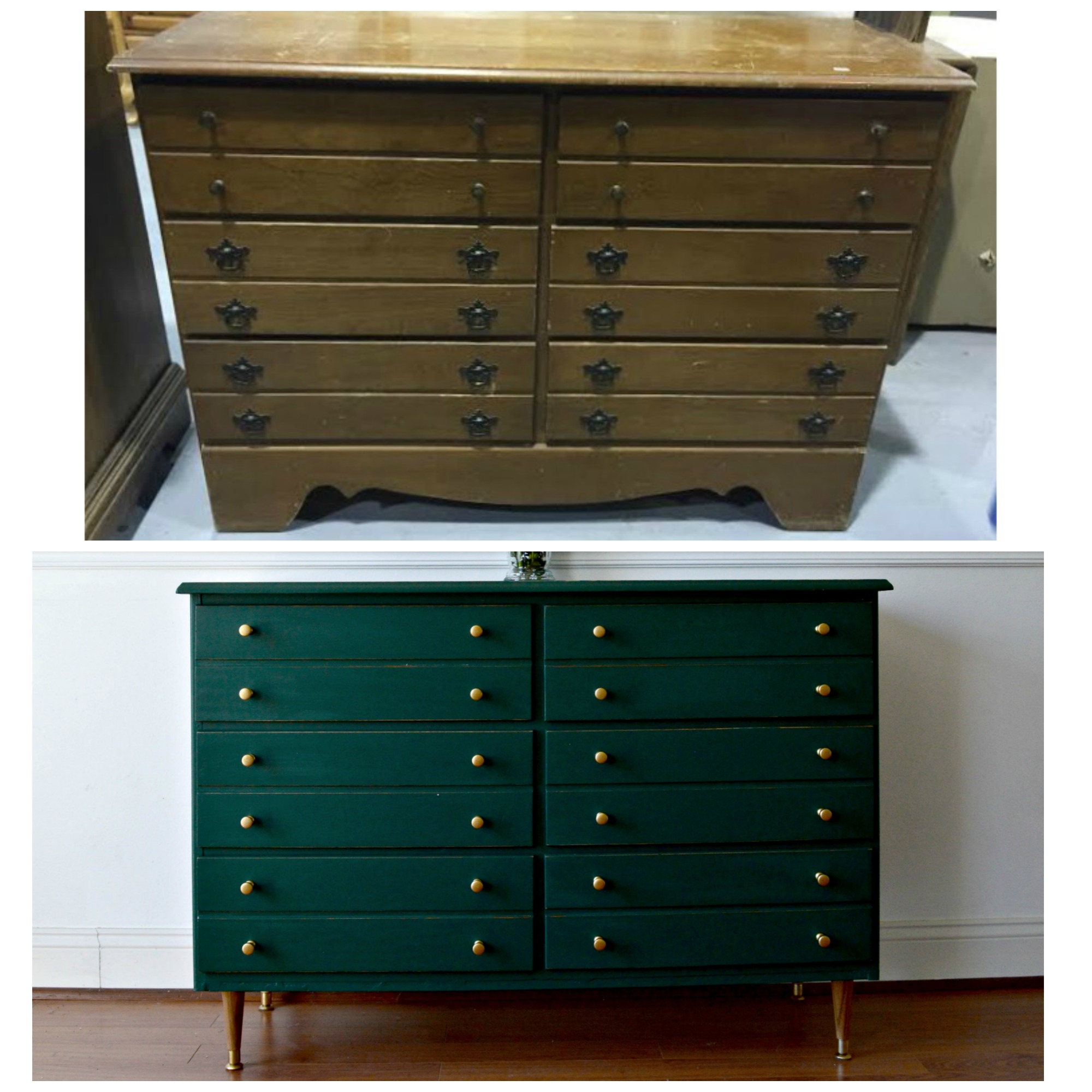
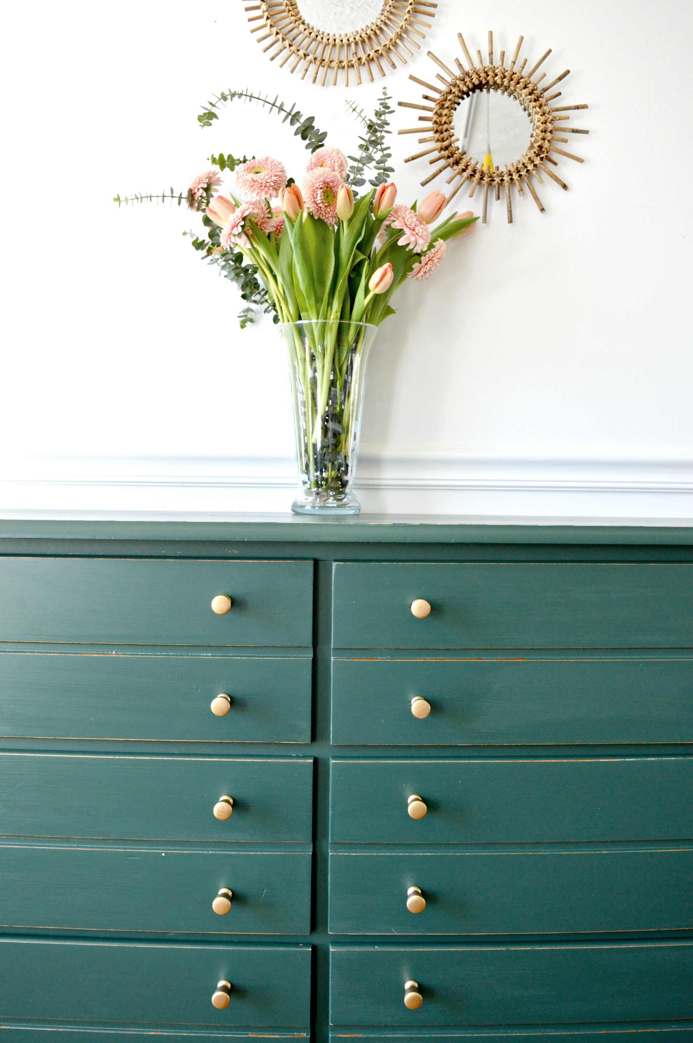
Dapper is the first word that came to mind when I finished flipping this dresser found last week:

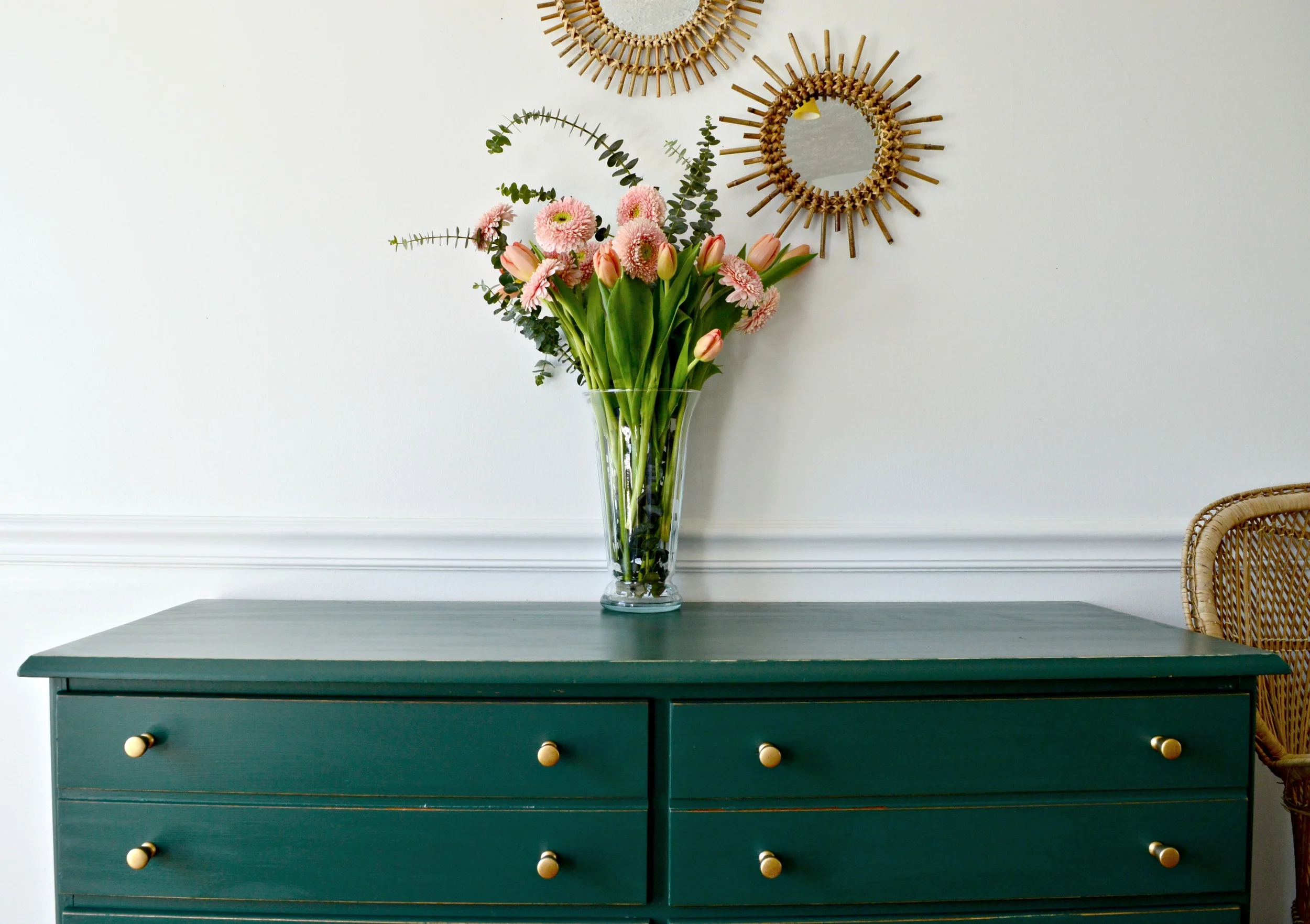
First - I found this piece the same day that Cate shared her Hairpin Legged Map Chest. I was so inspired by her flip that I snatched this one right up, (although mine is not a map chest; the drawers are deep wannabees)! I really wanted to do this in a rich tone which is not an inclination I typically have, (maybe I was channeling my inner Cate in more ways than one!) But there is something so suave about this hunter green ('Secluded Woods' by Behr), paired with brass; it makes me think of my husband when he's lookin' sharp! (Always) 

But this flip was anything but snappy! By first look I figured it would be easy enough to remove the scalloped piece at the bottom of this thing. And it was:

Okay, so this photo shamefully portrays how horribly out of order I do some things. I did remove the scalloped trim first, but then I painted away and added the hardware before I solved my biggest problem: What next?

I shared this photo with Cate telling her my latest flip and I had some major unfinished business to tackle together. And boy, did we! This shot doesn't show the magnitude of what was underneath but it took me several days and sleepless nights to finally figure out how to deconstruct the underpart of this dresser without ruining it. After solving the puzzle we gave our friend here a new base:

Now I could add the sleek legs I'd imagined when I saw this piece in the thrift store!

Oh - and a chair lying in a heap outside a thrift store found me. But that's a story for another day.

While 'dapper' is how I would describe this piece I wanted to style it with a more feminine presence and contrast that green with something sweet - peach! Hunter green and peach are a favorite combination at any time of the year, but seem especially fresh in the Spring. If a pastel palette doesn't work for you, try mixing deep rich tones with softer colors at the opposite side of the color spectrum. I found just the colors I was looking for during an early excursion to Trader Joes where I had the first pick of the days' stock:

My jolly green pal here is now available for sale to DC area locals!
45.75"L x 32"H x 17.5"D
$350
Please contact me at chelsea@stylemutthome.com if interested in this piece or a similar custom order!

Thank you guys for stopping by and have a wonderful weekend!