A couple months ago, a dear dear friend from college honored me with two incredibly humbling questions:
1) Will you be bridesmaid?
2) Will you build me a giant pink wall for my wedding?
I gushed and naturally said yes to both. Amanda had an AMAZING vision for her wedding: vintage Hollywood glam set in a downtown Richmond, VA historic train station with burgandy, black, champagne and blush as the wedding colors. Tres Chic!
Much like mine and Caleb's wedding, Amanda & Stephan had the ceremony and reception in the same room. Super convenient (if I do say so myself) but still proves a challenge to define your "altar" space. This is where the pink wall came in. Amanda needed some sort of free-standing focal point for the ceremony that could be moved during the reception. She found this STUNNING inspiration photo on pinterest and asked me if I could adapt the idea to her venue:
Gulp. Ok I was a little nervous. This backdrop is GORGEOUS! And we did not have a slush fund to pour into such a ceremony show stopper. But then the sweetest thing happened. Other than an epic union before God, weddings are the chance for the community to come together to celebrate the couple. To help Amanda achieve her pink vignette, her community stepped up and started scrounging up the materials we needed to complete the look. The bride's mom took down all the sheer curtain panels in her house. The groom's mom went on a hunt for the perfect bolt of blush sheer fabric. Even my local Home Depot got in on it: they let me spend 3 hours monopolizing a rep and the entire PVC pipe aisle to get the measurements for the frame just right.
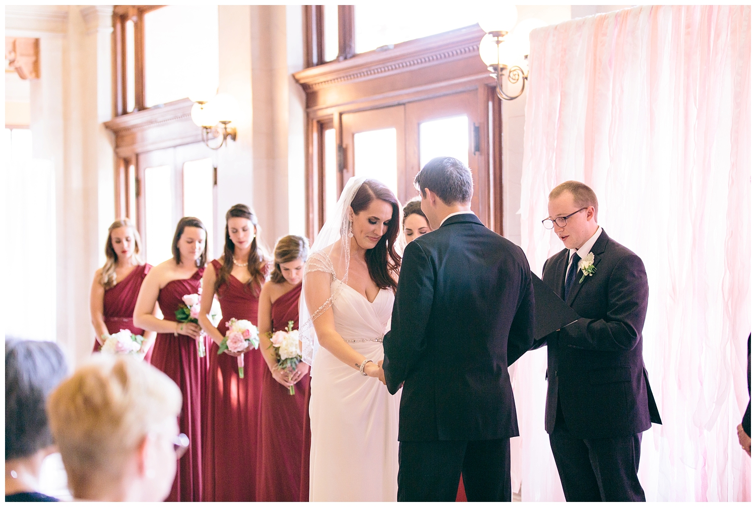
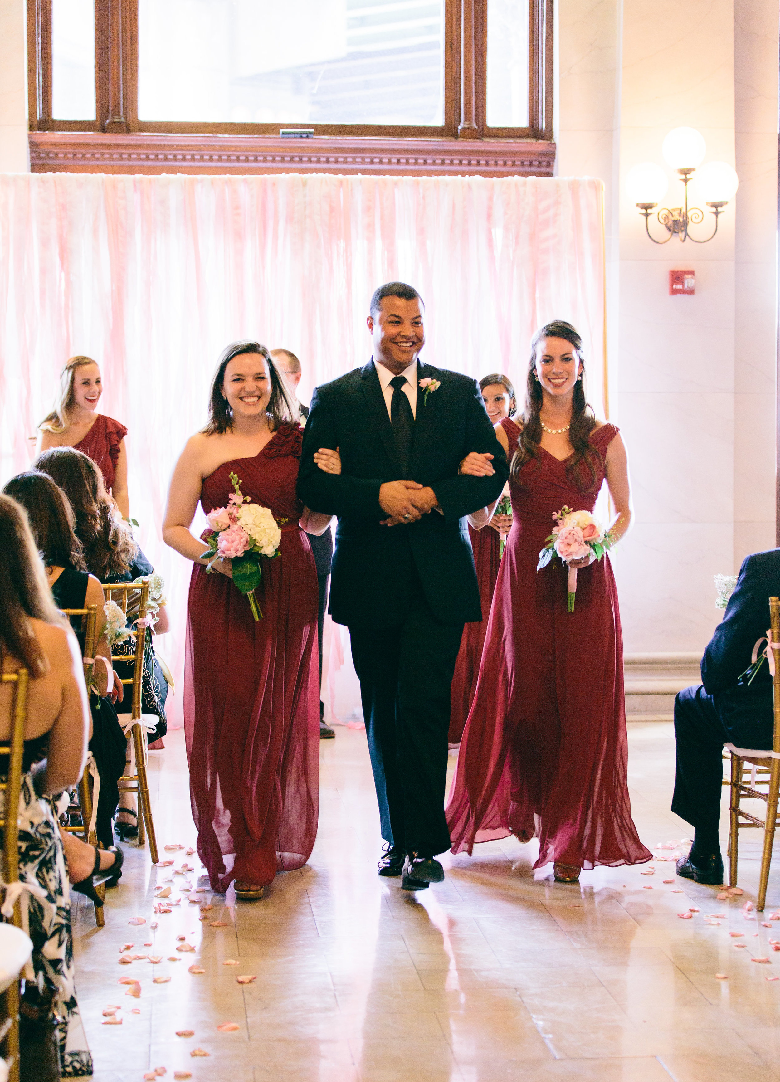
The end result was even more beautiful that the pinterest pic. Not because of my labor of love, but the compilation of loving family and friends that went above and beyond to love on Amanda & Stephan that it represented:
It's pale pink glow greeted the guests as they were seated for the ceremony without detracting from the glamorous venue and softly illuminated the already glowing couple.
Source: Derek Fowler Productions
Source: Shalese Danielle Photography
I love that Stephan is stealing a glance at his bride in this shot.
Source: Shalese Danielle Photography
Source: Shalese Danielle Photography
Source: Shalese Danielle Photography
Source: Shalese Danielle Photography
Getting escorted out with fellow CNU alumni.
Source: Shalese Danielle Photography
I made the 8' x 10' frame from gold painted PVC pipe. The curtains were a combination of LILL IKEA curtains, shredded shear curtain panels, pink tulle, crepe paper streamers, and 11 yards of blush organza.
To my dearest Amanda & Stephan: I am so so honored to have been a part of your big day and wish you both a lifetime of profound joy and love :)


