Reader Design: Ashlee's Calm & Comfy Home

After a bit of a hiatus on these reader design features, we're back and headed to sunny California! Ashlee is a sweet mother-to-be and talented interior design who draws inspiration from the calm and comfortable Sacramento surroundings.

sacramento-interior-photographer-photo-8.jpg
sacramento-interior-photographer-photo-3.jpg

From Ashlee:

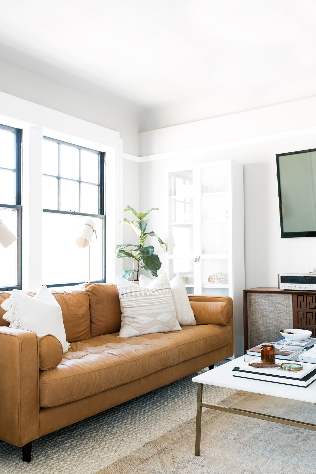
I’m a true California girl, and my personal style and interiors style, I think, are a reflection of that. I would have to say one geographic place that describes my homes aesthetic would be Venice or Ojai, just that simple modern California feel. I love evoking feelings of calm and comfort. I want my home to be a place where people just want to hang out for long periods of time and can truly zen out.
sacramento-interior-photographer-photo-2.jpg
sacramento-interior-photographer-photo-4.jpg

The home is classic and soothing, but still entirely on trend without it being too much. That's the California way, isn't it?

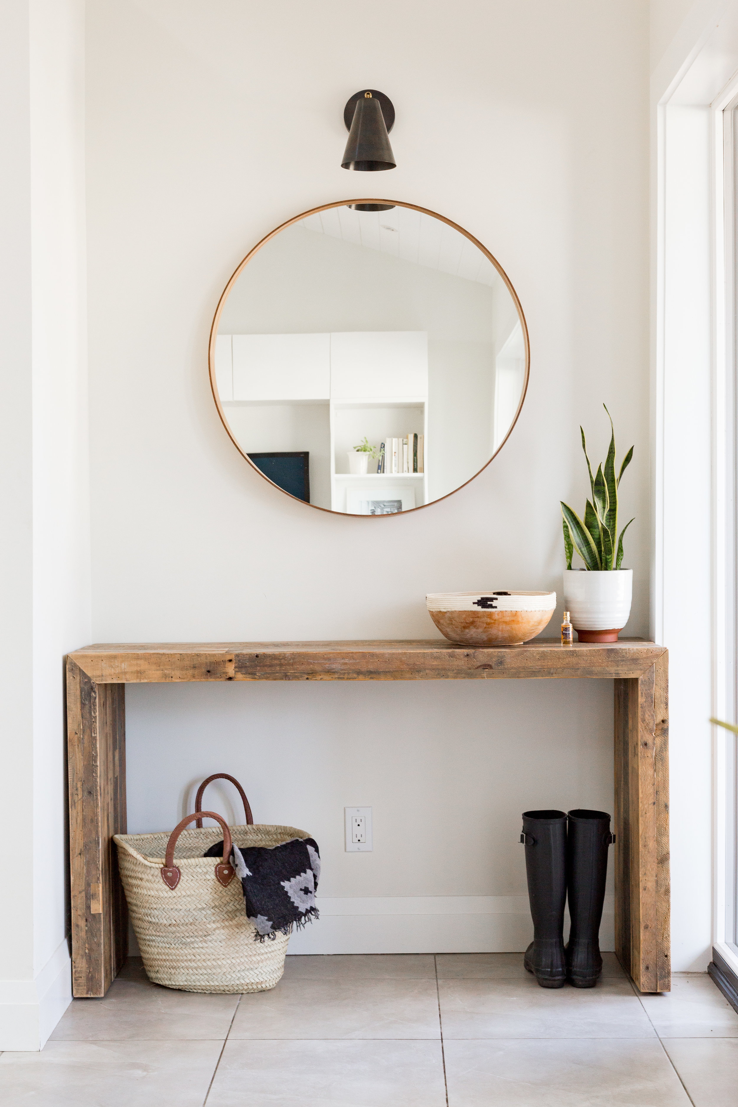
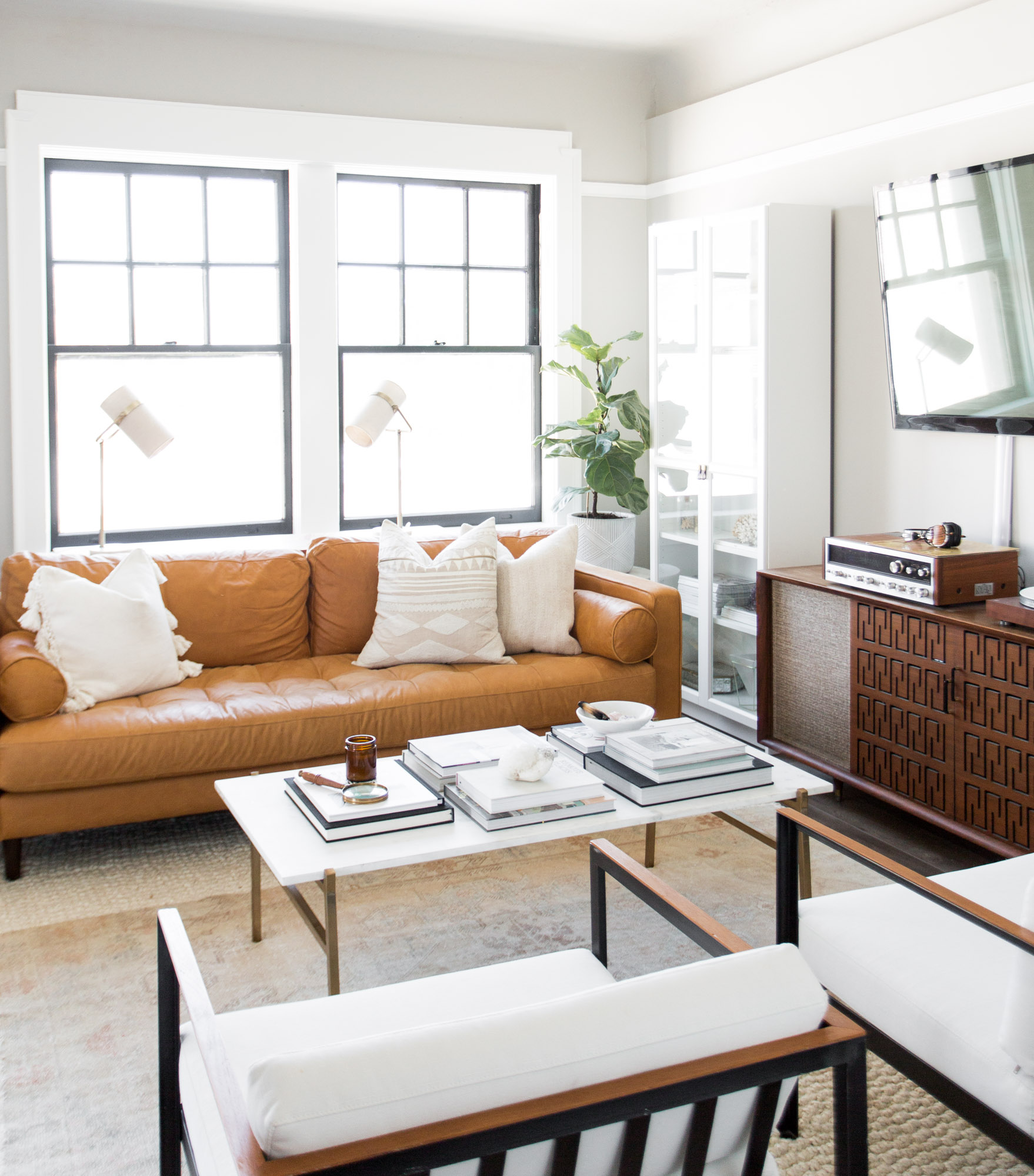
I have to admit I have dabbled in a few trends myself. Brass being one that is seen in my space. When making the decision to add some more trendier elements in my house that I know may not be around forever I kept it to a few select things (lighting, coffee table). It is easy to get carried away, but if you keep them to a few select items you can always switch them out later.
sacramento-interior-photographer-photo-1.jpg
sacramento-interior-photographer-photo-5 (1).jpg

Amongst the brass and plants are plenty of older and vintage touches. Take the dining room for instance.

While not a piece of furniture, the built-in element of our apartment is a total favorite. The building we live in is over 100 years old and recently went through a complete renovation. They kept the charm of the molding, built-ins, and doors that I truly love and appreciate. Plus I fill it with treasures that represent us as a couple.
sacramento-interior-photographer-photo-9.jpg

It's a home that's as classic today as it would have been years ago - and will for years to come. Ashlee, thank you for letting us in and showing us around!

Follow Ashlee along on Instagram at @ashlee_berry. And for more gorgeous photos, follow photographer Nicole at @nicoledianne.
McKenna Sig.jpg

Reader Design: Lisa's Scandinavian Style

Let's take a field trip to Canada and Lisa's neutral, simple, and modern home. It's the kind of place where you can relax but also feel like you're in an upscale hotel - possibly one situated in an urban Scandinavian city. 

Growing up I spent a lot of time in Denmark visiting family, and I was definitely influenced by their modern, simplistic and practical style. I remember being surprised by the bright, open spaces and simple decor. It contrasted so much with our own 80’s home that seemed dark and congested in comparison. I haven’t been back in ages, and now that I have a better understanding of modern design I think I would be in heaven.
 
AH6A1447-2.jpg
 
IMG_4594.jpg
IMG_4754.jpg
AH6A1469-2.jpg

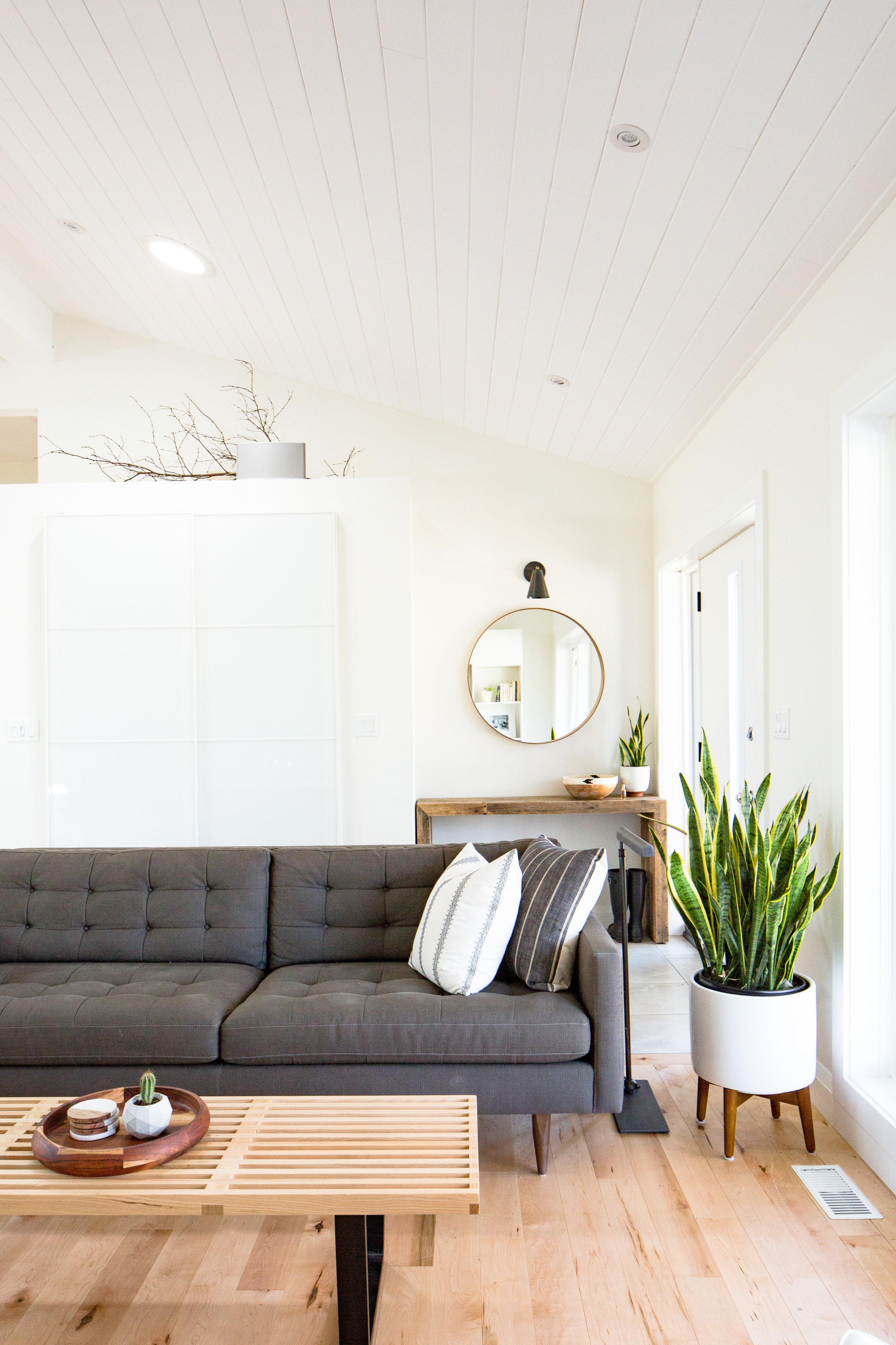
Sometimes Scandinavian or minimal style can read as cold, but Lisa still finds a way to make it warm and inviting for her family. 

More than anything I want my home to be a comfortable and inviting place for my family. I don’t think we get that feeling when a space is visually cluttered. On the other hand, too few things can make a place seem sterile, so I try to create balance by adding warm, natural elements like wood, leather, plants and textiles. I also prefer a neutral colour palate which creates a sense of calm. I recently purchased a couple of rugs for my home and they both have a rich colour to them, but work well with the surrounding neutrals. Textiles and artwork are two categories where I will make an exception to the no-colour rule.
AH6A1626-HDR-2.jpg
IMG_0760-2.jpg
AH6A1436-2.jpg
I try to avoid anything too trendy, preferring instead to invest in pieces that have been around for decades and have staying power. Also, for me, design has to be practical first, then stylish, not the other way around. I once purchased some gorgeous bedside sconces from a well known company, but when I turned them on they cast such a harsh light in the room. I was sad to return them, but there was no question about it.
IMG_4221.jpg

Morale of the story? Focus on timelessness, balance, and authenticity in the design. You will not get it right on the first try, but that's why stores have return policies, right? And eventually, you'll strike the perfect match with pieces like last, like this 85-year old Iranian bedroom rug from @rugandweave.

Great work, Lisa! You'll clearly created a home that works for your family - and that's quite the accomplishment! Thanks for the tour. 

Follow Lisa along on Instagram @lisafogt for more great design!

See you next week,

McKenna Sig.jpg

Reader Design: Michelle's Suburban Escape

As anyone who has lived in a major city knows, sometimes you just need to get out. It took starting a family for Michelle and her husband to call it quits on New York City and Hoboken and make the move to the suburbs.

From MIchelle:

We spent years living in New York City and then Hoboken, but as soon as our son became a toddler, we started looking at homes in neighboring suburbs. There’s just something so calming about having your own personal space; no upstairs neighbors, your own backyard, and enough room for overnight guests! We moved into our new house exactly one year ago, and I swear, it’s taken that amount of time to really turn it into a home!
familyroom1.JPG
familyroom3.JPG
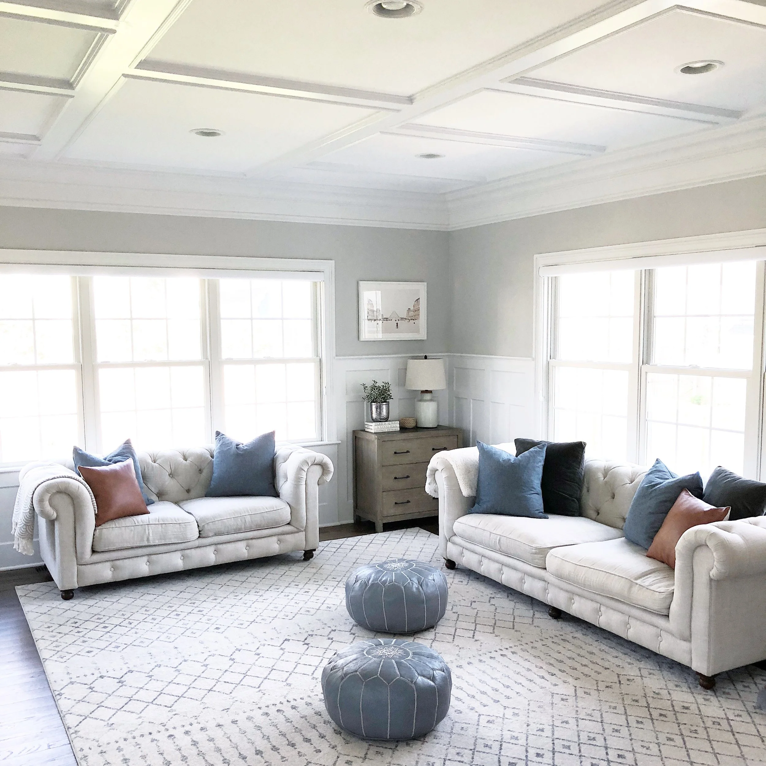
Even though we live in a suburb just outside New York City, but my style is definitely more “modern farmhouse” than anything else. I like the look of natural wood against more modern pieces, and in my opinion, you can have have too much white. I knew that I wanted our home to have a laid-back, cohesive feel. Nothing too bright or jarring, but still interesting, and most importantly, cozy. Plus, we have a 2 ½ year-old and a large dog, so it needed to be kid- and pet-friendly above all else!
diningnook2.JPG
diningnook3.JPG

Now, you all may not be seeing the family practicality in this design, but Michelle swears it's there!

When people come to visit, they usually laugh at the fact that nearly all of our furniture is white, despite having a toddler and a large, black dog — but I swear, it works for us! Everything is stain-resistant. My one tip of advice is to fill your home with pieces that you love, and to not worry too much about them being on-trend or getting destroyed. If you love the look of something, get it and keep it! I’d much rather live with a piece of furniture I love and have it fall apart after several years, vs. settling for something that never feels right.
kitchen4.JPG
Our kitchen is a simple and white, which is what I’ve always wanted. It’s bright even on a rainy day, and the closed cabinets offer tons of storage (which is good because we love to cook and have nearly every contraption you could think of!). The one thing we really insisted on when looking at houses was an open floor plan; we needed a kitchen that opened into the family room and dining area so we could prepare meals and entertain, while also keeping an eye on our son.
nursery1.JPG
nursery3.JPG
nursery2.JPG
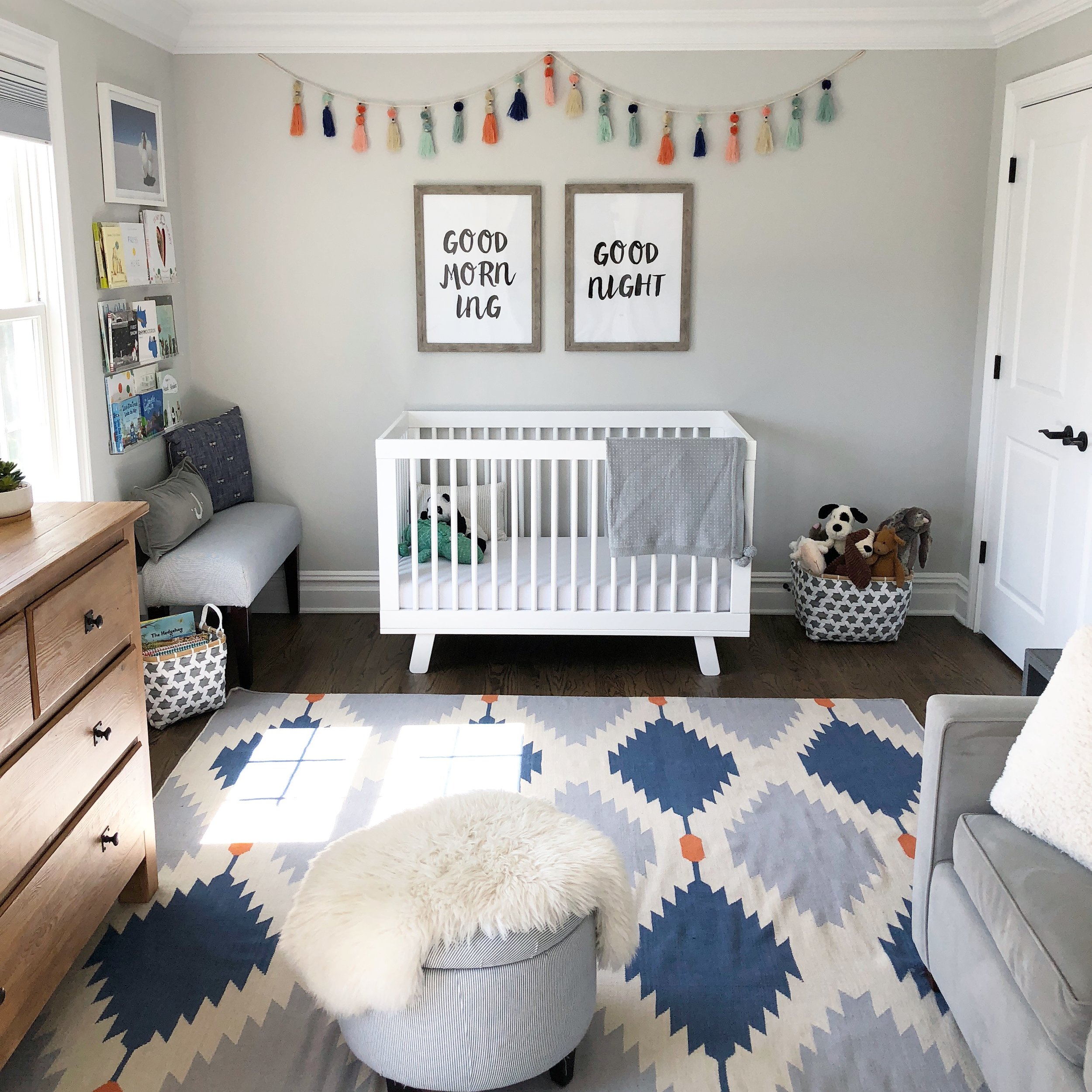
Our son’s room is probably the most colorful room in our house and I’m ok with that. The furniture is neutral, but I chose a colorful dhurrie rug and some fun garland to hang above his crib. And his toys and books add even more color.

The whole house is cozy, inviting, and classic, making it the perfect escape after years in the crowded city. Good choice, Michelle, and thank you for letting us in today!

Follow Michelle along on Instagram @girlonthehudson.

And now, I'm off to celebrate my birthday! Till next week,

McKenna Sig.jpg